Friday, December 31, 2021

The Best (and Worst) Movie Posters of 2021

For many, 2021 will be considered yet another highly abnormal, underwhelming year for movies. And it could go on for a while longer, further muddying the waters of not only what we watch, but how. While we've been moving away from traditional movie posters hanging in theater lobbies to signal an impending release for a while now, the shift's been accelerated over the past 18 months. It doesn't mean there still aren't great ones, just that you'll have to do little more searching. So for every design that seems engineered for a quick click when scrolling through your queue, I'd argue there are just as many out there ready-made for framing. Despite the circumstances, the year was still jam packed with great work, even as designers had to find new, creative ways around incorporating an increasing amount of text, streaming service logos, and multi-platform release dates onto their posters.

The IMP Awards site still serves as the most valuable resource for gathering most of the year's most notable posters, it's become impossible to ignore the fact that even they don't have everything, as the hunt for the one-sheet image of a little seen, well-reviewed indie can be just as challenging as locating the movie itself. In an obsessive effort to ensure none of those are missed I'm often last out of the gate with my list, often pushing this thing right up against the wire every December. So it wouldn't be fair of me to even post this without highlighting the lists came before since they're not only great compilations, but shine a light on the year's lesser known, overlooked picks. So before even looking at mine, please check these out: Mubi.com, Posteritati, SeekandSpeak,The Playlist

As usual, to be eligible, a poster must have been released between January 1st and December 31st, 2021, regardless of the actual film's drop date. But now the big change. After well over a decade of only deeming official release posters worthy of consideration, I've reluctantly decided to open the floodgates and include alternative/unofficial designs. It won't be without careful deliberation. but there's little reason to continue excluding valid designs from legitimate, professional artists and firms just because the studio didn't commission them for the job. And since everything is found or viewed on the web anyway, the line separating what's "official" from not has never seemed thinner, further reinforcing this as a dated rule. By now leaving the only question down to worthiness, I'd argue the adjustment improved this year's selections, opening up the field for riskier, less commercial-looking choices. So here's the top ten, followed by an alphabetical listing of runners-up and, of course, the highly anticipated year's worst.  


The Best...


10. King Richard 

At first glance, there doesn't seem to be anything incredibly special about GrandSon's official poster for King Richard, but maybe that's exactly the idea. It has one job: depict the uphill journey Richard Williams (Will Smith) took in training his daughters Venus (Saniyya Sidney) and Serena (Demi Singleton) to become the best tennis players in the world, against seemingly impossible odds. Whatever you may think of the real person or even how well or honestly the film interprets these events, this image nails that concept. Literally "pushing" them in a shopping cart full of tennis balls, it earns major points for not looking like a photoshopped image they just pasted on.

In rare attention to detail, they actually show their shadows, which you'd never guess makes that much of a difference until seeing it here. Great colors and use of negative space that puts the focus exactly where it belongs, with a border containing the tag line, which is different. The layout and placement of the credits on top are perfect, along with that awesome bright red King Richard title treatment. It actually compliments rather than distracts from Smith's top billing, making everything come together in a clean, crisp design that highlights the movie's primary intention in the best way possible.   


9. Red Rocket
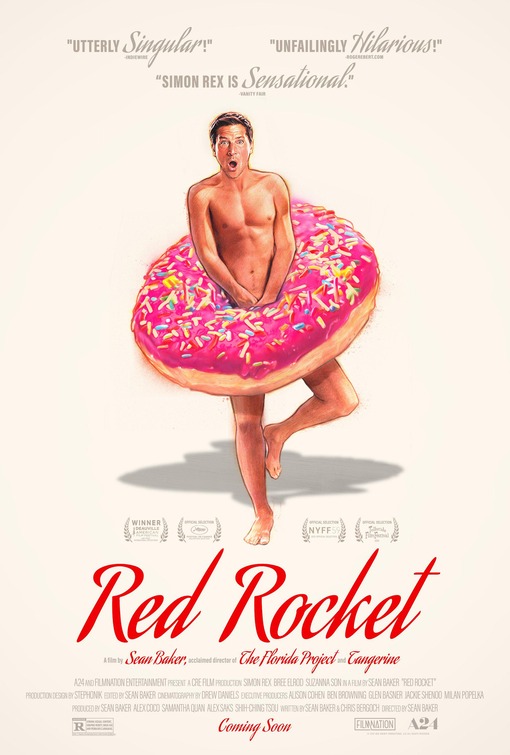
Another GrandSon design, this one for Sean Baker's film about former "adult entertainer," Mikey, (Simon Rex) who returns to his Texas hometown after 17 years, attempting to reconnect with his ex-wife and find work. It was never going to be the easiest sell, but this one-sheet illustrated by the great Steve Chorney more than overcomes that. Not only is the artwork top notch, the entire layout is excellent, with more great use of negative space along with those cursive critical blurbs hovering above the image of an obviously aghast Mikey covering himself with a bright pink donut. 

It's yet another example of how off-white/cream can be a strong background color, as the bright red, really well stylized Red Rocket title treatment nearly jumps off the page against it. There's no better combination that could have been used, resulting in a simple but memorable design capable of possibly  swaying any doubters on the fence about checking this out. While I previously had very little interest in seeing the movie, the artistry behind this poster makes me wonder if it doesn't contain a lot more depth than its description suggests. So for that, mission accomplished. 


8. Last Night in Soho

When the first wave of posters came out for Edgar Wright's 60's horror nostalgia head trip, Last Night in Soho, I couldn't believe how underwhelming they were given the film's premise and setting, both of which would seem to organically provide plenty of visual inspiration. For a while it looked hopeless until this painting from British artist James Paterson dropped, encapsulating on a one-sheet everything that those heavily anticipating Wright's movie hoped it could be.

Paterson avoids the pitfalls of the other inferior, more mainstream designs that struggled in depicting the duality of the two main characters. Their solutions were predictably a half-face, floating heads approach whereas Paterson is clearly reaching for something richer. With the bleeding pinks and blues, there's a watercolor vibe to it enhanced by a pretty magnificent rendering of Sandie (Anya Taylor Joy) staring a hole right through us, as wide-eyed, terrified Ellie (Thomasin McKenzie) hovers in the background. And you have to appreciate that old school title treatment, as well as that three-dimensional effect going on with the blue street.  


 7. The Batman

Those who saw the trailer for The Batman already have strong opinions on the decision to reimagine Riddler as a serial killer in the vein of the Zodiac. Being someone completely on board with this idea, when these series of posters dropped touting its eventual 2022 release, my interest was only further piqued for that approach. Works ADV came up with a few that all followed the same instantly recognizable red and black color scheme, but this is the one that truly stands out. In concept, it eerily recalls that memorable Heath Ledger Joker teaser from 2008, though a case could be made that this might be even more visually striking, if not scarier. 

The blurry, out of focus image of Paul Dano's Riddler against that black abyss of a background is as creepy and unsettling as it gets. And aside from the Zodiac-inspired question mark on his coat, the one thing we can make out ( that creepy, knife-carved, almost childlike "To The Batman" etching) gets the villain's message across loud and clear. And they couldn't have found a better, more unobtrusive spot than that top left corner for the scribbled Bat logo and March 4th date (assuming that holds). The verdict may still be out on the film, but this poster is the stuff of nightmares.


6. Prisoners of the Ghostland

"The Wildest Movie I've Ever Made" - Nicolas Cage. Well, that's saying something. It doesn't get much better than an endorsement from the man himself. I took me a while to even notice this amazing quote  because there's just so much else to look at and appreciate in this Prisoners of the Ghostland one-sheet from Stockholm Design. Whether it's really the wildest movie Cage has made (a high bar to clear there), this one-sheet does a very convincing job proving that case. It's almost impossible to believe this is an officially commissioned theatrical poster rather than an alternative design created by an independent artist, but it is. 

Definitely enough crazy to match its star, the incandescent glow of those reds and pinks almost give the illustration a blacklight effect. And just look at the scrap pile of skulls, corpses, clocks, samurai warriors and who knows what else inside that transfixing, glow-eyed statue. While a risk, that flowery background works against that color scheme, as does the bright yellow title. Obscuring Cage by having his back turned and hovering over the fray is brilliant since we know exactly who he is by silhouette alone. A long running joke that most of his films' posters have landed on worst lists for years has resulted in the thrill of seeing the actor's recent choices improve substantially, while as remaining weird as ever. This definitely captures that feeling in all its glory. And then some. 


5. West Side Story (Dolby and IMAX versions)
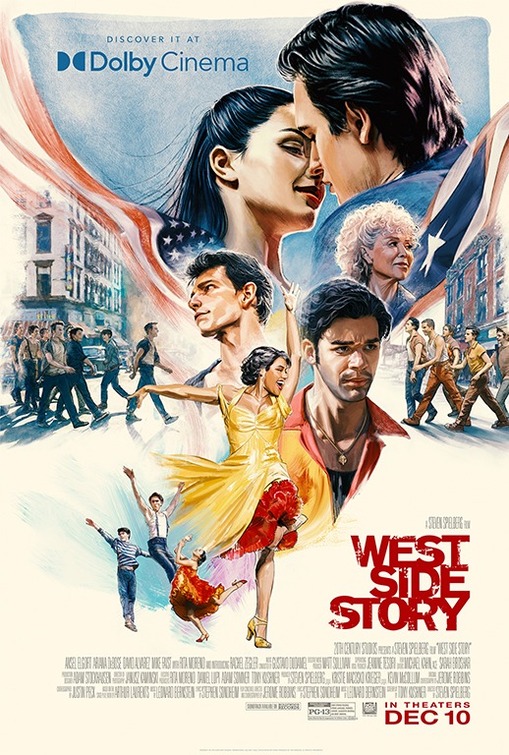
 

Steven Spielberg's long gestating remake of West Side Story had kind of a rough year. That is if you can drum up enough sympathy in your heart for a critically hailed musical sure to be nominated for a truckload of Oscars. The problem is that no one went, and while many theories were bandied about as to why, it's still a stretch to claim an ad campaign centering around uninventive, retread-style posters played a major role in its box office failure. But you could argue it was systemic of a far larger issue and couldn't have helped its chances.

If Gravillis' fantastic Dolby and IMAX official one-sheets above were the only posters released for the film, it still wouldn't have made a difference, but they sure are much nicer to look at. Especially the Dolby one on top, where the characters nearly jump off the page with an energy and vigor that at least advertises an experience that audiences of all ages would be breaking down doors to have. While I'm still not sure they properly capture Rita Moreno's likeness in either, the artwork is otherwise outstanding and seems appropriate to the film's intended tone. There's a lot happening in both these prints (favorite images: Ariana DeBose's Anita dancing through the credits and Mike Faist's Riff holding the bat), but everything's laid out well enough that it doesn't seem overstuffed. More importantly, they make practical sense for the movie this is, a detail otherwise missing from the rest of the film's marketing


4. Don't Look Up

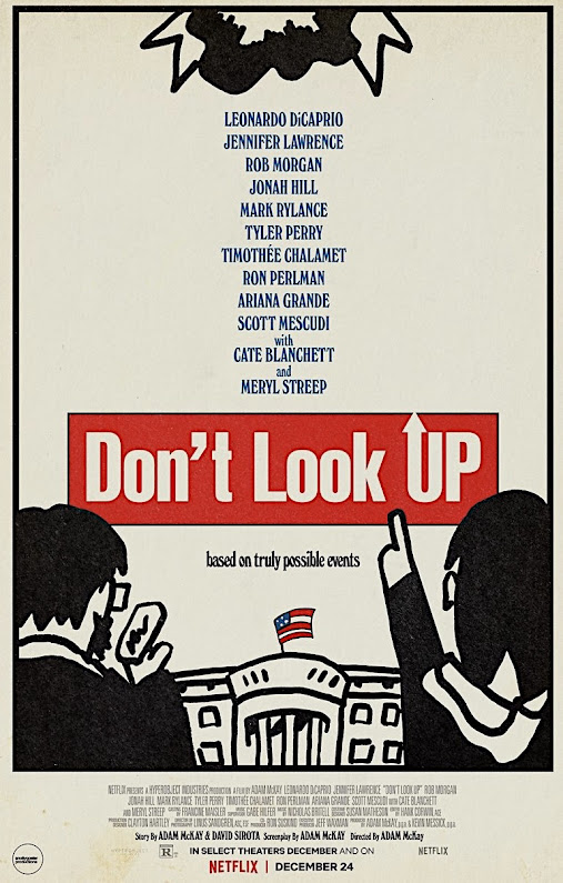
Snollygoster Productions' alternative design for Adam McKay's extremely divisive climate change satire, Don't Look Up, is the best kind of homage. Drawing obvious inspiration from Tomi Ungerer's iconic Dr. Strangelove poster (and maybe some Saul Bass), this incorporates everything that worked with that classic one-sheet and ingeniously applies it to a current release with which it shares some thematic similarities. Purists may bristle at the concept of a parody since it's been attempted so many times before with other films and lesser ideas, but this is different. Satirizing something that was already a parody in itself lends this one-sheet a weird meta quality that only enhances the very effect they're going for.

Far from merely a "copy," you can actually tell a lot of thought went into repurposing elements of Ungerer's original to fit in a new, inspired way, like the comet in place of planes, The White House standing in for the globe and those charmingly simple, sketch style depictions of DiCaprio and Lawrence's astronomers, complete with her pointing upward through the title (which looks great). Retaining the retro quality of the Strangelove piece, this still goes in different directions with the off-white background, use of a black border and its utilization of negative space for the lengthy all-star cast, positioning the credits on the bottom like the original. In many respects this is the ideal companion piece to what it's honoring, while still showing great flashes of originality.  I'll soon discover whether the film even deserves comparisons to Strangelove, but this design would sell anyone on the notion that it's at least worth finding out. (Note: see also the Network-inspired poster for this film by graphic designer Scott Saslow on the runners-up list below. Another brilliant parody.) 


3. Spencer

As far as visual metaphors go, it doesn't get more literal than this teaser for Pablo Larraín's Spencer, recalling a thematically similar one-sheet for 2013's Diana, starring Naomi Watts, which covered the last two years of the Princess of Wales' life. The concept, of course, is isolation, an idea that's never been much of a stretch when analyzing her turbulent, emotional time in the public lens. What's most impressive about this is how Empire Design could have very easily slammed us over the head with that, so even as their intent is plainly obvious, it's presented in such an inviting, restrained style that you can't help but be sucked in.

Kristen Stewart is a huge, huge star and the draw of this entire film, but in a gutsy move, they're choosing not to show her face in order to make a stronger, more relevant point. As Diana, her entire identity is engulfed by the unimaginable pressure and scrutiny that came from both inside and outside the Royal Family. This shows her completely erased by fame and drowned out by that enormous white gown, making for an almost unbearably depressing contrast against that black background. And the matching gold title and credits are so meticulously placed that they invisibly bleed into the giant gown, proving to be the most clever kind of design decision. One that impresses without overtly drawing attention to itself.       


2. Licorice Pizza (All Versions)


It was always a matter of "where" rather than "if" this already iconic poster for Paul Thomas Anderson's coming-of-age dramedy, Licorice Pizza, would be showing up on the list. And most probably assumed this would be landing in the top spot, which it nearly did. It's not to hard to understand why, as the muted reaction accompanying the film's first, still somewhat oddly compelling one-sheet was transformed into pure elation upon seeing this. Beautifully illustrated by local Hawaiian artist Kat Reeder, (who has quite a story) it's everything a poster for a film like this should be, taking us back to not only the film's San Fernando Valley setting in 1973, but a time and place where illustrated pieces like this were commonplace. Far from just a retro aesthetic, it's the real deal.

This authentically looks and feels as if it's been transported from that era, from its stars in those bubbles, to the backdrop, and of course, the central image of Alana (Alana Haim) literally holding the pensive-looking Gary (Cooper Hoffman) in her hand above the credits, as if presenting him to us on a silver platter. And just imagine being Alana Haim starring in your first feature film and realizing this is how the world will see you on its poster  Kind of resembling her, yet sort of not, it's the best kind of illustration, wonderfully straddling that grey area between fantasy and reality. That there are actually more than a few different versions of the poster makes little difference. White blackground, black background, credits, no credits. Does it even matter? The end result's the same since it's the unusual style in which this is done that sets it apart. So much so that people have actually gone as far as to steal these from subways, train stations, park benches and theaters to keep or sell because they've been that scarce. Let me know if you find one.


1. The Amusement Park

When George A. Romero's shelved 1975 educational film on elder abuse, The Amusement Park, was finally unearthed and restored for a premiere on the Shudder streaming service earlier in the year, horror fans wondered how such an important cinematic curiosity could be brushed under the rug for so long. Then they saw it. With ambition reaching far beyond what the Lutheran Service Society of Western Pennsylvania must have expected after hiring Romero for the project, it's a sad, brilliantly disturbing portrait of impending, unavoidable doom. And now accompanying its release 46 years later is this official poster designed by Polish artist Aleksander Wasilewski that captures the picture's uncomfortable spell with one horrifying illustration. 

Very much in the style of the classic Polish movie posters of decades past, this image tells the uninitiated everything they need to know about what's to come. And for those who watched it, this takes you right back, conjuring up those nightmarish feelings all over again. The artwork is captivating, with the unnamed elderly man's (Lincoln Maazel) face literally cut in half by the carousel as blood trickles down his head and cheeks, recalling one of the film's most infamous scenes. Accurately depicted with his white suit, mustache and gray hair, it's hard not to avoid those Colonel Sanders comparisons.

The placement of the title is clean and crisp, set against a cheery sky blue background that jarringly contrasts with that mind blowing image. And if we're talking about trying to jam studio names, streaming services and production companies onto a page, this is a case study on how it's done correctly, with everything neatly centered and condensed on the bottom under his chin. Then there's that unforgettably chilling tag line,"See You In The Park, Someday." A promise and a threat the film fully delivers on.           
 

Runners-Up...


 ...And The Worst

To be fair, there are probably plenty of posters from the past year that could have landed in its place. It's just that none of them have the silly title, American Traitor: The Trial of Axis Sally (not be confused with Typhoid Mary) to draw attention to them. Nor do they contain the heavily photoshopped presence of a certain legendary actor who happens to be sporting a a mustache and has never looked as bored or depressed to be in a bad movie as he does here. And that's saying something. 
 

How bad does Amazon's Prime Video logo looks on nearly every poster for a movie they've released? And they they also added "Amazon Original Movie" across the top and "Amazon Studios" on the bottom right just to hammer it home. Maybe it seems more visually offensive here because the design is so hideous to begin with. The bright blue title treatment and old school font work well but the rest of it seems as if airbrush and photoshop ran rampant. Forget about these two resembling Lucy and Desi. They don't even look like Nicole Kidman and Javier Bardem. 


Clint Eastwood's never been known for either directing or appearing in movies with promotional material that looks as lazily cobbled together as this. There's a fan-made quality about it, though I'd like to believe anyone claiming to be a "fan" of the 91 year-old legend would have at least tried to design something more flattering than this. The title treatment is particularly embarrassing and the whole thing looks like it could pass as a believable bootleg DVD cover, back when those existed. And nowhere on here does it explicitly state that Eastwood directed this, which you'd think is a justifiable source of pride for him at this point.
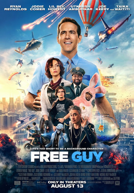

We knew at least one of these kitchen sink, superhero-style designs would have to make it since there are always so many to choose from. You know the ones where they just superimpose every single character onto the poster in a nonsensical way with explosions and tons of action in the background. Sure, we're all pretty much numb to them by now and Free Guy's plot does supposedly resemble such a mess, but it can't get a pass because we still have to look. And it's unpleasant. I mean, he's even holding a fishbowl.    


Remember how excited everyone was when David Chase's Sopranos prequel came out in September? Me neither. It's hard to tell exactly when that enthusiasm completely waned (perhaps when it was seen), but I'd like to think it happened around the time these by-the-numbers character posters dropped, which firmly established a highly anticipated event as just another October release. Giant photoshopped heads, too much poorly placed text, Ray Liotta playing a guy named "Hollywood Dick." No thanks.


Intentional or not, this Bradley Cooper-centric Nightmare Alley one-sheet definitely shares more than a few passing visual similarities with a certain There Will Be Blood poster from '07 featuring Daniel-Day Lewis. Except it's far worse. We can barely see him and that very small sliver of light is mitigated by how drab and dull the whole color scheme is. The weak tagline is lost and unreadable, complete with a poorly placed cast rundown that looks as if someone copied a call sheet from the day's shoot. They tried again with a more sophisticated version, but it's still bad, looking more like missing promotional material from The Artist. 


So strange. Did you know there was also an American Boogeywoman movie released in 2021? That poster's terrible too, but at least it fails a relatively normal, inoffensive way. This actually went for something, and while risks should usually be applauded, look at this. A floating heads nightmare featuring four (!) faces of Ted Bundy (Chad Michael Murray), split by some kind of ugly jagged chainsaw effect that makes no sense upon realizing Bundy never used a saw of any kind on his victims. But don't look too far into it, as that could be a waste of energy, giving this film and poster more attention than it probably deserves.  


Something about the layout and flame overkill (reds and oranges all over the place) makes this one-sheet for the poorly received Angelina Jolie action vehicle, Those Who Wish Me Dead, really difficult to stare at for an extended period of time. Like over 5 seconds. If you didn't know any better you'd think this was a sequel to Backdraft, even if I'm willing to bet this poster would have Ron Howard frantically scrambling to call the local fire department. It looks like it needs to be hosed down rather than displayed in theater lobbies.  


Chris Pratt in an Amazon Original Movie released by Amazon Studios coming soon on Prime Video. Anyone claiming the days of big name stars being able to open movies are over should probably have a conversation with committee who designed this. They seem very sure Pratt is the exception and that his mere presence (emphasized by a very heroic pose) will override whatever problems exist within the film. The title couldn't possibly be any larger and that ugly Prime Video still manages to distract from it, somehow further cheapening this. No small feat.


The creatively troubled Amy Adams-starring The Woman in the Window was unceremoniously dumped on Netflix with little fanfare and these uninspired poster designs definitely reflect it. So hard to pick just one, as the black and white version looks most like it was churned out by some kind of Netflix algorithm, ready-made as a thumbnail to create clicks while conveying the film's theme in the laziest, most basic way. If that doesn't work for you, they also have a hideous looking rain effect version complete with an odd, multi-colored title treatment that too closely resembles Netflix's typeface. While the rain is dialed down some in the third attempt above and they've changed up the layout, it has an ugly yellow tint and Adams was gifted a mustache. As for the hand on the window, they're smearing something, but it doesn't look like blood.

Thursday, December 23, 2021

No Time to Die

Director: Cary Joji Fukunaga
Starring: Daniel Craig, Léa Seydoux, Rami Malek, Lashana Lynch, Ben Whishaw, Naomie Harris, Jeffrey Wright, Christoph Waltz, Ralph Fiennes, Billy Magnussen, Ana de Armas, David Dencik, Rory Kinnear, Dali Benssalah, Lisa-Dorah Sonnet
Running Time: 163 min.
Rating: PG-13

**The Following Review Contains Major Plot Spoilers For 'No Time to Die'**

★★★ (out of ★★★★) 

The first thing that jumps out at you after viewing the 25th Bond installment, No Time to Die is that it's really over. Daniel Craig's done as 007. We knew the day was coming, and yet, how it happens still manages to leave the kind of indelible mark that should separate this film from the pack. To an extent, it does, covering a lot of the same ground we've seen in many of Craig's previous outings while taking full advantage of a gargantuan, somewhat punishing running time to do so. It goes all out, but the most shocking revelation is that they chose to make a direct sequel to Spectre, which could be viewed as a victory for those appreciating series continuity. That's not a practice Bond producers have historically embraced, often moving from one entry to the next while only occasionally connecting the dots or leaving some Easter eggs behind.

You'd think all this suggests a forward-looking franchise, but the opposite's true, as different directors have conformed to a traditional 007 template that's been strikingly similar in tone, plot and execution. Cary Fukunaga rarely breaks from it, giving us the usual hits and misses we've grown to expect and have associated with this Bond run. There are some absolutely spectacular sequences followed by others that don't quite work, with the latter magnified by a bloated length filled with expository scenes that sometimes halts the momentum. But if Spectre dissenters can get past this picking up where that mildly received entry left off, it's satisfying in a lot of ways. Unlikely to supplant either Skyfall or Casino Royale as a definitive favorite, it should still justifiably impress many fans by further emphasizing just how much Craig's brought to the table during his Bond reign.

After a chilling flashback shows a young Madeleine Swann witnessing the death of her mother at the hands of future bio-terrorist Lyutsifer Safin (Rami Malek), we flashforward to the present where James Bond (Craig) is vacationing in Matera with Madeleine (Léa Seydoux) following the capture and imprisonment of Blofeld (Christoph Waltz). But when Bond's trip to Vesper Lynd's grave leads to a violent ambush by a group of mercenaries, he leaves Madeleine behind, believing she betrayed him. 

It's now five years later when a retired Bond is contacted in Jamaica by Felix Leiter (Jeffrey Wright) and his new colleague Logan Ash (Billy Magnussen) regarding a bioweapon that's been developed by kidnapped MI6 scientist Dr. Valdo Obruchev (David Dencik). Despite warnings from his 007 successor, Nomi (Lashana Lynch) not to get involved, Bond agrees to help Leiter, stepping out of retirement and on a head-to-head collision with the dangerous Safin. Initially picking off Spectre agents, he has a much more ambitious, demented plan of world domination in store, intending to use Madeleine as a pawn in that game. Terrifyingly obsessed with finishing the trauma he inflicted on her as a child, it'll be up to Bond to get to him first. 

A nearly half-hour prologue that features the snowbound Safin/Madeleine home invasion flashback sequence is unnerving and suspenseful in all the right ways, letting us know under no uncertain terms that what happens here will reverberate through the rest of the narrative and pay off later. And it mostly does. The surprise attack on Bond and call-back to Eva Green's Vesper Lynd might be the first time we've seen him attempt to process her death, serving as sort of a catharsis for fans who finally receive open acknowledgment from the many screenwriters credited on this project of her enduring impact on 007 and the franchise as a whole. 

Of course, the cruel joke here is that all this Vesper reverence occurs in a movie where Léa Sedoux is given the enormous role many would have liked to see reserved for Green had she continued past Casino Royale. There really wasn't any reason to believe Seydoux's character would even be back following Spectre, much less be such a focus that she seems to get as much screen time as Craig. But while still not sharing the greatest chemistry with him, she does give a much stronger performance in her second outing, and that's while being given about four or five times more to do this time around.

After an exhilarating opening and promising set-up, the action starts settling into a more predictable rhythm, with some occasional greatness thrown in. A typically inventive opening title sequence accompanied by Billie Eilish's serviceable but somewhat sleepy main theme leads us into Bond's re-emergence as an MI6 agent, which M. (Ralph Fiennes) resists. If the latter's carelessness can at least be partially blamed for the calamity that brought him back, the usual attempts to establish Bond as this reckless rule breaker who'd rather die than do things "by the book" are offset by all the pull and support he still has within the agency.

Since it's basically established that Moneypenny (Naomie Harris) and Q (Ben Whishaw) will do anything for Bond, retired or not, this leaves the only potential conflict within the ranks to be with his 00 stand-in, Nomi, well played by Lashana Lynch. Any fans bent out of shape that he's somehow been "replaced" should know it seems to be in title only, and not for long. She's very much a supporting player in Bond's story and at times seems as much on his side as Felix, Penny or Q, and probably even more than M. 

Ana de Armas' show-stealing turn as Paloma, a CIA agent assisting Bond in infiltrating a Spectre party in Cuba, is hands down the best performance in the film, supporting or otherwise. Playing a character claiming to only have three weeks training, she quickly wins us over as this bubbly, hyperactive, nervous personality who throws caution to the wind while also having a great sense of humor. Unlike any previous "Bond Girl" it almost feels demeaning to refer to her as such, as de Armas cultivates this easy, effortless flirty rapport with Craig that no one's quite had until now.

Full of surprises, the kick-ass Paloma proves to not only be deceptively dangerous, but the consummate pro whose unusual approach belies an almost astounding level of competence. Her stay lasts only about 20 minutes but does de Armas ever make the most what should be a throwaway role. That the film never fully regains that same energy following her exit should serve as a sign that this is the kind of fresh, contemporary character producers should be thinking about when considering directions the franchise could potentially go.  

If there's a drawback in the screenplay, it's that viewers will feel as if they're far ahead of Bond and the other characters in terms of the plot. There are points where it seems we're literally waiting for them to catch up to the grand scheme (which is no less absurd than some others in the franchise) and who's behind it. That's not to say there aren't still some really great moments like Bond's prison encounter with Blofeld or his emotionally charged reunion with Madeleine, now with a young daughter named Mathilde (Lisa-Dorah Sonnet). While it's not exactly a shocker whose child this is, the idea of Bond as a father has been unexplored, infusing the proceedings with a welcome dynamic that raises the stakes considerably, adding a fair amount of tension to what's already a strong final act.

Largely absent through much of the film's middle portion, Rami Malek's disturbed, disfigured Safin doesn't get as much screen time as you'd expect, but it still kind of works, building up the myth of this character until he finally unleashes hell on Bond. Judging by the end result, he almost has to be considered one of 007's more formidable challengers, with a fairly intriguing backstory that enables Malek to calmly, creepily get under his adversary's skin as a villain completely convinced he's the victimized, misunderstood hero. 

Saffin may not fully succeed in his global plan, he's able to do something no one has in setting off a chain of events that eventually take out Bond. The image of a shot, poisoned 007 standing atop Safin's headquarters as the missiles descend upon the island is about as emotional an end to Craig's run that you could imagine, especially given what Bond leaves behind. And like Spectre before it, the look of this island station is awe-inspiring, with production designer Mark Tildesley successfully paying homage to some of the franchise's classic settings of decade's past. All of it converges as a fitting close for Craig, who's always been underappreciated in the role, his performances wrongly perceived as being only as good as the entries in which he's appeared. It's a problem that plagued his predecessors, but no actor since Connery has done more to overcome it.

If it took Craig's exit from this notoriously risk-averse property to give us something completely different and unexpected, so be it. While they weren't really given much of a choice considering the circumstances, any serious backlash will be offset by the inevitability that this series will soon get a fresh coat of paint anyway, if not a hard reboot that goes beyond the recasting of its iconic protagonist. Whether that's something to look forward to is debatable, as we can certainly do a whole lot worse than No Time to Die. Either way, it carries a great sense of finality, sending 007 out on top and making it very clear that the Bond we've known for the past fifteen years is gone. What's left in his wake is a mixture of dread and anticipation for what's next.                    

Saturday, December 18, 2021

The Power of the Dog

Director: Jane Campion
Starring: Benedict Cumberbatch, Kirsten Dunst, Jesse Plemons, Kodi Smit-McPhee, Thomasin McKenzie, Genevieve Lemon, Keith Carradine, Frances Conroy, Peter Carroll, Alison Bruce, Alice Englert
Running Time: 126 min.
Rating: R

★★★ ½ (out of ★★★★)

For much of Jane Campion's The Power of the Dog, you're wondering where it's all going. There's this uneasy feeling that never subsides throughout, even as it remains too easy to categorize the absorbing Western as merely a set-up awaiting the big payoff. While the narrative's broken into five parts and centers on four characters, the story's really focused on one. He's the antagonist, instigator and individual keeping us in constant tension as we dread his next move. From this antagonist's first appearance, we speculate what his deal really is, and that curiosity never lets up as he tightens his stranglehold on the other characters forced to reckon with his sociopathic behavior, albeit in very different ways. Spending an entire film waiting for someone to snap and anticipating the catalyst could be draining, but Campion milks that for everything it's worth. When the explosion does come, it definitely doesn't arrive how we expect, as do very few developments in this deeply layered script adapted from Thomas Savage's 1967 novel. 

Set against the backdrop of a cold, unforgiving world that suffers no fools (and an equally icy Jonny Greenwood score) the film's about monstrous behavior in search of an explanation where none could ever suffice. It's when an answer starts presenting itself that the story gets even stronger, with Campion showing incredible restraint by presenting this development as almost entirely subtext, letting viewers draw their own conclusions about this man and what shaped him. Similar to There Will Be Blood, it's about an egotistical madman running roughshod, dominating the proceedings and devouring everyone around him. And like that film, we root for his comeuppance, unaware of what those consequences could entail. 

It's 1925 Montana and wealthy, ranch owning brothers Phil (Cumberbatch) and George Burbank (Jesse Plemons) stop by the inn of widow Rose Gordon (Kirsten Dunst), whose son Peter's (Kodi Smit-McPhee) effeminate demeanor and appearance is mocked by the cruel Phil. Considerably kinder brother George consoles Rose over the incident, leading the two to become romantically involved and eventually engaged, with her moving in with him at the Burbank ranch, further angering Phil. As Rose whittles under the pressure of having to impress George's parents and Governor Edward (Keith Carradine), loose cannon Phil becomes even more of an unwelcome, threatening presence in their lives. With Peter coming back from school to stay at the ranch and George walking a difficult line in attempting to control his brother, Rose continues to mentally and physically deteriorate. But unfortunately for her, Phil seems to have found a new friend, further fragmenting an already tenuous family dynamic at the brink of implosion.

Upon first meeting the Burbank brothers, a couple of details are clear right away. Phil's an angry, bitter, damaged man who never misses an opportunity to belittle or insult anyone he comes in contact with. He shows his only shred of humanity when reminiscing and telling stories about late friend and mentor, "Bronco" Henry, who has to rank among the most important unseen characters in recent film, assuming he even exists. Residing somewhere between reality, myth, and legend, it's obvious this mystery man molded and shaped Phil into what he eventually became. Not showing him is smart, as even a brief flashback would shatter the mystique of a character audiences have already built up in their minds as being more impactful than whoever we'd see on screen.

Hints are dropped that Phil used to be somewhat of a respectable member of society with an impressive educational background. He's also touted by his brother as an engaging conversationalist, to the point that his presence is actually highly anticipated by the governor at George's disaster of a dinner party. It becomes even more of one when Phil makes a unfashionably late entrance after being insulted by his brother's suggestion that he clean up and bathe. It's one of the few times George stands up to his brother in any way and he's noticeably weak and uncommitted, walking back the suggestion almost immediately, even going so far as to apologize later for bringing it up.

Brother George definitely has a system in place for dealing with Phil. He simply doesn't, finding ways to work around his deplorable behavior, just taking it on the chin when he calls him "chubby" and even occasionally building Phil up in ways that may not even be true, further encouraging his brother's narcissism and selfishness. And yet George remains the only guardrail and protector from himself Phil has, as ineffective as he often is at the job. With his down home demeanor and outwardly pleasant disposition, Jesse Plemons is perfect in this and likely won't get the credit due to him for carrying much of the picture's fist half. With him providing such a stark contrast as the calm, steady responsible sibling, Cumberbatch's bone-chilling portrayal of Phil jumps out even more. 

Dunst's arc might be the most shocking in just how far Rose falls from how she's initially perceived. Some of this can be attributed to Phil, but red flags hint that it wouldn't have taken much to send her spiraling down a hole of alcoholism and depression. What's impressive about Dunst is how it seems as if she's playing two parts before completely letting go of one, stripping away the functional facade Rose attempted to project upon marrying George. She wrongly sees herself as a fraud and a series of challenges bring out her instability, with only son Peter seemingly in tune with its severity, even while remaining too withdrawn to act. Kodi Smit-McPhee plays Peter's cards close enough to the vest that he becomes just as intriguing a mystery as Phil. In the last act, his performance takes over in ways entirely unexpected, especially considering how unassuming his introduction was.  

Phil Burbank remains the story's big question mark until the very end. And what a finish Campion gives us, as George and Rose kind of fade into the background while Phil's motivations and history become the focus. Even as he continues his abusive, performative displays of toxic masculinity, Cumberbatch still gives Phil these fleeting self-reflective moments of vulnerability where we know there's a lot more to this guy than the show he's putting on. And the scariest part of this is that there's another character who might be just as maladjusted and complicated as he is.         

When karma does finally catch up it's a cruel irony we're too conflicted to know how to feel because Cumberbatch's performance has taken us on such a ride, adding new wrinkles and questions to Phil with each surprising plot development. An emotionally diseased man who doesn't see himself as anyone else does, the entire film undergoes a shift in perspective by revealing how he truly views himself, taking the story to another level and lifting everything around it. And then there's that final twist, so carefully and patiently executed that you may need a rewatch to truly appreciate how all the seeds were subtly planted to get there. The Power of the Dog is a slow, deliberate burn, but for good reason, keeping you on edge waiting to see how a seemingly impossible situation can be resolved when no one seems capable of taking the initiative to stop it. 

Thursday, December 9, 2021

Pig

Director: Michael Sarnoski
Starring: Nicolas Cage, Alex Wolff, Adam Arkin, Darius Pierce, Cassandra Violet, Julia Bray, Elijah Ungvary, David Knell
Running Time: 92 min.
Rating: R

★★★ (out of ★★★★)

Nicolas Cage must have known something we didn't. Hardly the actor to conform to expectations or follow any kind of predictable career trajectory, there's always been talk about how the Oscar winner's choice of roles have flown off the rails in recent years, even by Cage standards. Annually churning out an onslaught of low budget, V.O.D. action titles led to criticisms surrounding everything from his financial situation to the unusual cries that he's wasting his talent in projects so clearly beneath him. But then something happened. The films got a little weirder, more interesting, and better. 

Regardless of how little seen Mandy or Color out of Space may have been, they were ambitious, visionary sci-fi head trips that reminded us Cage rarely phones it in or stops challenging himself, even as we sometimes scratch our heads at the choices. He gets it, and that's all that matters, constantly finding moments of invention and discovery within questionable characters and projects. It was only a matter of time before a fresh filmmaker came along and recognized this, coming up with something that perfectly plays to his biggest strengths as a performer. 

Michael Sarnoski's directorial debut, Pig, is eccentric in all the ways we've come to expect Cage movies to be, but there's an intelligence and melancholy to its story that allows the actor to do the kind of work we know he's capable of. It would be a different movie without him, possibly teetering on the edge of disaster due to the odd premise, but he keeps it afloat with his most affecting performance in years. Sarnoski's script takes its time exposing the mystery of this man, letting Cage fill in most of the blanks and avoiding a predictable path of bloodshed and violence that's accompanied some of the actor's more recent outings. This has more important things on its mind, delving into the relatable bond between man and animal before peeling back the layers to reveal the true loneliness at this reclusive protagonist's core. It's not for everyone, but even those who can't quite get on its unique wavelength should be able to respect the care and craft with which it's made. 

Robin "Rob" Feld (Cage) is a reclusive loner living off the grid in a cabin in the Oregon woods, where he spends his days hunting for truffles with his prized foraging pig. He's visited weekly by Amir (Alex Wolff), a young, inexperienced entrepreneur who buys the truffles from Rob, supplying the ingredients to a high-class restaurants in the Portland area. But when Rob is unexpectedly assaulted in the middle of the night and his pig is stolen by mysterious assailants, he must call on whatever contacts remain of his previous life to locate the animal, with whom he shares a deep bond that perplexes Amir. As he reluctantly chauffers a bruised, battered loner into the city's underbelly to follow a dangerous lead, the more we learn what drove him into the forest, as well as Amir's own history, which interects with Rob's in surprising, unexpected ways. As they get closer to discovering what happened to the pig, Rob doesn't even have to think twice whether it's worth the extreme danger he's putting them both in.    

With a hulking frame, dirty overalls, long, stringy unwashed hair and an unkempt beard, Rob is a man of few words, at first glance closely resembling a composite of the Unabomber. And Cage is so good at giving  nothing away in these early scenes other than his devotion to this pig, who more than just a pet or a means to him making an income, is the only family member he has. It's clear something happened to isolate Rob in this cabin and adapt a lifestyle he's made work for him, but to reveal exactly what, would spoil nearly all the film's surprises. 

With a sharp suit and bright yellow sports car, Amir couldn't appear more superficially different from Rob or unsympathetic to his plight, and while that initially appears to be true, the deeper they dive into this recluse's history, the more Amir's facade starts to crack. For a stretch, it nearly evolves into a buddy picture with Cage and Wolff, until we realize the stakes are higher than that, with Rob reentering a world in which he may be remembered, but not necessarily welcomed ever again. A Fight Club-like sequence when he offers himself up as a sacrifice for key information is difficult to watch, revealing the humiliating depths he needs to sink to reclaim what's rightfully his.

Heading down a path that seems to suggest a dark, violent thriller, the script instead leans further in the direction of sadness and regret, with Rob coming face-to-face with a world he abandoned and no longer holds a place for him. A scene in a posh restaurant where he confronts a chef is unbearably tense as a bloodied Cage calmly stares a hole through this guy, emotionally breaking him down with only a few painfully true words until he gets what he needs. More than any other sequence, it reveals who Rob was, or rather explains what he's become since. And once we find out all the details, it's tough to blame him for any of it. 

Cage does most of this work without utttering a word, using his body language to convey a broken, irreparably damaged soul whose name still carries just enough currency ten years out to garner some lingering respect, but also utter disbelief and pity. When the final showdown does come with the man responsible for what happened to his pig, it's settled not with fisticuffs or a shootout, but something more profound, that has more far-reaching, emotional ramifications for the three men involved. Everything about the last act is unusually restrained, finding Rob right back where he's meant to be, with a hint that perhaps he's been slightly altered, if not necessarily changed, by the traumatizing experience he's endured.