For many, 2021 will be considered yet another highly abnormal, underwhelming year for movies. And it could go on for a while longer, further muddying the waters of not only what we watch, but how. While we've been moving away from traditional movie posters hanging in theater lobbies to signal an impending release for a while now, the shift's been accelerated over the past 18 months. It doesn't mean there still aren't great ones, just that you'll have to do little more searching. So for every design that seems engineered for a quick click when scrolling through your queue, I'd argue there are just as many out there ready-made for framing. Despite the circumstances, the year was still jam packed with great work, even as designers had to find new, creative ways around incorporating an increasing amount of text, streaming service logos, and multi-platform release dates onto their posters.
The IMP Awards site still serves as the most valuable resource for gathering most of the year's most notable posters, it's become impossible to ignore the fact that even they don't have everything, as the hunt for the one-sheet image of a little seen, well-reviewed indie can be just as challenging as locating the movie itself. In an obsessive effort to ensure none of those are missed I'm often last out of the gate with my list, often pushing this thing right up against the wire every December. So it wouldn't be fair of me to even post this without highlighting the lists came before since they're not only great compilations, but shine a light on the year's lesser known, overlooked picks. So before even looking at mine, please check these out: Mubi.com, Posteritati, SeekandSpeak,The Playlist
As usual, to be eligible, a poster must have been released between January 1st and December 31st, 2021, regardless of the actual film's drop date. But now the big change. After well over a decade of only deeming official release posters worthy of consideration, I've reluctantly decided to open the floodgates and include alternative/unofficial designs. It won't be without careful deliberation. but there's little reason to continue excluding valid designs from legitimate, professional artists and firms just because the studio didn't commission them for the job. And since everything is found or viewed on the web anyway, the line separating what's "official" from not has never seemed thinner, further reinforcing this as a dated rule. By now leaving the only question down to worthiness, I'd argue the adjustment improved this year's selections, opening up the field for riskier, less commercial-looking choices. So here's the top ten, followed by an alphabetical listing of runners-up and, of course, the highly anticipated year's worst.
The Best...
10. King Richard
At first glance, there doesn't seem to be anything incredibly special about GrandSon's official poster for King Richard, but maybe that's exactly the idea. It has one job: depict the uphill journey Richard Williams (Will Smith) took in training his daughters Venus (Saniyya Sidney) and Serena (Demi Singleton) to become the best tennis players in the world, against seemingly impossible odds. Whatever you may think of the real person or even how well or honestly the film interprets these events, this image nails that concept. Literally "pushing" them in a shopping cart full of tennis balls, it earns major points for not looking like a photoshopped image they just pasted on.
In rare attention to detail, they actually show their shadows, which you'd never guess makes that much of a difference until seeing it here. Great colors and use of negative space that puts the focus exactly where it belongs, with a border containing the tag line, which is different. The layout and placement of the credits on top are perfect, along with that awesome bright red King Richard title treatment. It actually compliments rather than distracts from Smith's top billing, making everything come together in a clean, crisp design that highlights the movie's primary intention in the best way possible.
9. Red Rocket
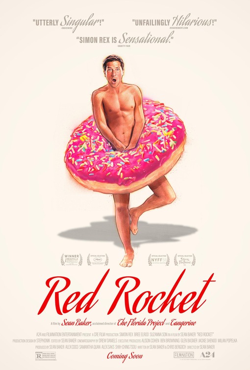
Another GrandSon design, this one for Sean Baker's film about former "adult entertainer," Mikey, (Simon Rex) who returns to his Texas hometown after 17 years, attempting to reconnect with his ex-wife and find work. It was never going to be the easiest sell, but this one-sheet illustrated by the great Steve Chorney more than overcomes that. Not only is the artwork top notch, the entire layout is excellent, with more great use of negative space along with those cursive critical blurbs hovering above the image of an obviously aghast Mikey covering himself with a bright pink donut.
It's yet another example of how off-white/cream can be a strong background color, as the bright red, really well stylized Red Rocket title treatment nearly jumps off the page against it. There's no better combination that could have been used, resulting in a simple but memorable design capable of possibly swaying any doubters on the fence about checking this out. While I previously had very little interest in seeing the movie, the artistry behind this poster makes me wonder if it doesn't contain a lot more depth than its description suggests. So for that, mission accomplished.
8. Last Night in Soho
When the first wave of posters came out for Edgar Wright's 60's horror nostalgia head trip, Last Night in Soho, I couldn't believe how underwhelming they were given the film's premise and setting, both of which would seem to organically provide plenty of visual inspiration. For a while it looked hopeless until this painting from British artist James Paterson dropped, encapsulating on a one-sheet everything that those heavily anticipating Wright's movie hoped it could be.
Paterson avoids the pitfalls of the other inferior, more mainstream designs that struggled in depicting the duality of the two main characters. Their solutions were predictably a half-face, floating heads approach whereas Paterson is clearly reaching for something richer. With the bleeding pinks and blues, there's a watercolor vibe to it enhanced by a pretty magnificent rendering of Sandie (Anya Taylor Joy) staring a hole right through us, as wide-eyed, terrified Ellie (Thomasin McKenzie) hovers in the background. And you have to appreciate that old school title treatment, as well as that three-dimensional effect going on with the blue street.
7. The Batman
Those who saw the trailer for The Batman already have strong
opinions on the decision to reimagine Riddler as a serial killer in the
vein of the Zodiac. Being someone completely on board with this idea,
when these series of posters dropped touting its eventual 2022 release, my interest was only further piqued for that approach. Works ADV
came up with a few that all followed the same instantly recognizable
red and black color scheme, but this is the one that truly stands out.
In concept, it eerily recalls that memorable Heath Ledger Joker teaser from 2008, though a case could be made that this might be even more visually striking, if not scarier.
The
blurry, out of focus image of Paul Dano's Riddler against that black
abyss of a background is as creepy and unsettling as it gets. And aside
from the Zodiac-inspired question mark on his coat, the one thing we can
make out ( that creepy, knife-carved, almost childlike "To The Batman" etching) gets the villain's message
across loud and clear. And they couldn't have found a better, more
unobtrusive spot than that top left corner for the scribbled Bat logo
and March 4th date (assuming that holds). The verdict may still be out
on the film, but this poster is the stuff of nightmares.
6. Prisoners of the Ghostland
"The Wildest Movie I've Ever Made" - Nicolas Cage. Well, that's saying something. It doesn't get much better than an endorsement from the man himself. I took me a while to even notice this amazing quote because there's just so much else to look at and appreciate in this Prisoners of the Ghostland one-sheet from Stockholm Design. Whether it's really the wildest movie Cage has made (a high bar to clear there), this one-sheet does a very convincing job proving that case. It's almost impossible to believe this is an officially commissioned theatrical poster rather than an alternative design created by an independent artist, but it is.
Definitely enough crazy to match its star, the incandescent glow of those reds and pinks almost give the illustration a blacklight effect. And just look at the scrap pile of skulls, corpses, clocks, samurai warriors and who knows what else inside that transfixing, glow-eyed statue. While a risk, that flowery background works against that color scheme, as does the bright yellow title. Obscuring Cage by having his back turned and hovering over the fray is brilliant since we know exactly who he is by silhouette alone. A long running joke that most of his films' posters have landed on worst lists for years has resulted in the thrill of seeing the actor's recent choices improve substantially, while as remaining weird as ever. This definitely captures that feeling in all its glory. And then some.
5. West Side Story (Dolby and IMAX versions)
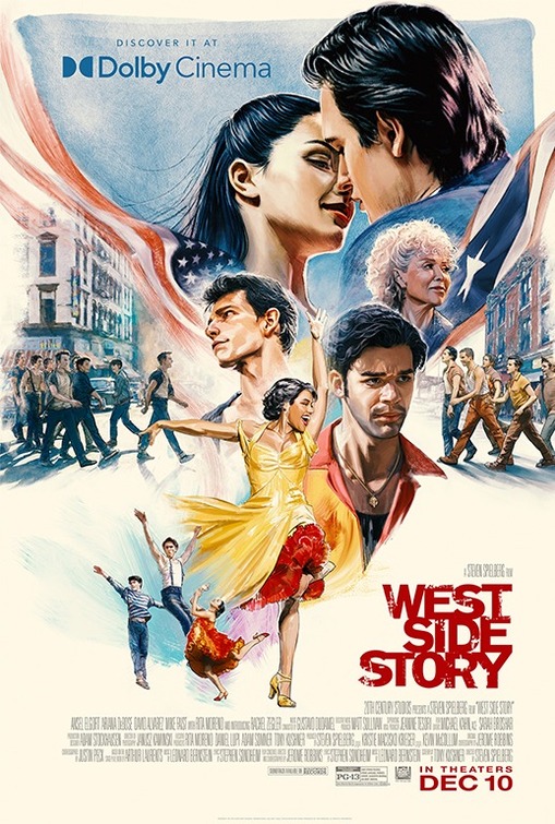
Steven Spielberg's long gestating remake of West Side Story
had kind of a rough year. That is if you can drum up enough sympathy in
your heart for a critically hailed musical sure to be nominated for a
truckload of Oscars. The problem is that no one went, and while many
theories were bandied about as to why, it's still a stretch to claim an
ad campaign centering around uninventive, retread-style posters
played a major role in its box office failure. But you could argue it
was systemic of a far larger issue and couldn't have helped its chances.
If
Gravillis' fantastic Dolby and IMAX official one-sheets above were
the only posters released for the film, it still wouldn't have made a
difference, but they sure are much nicer to look at. Especially the
Dolby one on top, where the characters nearly jump off the page with an
energy and vigor that at least advertises an experience that audiences
of all ages would be breaking down doors to have. While I'm still not
sure they properly capture Rita Moreno's likeness in either, the artwork
is otherwise outstanding and seems appropriate to the film's intended
tone. There's a lot happening in both these prints (favorite images:
Ariana DeBose's Anita dancing through the credits and Mike Faist's Riff
holding the bat), but everything's laid out well enough that it doesn't
seem overstuffed. More importantly, they make practical sense for the
movie this is, a detail otherwise missing from the rest of the film's
marketing
4. Don't Look Up
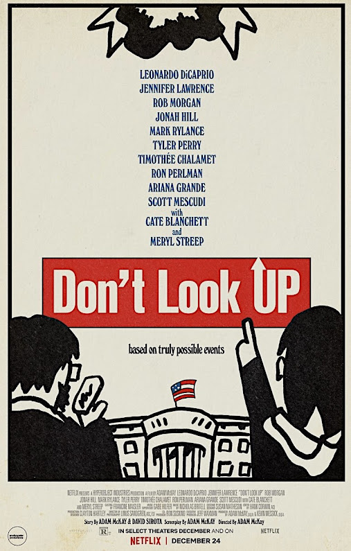
Snollygoster Productions' alternative design for Adam McKay's extremely divisive climate change satire, Don't Look Up, is the best kind of homage. Drawing obvious inspiration from Tomi Ungerer's iconic Dr. Strangelove poster (and maybe some Saul Bass), this incorporates everything that worked with that classic one-sheet and ingeniously applies it to a current release with which it shares some thematic similarities. Purists may bristle at the concept of a parody since it's been attempted so many times before with other films and lesser ideas, but this is different. Satirizing something that was already a parody in itself lends this one-sheet a weird meta quality that only enhances the very effect they're going for.
Far from merely a "copy," you can actually tell a lot of thought went into repurposing elements of Ungerer's original to fit in a new, inspired way, like the comet in place of planes, The White House standing in for the globe and those charmingly simple, sketch style depictions of DiCaprio and Lawrence's astronomers, complete with her pointing upward through the title (which looks great). Retaining the retro quality of the Strangelove piece, this still goes in different directions with the off-white background, use of a black border and its utilization of negative space for the lengthy all-star cast, positioning the credits on the bottom like the original. In many respects this is the ideal companion piece to what it's honoring, while still showing great flashes of originality. I'll soon discover whether the film even deserves comparisons to Strangelove, but this design would sell anyone on the notion that it's at least worth finding out. (Note: see also the Network-inspired poster for this film by graphic designer Scott Saslow on the runners-up list below. Another brilliant parody.)
3. Spencer
As far as visual metaphors go, it doesn't get more literal than this teaser for Pablo Larraín's Spencer, recalling a thematically similar one-sheet for 2013's Diana, starring Naomi Watts, which covered the last two years of the Princess of Wales' life. The concept, of course, is isolation, an idea that's never been much of a stretch when analyzing her turbulent, emotional time in the public lens. What's most impressive about this is how Empire Design could have very easily slammed us over the head with that, so even as their intent is plainly obvious, it's presented in such an inviting, restrained style that you can't help but be sucked in.
Kristen Stewart is a huge, huge star and the draw of this entire film, but in a gutsy move, they're choosing not to show her face in order to make a stronger, more relevant point. As Diana, her entire identity is engulfed by the unimaginable pressure and scrutiny that came from both inside and outside the Royal Family. This shows her completely erased by fame and drowned out by that enormous white gown, making for an almost unbearably depressing contrast against that black background. And the matching gold title and credits are so meticulously placed that they invisibly bleed into the giant gown, proving to be the most clever kind of design decision. One that impresses without overtly drawing attention to itself.
2. Licorice Pizza (All Versions)
It was always a matter of "where" rather than "if" this already iconic poster for Paul Thomas Anderson's coming-of-age dramedy, Licorice Pizza, would be showing up on the list. And most probably assumed this would be landing in the top spot, which it nearly did. It's not to hard to understand why, as the muted reaction accompanying the film's first, still somewhat oddly compelling one-sheet was transformed into pure elation upon seeing this. Beautifully illustrated by local Hawaiian artist Kat Reeder, (who has quite a story) it's everything a poster for a film like this should be, taking us back to not only the film's San Fernando Valley setting in 1973, but a time and place where illustrated pieces like this were commonplace. Far from just a retro aesthetic, it's the real deal.
This authentically looks and feels as if it's been transported from that era, from its stars in those bubbles, to the backdrop, and of course, the central image of Alana (Alana Haim) literally holding the pensive-looking Gary (Cooper Hoffman) in her hand above the credits, as if presenting him to us on a silver platter. And just imagine being Alana Haim starring in your first feature film and realizing this is how the world will see you on its poster Kind of resembling her, yet sort of not, it's the best kind of illustration, wonderfully straddling that grey area between fantasy and reality. That there are actually more than a few different versions of the poster makes little difference. White blackground, black background, credits, no credits. Does it even matter? The end result's the same since it's the unusual style in which this is done that sets it apart. So much so that people have actually gone as far as to steal these from subways, train stations, park benches and theaters to keep or sell because they've been that scarce. Let me know if you find one.
1. The Amusement Park
When George A. Romero's shelved 1975 educational film on elder abuse, The Amusement Park, was finally unearthed and restored for a premiere on the Shudder streaming service earlier in the year, horror fans wondered how such an important cinematic curiosity could be brushed under the rug for so long. Then they saw it. With ambition reaching far beyond what the Lutheran Service Society of Western Pennsylvania must have expected after hiring Romero for the project, it's a sad, brilliantly disturbing portrait of impending, unavoidable doom. And now accompanying its release 46 years later is this official poster designed by Polish artist Aleksander Wasilewski that captures the picture's uncomfortable spell with one horrifying illustration.
Very much in the style of the classic Polish movie posters of decades past, this image tells the uninitiated everything they need to know about what's to come. And for those who watched it, this takes you right back, conjuring up those nightmarish feelings all over again. The artwork is captivating, with the unnamed elderly man's (Lincoln Maazel) face literally cut in half by the carousel as blood trickles down his head and cheeks, recalling one of the film's most infamous scenes. Accurately depicted with his white suit, mustache and gray hair, it's hard not to avoid those Colonel Sanders comparisons.
The placement of the title is clean and crisp, set against a cheery sky blue background that jarringly contrasts with that mind blowing image. And if we're talking about trying to jam studio names, streaming services and production companies onto a page, this is a case study on how it's done correctly, with everything neatly centered and condensed on the bottom under his chin. Then there's that unforgettably chilling tag line,"See You In The Park, Someday." A promise and a threat the film fully delivers on.
Runners-Up...
...And The Worst
To be fair, there are probably plenty of posters from the past year that could have landed in its place. It's just that none of them have the silly title, American Traitor: The Trial of Axis Sally (not be confused with Typhoid Mary) to draw attention to them. Nor do they contain the heavily photoshopped presence of a certain legendary actor who happens to be sporting a a mustache and has never looked as bored or depressed to be in a bad movie as he does here. And that's saying something.

How bad does Amazon's Prime Video logo looks on nearly every poster for a movie they've released? And they they also added "Amazon Original Movie" across the top and "Amazon Studios" on the bottom right just to hammer it home. Maybe it seems more visually offensive here because the design is so hideous to begin with. The bright blue title treatment and old school font work well but the rest of it seems as if airbrush and photoshop ran rampant. Forget about these two resembling Lucy and Desi. They don't even look like Nicole Kidman and Javier Bardem.

Clint Eastwood's never been known for either directing or appearing in movies with promotional material that looks as lazily cobbled together as this. There's a fan-made quality about it, though I'd like to believe anyone claiming to be a "fan" of the 91 year-old legend would have at least tried to design something more flattering than this. The title treatment is particularly embarrassing and the whole thing looks like it could pass as a believable bootleg DVD cover, back when those existed. And nowhere on here does it explicitly state that Eastwood directed this, which you'd think is a justifiable source of pride for him at this point.
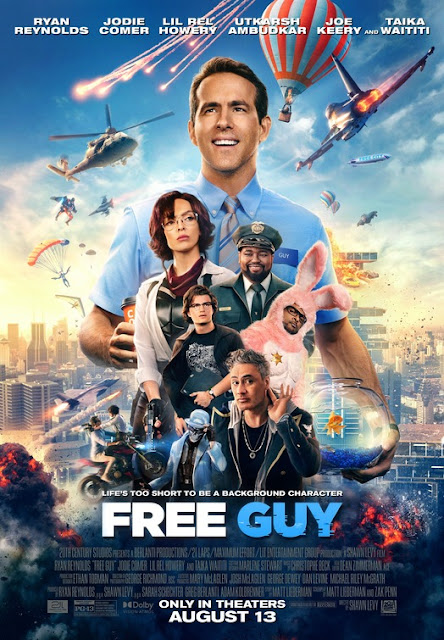
We knew at least one of these kitchen sink, superhero-style designs would have to make it since there are always so many to choose from. You know the ones where they just superimpose every single character onto the poster in a nonsensical way with explosions and tons of action in the background. Sure, we're all pretty much numb to them by now and Free Guy's plot does supposedly resemble such a mess, but it can't get a pass because we still have to look. And it's unpleasant. I mean, he's even holding a fishbowl.


Remember how excited everyone was when David Chase's Sopranos prequel came out in September? Me neither. It's hard to tell exactly when that enthusiasm completely waned (perhaps when it was seen), but I'd like to think it happened around the time these by-the-numbers character posters dropped, which firmly established a highly anticipated event as just another October release. Giant photoshopped heads, too much poorly placed text, Ray Liotta playing a guy named "Hollywood Dick." No thanks.

Intentional or not, this Bradley Cooper-centric Nightmare Alley one-sheet definitely shares more than a few passing visual similarities with a certain There Will Be Blood poster from '07 featuring Daniel-Day Lewis. Except it's far worse. We can barely see him and that very small sliver of light is mitigated by how drab and dull the whole color scheme is. The weak tagline is lost and unreadable, complete with a poorly placed cast rundown that looks as if someone copied a call sheet from the day's shoot. They tried again with a more sophisticated version, but it's still bad, looking more like missing promotional material from The Artist.

So strange. Did you know there was also an American Boogeywoman movie released in 2021? That poster's terrible too, but at least it fails a relatively normal, inoffensive way. This actually went for something, and while risks should usually be applauded, look at this. A floating heads nightmare featuring four (!) faces of Ted Bundy (Chad Michael Murray), split by some kind of ugly jagged chainsaw effect that makes no sense upon realizing Bundy never used a saw of any kind on his victims. But don't look too far into it, as that could be a waste of energy, giving this film and poster more attention than it probably deserves.

Something about the layout and flame overkill (reds and oranges all over the place) makes this one-sheet for the poorly received Angelina Jolie action vehicle, Those Who Wish Me Dead, really difficult to stare at for an extended period of time. Like over 5 seconds. If you didn't know any better you'd think this was a sequel to Backdraft, even if I'm willing to bet this poster would have Ron Howard frantically scrambling to call the local fire department. It looks like it needs to be hosed down rather than displayed in theater lobbies.

Chris Pratt in an Amazon Original Movie released by Amazon Studios coming soon on Prime Video. Anyone claiming the days of big name stars being able to open movies are over should probably have a conversation with committee who designed this. They seem very sure Pratt is the exception and that his mere presence (emphasized by a very heroic pose) will override whatever problems exist within the film. The title couldn't possibly be any larger and that ugly Prime Video still manages to distract from it, somehow further cheapening this. No small feat.


The creatively troubled Amy Adams-starring The Woman in the Window was unceremoniously dumped on Netflix with little fanfare and these uninspired poster designs definitely reflect it. So hard to pick just one, as the black and white version looks most like it was churned out by some kind of Netflix algorithm, ready-made as a thumbnail to create clicks while conveying the film's theme in the laziest, most basic way. If that doesn't work for you, they also have a hideous looking rain effect version complete with an odd, multi-colored title treatment that too closely resembles Netflix's typeface. While the rain is dialed down some in the third attempt above and they've changed up the layout, it has an ugly yellow tint and Adams was gifted a mustache. As for the hand on the window, they're smearing something, but it doesn't look like blood.














 Posts
Posts


