After begrudgingly accepting that far fewer films would be released in 2020 than anticipated, accompanying it was the bitter reality that there also wouldn't be as many movie posters to admire, or even dislike. With the state of movies on shaky ground all year, the industry was basically forced to adjust its business model on the fly, pushing releases out a year or longer regardless of the advertising. With no concrete idea as to how much it affected the studios' marketing strategies for these titles, we do know it made an impact, causing more films to fall through the cracks than ever before. On the flip side, many were able to reach an untapped audience, giving them attention they may not have otherwise gotten.
This wild year actually made my 15th edition of The Best (and Worst) Movie Posters list one of the more interesting to compile, even while it wasn't the easiest, fraught with more hunting and pecking than usual to make sure nothing was missed. Of course, the big story, already building for years but breaking through in a big way in 2020, was the rise of home viewing, with a Netflix release nabbing top poster honors for the first time. Otherwise, the rules haven't changed all that much.
Complicated or busy just aren't hallmarks of an effective movie poster design. Layouts like that might get a lot of attention, but they're hardly ever capable of holding it. And when you don't see a poster here that was universally praised everywhere for its ingenuity, there's a good chance that's the reason.With only the occasional exception, a poster's main purpose is to cleanly, crisply convey in a single image the idea of the film, giving up just enough, but not too much about what we're in for.
I'll always contend there's a direct, symbiotic relationship between a movie's marketing and quality. There have been too many posters for great pictures cracking the top 10 each year to think otherwise. And an intriguing enough one-sheet on its own can always make a difference in eventually getting me in front of the screen to watch the film, no matter how little known it may be (case in point--2019's winner, Starfish). While 2020's champ isn't a title in need of such attention, that doesn't make its original, eye-catching poster any less impressive.
In a distinction suddenly more important than usual this go around, a poster would need to be released during the 2020 calendar year to qualify, regardless of whether the film was. So while any official design that dropped between January 1st and December 31st is eligible, it did lead to one unusual situation where two entirely different posters for the same movie appeared on both last year's and this year's lists. As usual, only "official" movie posters are eligible, as shaky as that definition has become. The runners-up, along with the always popular compilation of the worst, are alphabetically listed below. All images via Impawards.com. Just click to enlarge.
The Best...
10. She Dies Tomorrow

Maybe not the most upbeat title for a horror film, but you don't exactly go into a psychological horror thriller about a woman sure she will perish the next day looking for laughs and giggles. By these standards, Legion Creative Group's design for Amy Seimetz's She Dies Tomorrow is terrifyingly effective and not entirely unfamilar to the genre, as either melting or distorted faces in a state of distress have gotten very popular of late. This unquestionably stands out from the pack, not only because actress Kate Lyn Sheil's haunted face (s) is perfect for this kind of presentation, but those colors. The reds, blues, purples and pinks are literally exploding all over the page in a swirling, mesmerizing pattern that seems to be taking us down the rabbit hole. The red blood effect around her mouth really take it to another level, as does the bright, perfectly centered title. "Your Deepest Fear Is Spreading" is too good a tag line to keep that hidden though, making reference to the parasitic, contagious nature of her condition. Well done.
9. Funny Face

Now this is unique. And no, it's not a poster for that other Funny Face movie, but Tim Sutton's low-budget revenge crime drama about a young man (played by Cosmo Jarvis) who adopts a masked persona after his grandparents' home is destroyed. As you can probably tell, this mask is certifiably creepy, only made more jarring by the manner it's inserted into this one-sheet, presenting a darkly violent social allegory (it's supposedly not a horror film) as a spiritual and religious experience. Consider us disturbed. Great use of the fire engine red against the black background, and the title and credit placement on the top left is a disorienting attention grabber, freeing up all that negative space. Up close, it looks even better, with a weathered, distressed quality that only adds to its appeal. It's surprising this poster hasn't been talked about more, flying so far under the radar I couldn't even uncover the designer.
8. Moving in 2008

Talk about negative space. Taking a cue from that legendary Downhill Racer one-sheet, there's something special about the audacity of this Sister Hyde design, especially considering how the film's subject matter deals with a 2008 recession, "catalyzed by unemployment, personal crisis, and illness." So yeah, not timely at all. Even if brown isn't the most pleasing color, you could argue that's exactly the point considering this isn't an image intended to convey comfort or tranquility. Love the bold title treatment here, both in look and placement, with that "everything just happened so fast" tagline and its microscopic size contrasting nicely with the vast sandy background. Barely keeping her head above ground, those uncertain, sorrowful eyes trail that moving van as it makes it way across the page, delivering a great visual metaphor for an entire life being packed up and driven away.
7. Minor Premise (Both Versions)


More melting and distorted faces, this time in two entirely different one-sheets for Minor Premise, which may not be living up to its title since the plot seems to be anything but. According to imdb, "a reclusive neuroscientist attempting to surpass his father's legacy becomes entangled in his own experiment, pitting ten fragments of his consciousness against each other" in co-writer/director Eric Schultz's sci-fi thriller. It's great when you can read a logline and then literally see the visual manifestation of it in poster form. That top one, designed by Jump Cut and Brandon Schaefer, has the fractured fragments portion of this pretty well covered with that blurry, overlapping imagery conveying a genuine sense of unease and dread. But the face-melting design could be also considered another close relative of last year's aforementioned Daniel Isn't Real design, right down to the color scheme. And you have to love it when a movie's consistently branded across the board, in this case with that slanted "M" in the title treatment.
6. The Atlantic City Story

What a throwback this is. The watercolor-style design looks like it came straight out the 1970's, causing anyone to do a double take on The Atlantic City Story's release date. But yes, it did come out in 2020 and is about an unhappily married woman who runs away to the title city where she meets a young gambler. There's just something so aesthetically pleasing about this one-sheet that harkens back to a simpler time in movie advertising when photoshopped heads of actors weren't used to sell smaller adult-skewing romantic dramas. Supposedly, this is more of a muted character study, which only makes this off kilter idea work that much better, with great faded use of pinks and purples, a magnificent illustration and some more excellent use of negative space. But it's that retro title font that seals the deal, perfectly complimenting the tone and style of the poster. Haven't seen the film, but will now knowing there's at least a small chance it could live up to the high bar set here.
5. Promising Young Woman

Yes, yes, and yes. This is how you make an impact with a single, striking image.Writer/director Emerald Fennell's polarizing #MeToo revenge thriller Promising Young Woman dives head first into the controversy surrounding it with a teaser poster that's basically the movie incarnate There's another one-sheet for this below in the runners-up section that's visually clever, but this feels more wholly original and literally dripping with with the toxic venom "promised" from the film's protagonist /antagonist played by Carey Mulligan, who has unusually long arms if this image is to believed. Proportions notwithstanding, it doesn't get much better than her sprawled across hot pink dripping lips, with a wicked tagline ("Take Her Home And Take Your Chances.") and an 80's inspired title font. Memorable and provocative, it's everything a poster for this kind of movie should be, with an image that already feels iconic.
4. Color Out Of Space

Just when you thought we couldn't get a crazier Nic Cage poster for director Richard Stanley's 2019 sci-fi adaptation of Color Out of Space, Tom Hodge arrives with a one-sheet that breaks that aforementioned rule that all great one-sheets must be clean, simple and uncomplicated. If ever an exception is to be made, you'd figure it would be for a Cage movie since those adjectives would be among the last to describe the actor's career. While I still prefer last year's trippier, psychedelic design, this one that dropped at the very start of 2020 is a worthy companion that's very Mondo-like in its style, further cementing that company's influence on more mainstream releases, if this could be considered that. Despite seeing chaotically illustrated posters more than ever, this does feel a level above, and definitely in line with Hodge's other work. It's also giving off some major Stranger Things vibes, trading out that series' red color scheme for a very memorable purple.
3. The Nest

Coming soon to NBC: A Sunday Night Special Feature Presentation of Sean Durkin's The Nest, which is sure to be the top ratings grabber of 1987. Brought to you with limited commercial interruption by Chevrolet ("The Heartbeat of America") and Pepsi ("The Choice of a New Generation") American entrepreneur Rory O' Hara (Jude Law) and his wife Alison's (Carrie Coon) seemingly happy lives take a sinister turn after relocating their family to an English country manor in this heart-stopping thriller. Okay, it's one thing to pay homage with a retro poster design, but it's legitimately scary how P+A's design exactly resembles a poster or advertisement that would appear in TV Guide in the 1980's, the decade during which the film's events take place.
This nails everything, from the layout to the title treatment to the washed out color, as well as the lost art of correctly lining up the actors with their names. Even the cracked mirror visual (often overused and poorly presented in other poster designs) works incredibly well, done just subtly enough to throw you off balance while conveying the film's theme of shattered identity. Who cares if Law's reflection looks more like a young Bryan Cranston's or that Coon is completely unrecognizable with longer hair? Staring at this poster out of context I'd believe it's from thirty years go, deserving of prime gallery space right next to this classic,VHS-inspired design for Frost/Nixon. Now there's a double feature.
2. Stardust (U.K. and U.S. Versions)


Ground control to Major Tom. It may not have generated a lot of buzz, but a David Bowie biopic came out in 2020 called Stardust, starring Johnny Flynn as the young singer making his first visit to the U.S. in 1971, inspiring the creation of his Ziggy Stardust persona. That hook alone should solidify the film as a must-see, but these teaser posters, which couldn't be further apart conceptually, are equally effective at conveying the spirit of the artist as he approached his peak. As a fan of stark simplicity and logos, that U.K.teaser is the embodiment of Bowie with the instantly recognizable lightning bolt design seen on his Aladdin Sane album cover.
In a uniquely advantageous position to use music iconography to sell their movie, it's hard to imagine anything that would have looked or felt as right. Taking a totally different route, P+A strikes again with that wild design directly above, highlighting the outer space theme to maximum effect. The bright pinkish red against the beige and black background really compliments the bold title treatment and teal credits, but the real focal point is that astronaut floating into the abyss. Perfect.
1. Mank

That the winning one-sheet for David Fincher's Mank doesn't even look like anything resembling a traditional movie poster is one of its greatest assets. Much like the film, it's outside the box and requires some effort to absorb all the wonderfully hidden details. Depicting what's arguably the best scene in the entire picture when a drunk Herman J. Mankiewicz crashes a costume party at Hearst's mansion and pitches his Citizen Kane idea right to the publishing kingpin's face. Obviously, the black and white sketch-style illustration is completely unique, superbly capturing the look and atmosphere of this memorable sequence while still managing to go even a few steps further.
Not only playing with depth in the same way Kane does with some of its most famous shots, it absoutely nails the looks of horror and concern on the faces of these guests, most of whom are artistically rendered as almost exaggerated caricatures of themselves, like something out of The Twilight Zone. That's especially true for our title character, who's never appeared as maniacal or frightening in the film as he does raising his glass like a court jester on this one-sheet, showcasing the enormity of his montrous outburst. Of everyone, he looks the least like the actor playing him, baring virtually no resemblance to Gary Oldman, which had to be intentional. Larger than life and cartoonized, this may as well serve as a dark teaser for Citizen Kane: The Animated Series. And it works.
With her unmistakably unique look, Amanda Seyfried has rarely been properly captured in illustrative form until now, clad in Marion Davies' unforgettable circus costume from that party. The title typography serves as another neat Kane homage and I like how the credits are arranged almost like a menu or drink list. That makes sense not only considering the protagonist's demons, but because the poster looks like it could be hanging in a pub or tavern in the 1940's. Just imagine this thing on the wall lit up. After waiting fifteen years for my favorite director to have a movie that's poster is the best of the year, this definitely didn't disappoint.
Runners-Up...


...And The Worst

There are a lot of different poster ideas going on in this single one-sheet for Blindfire and all of them are equally ill-conceived. For all we know, this low-budget cop thriller could actually be of decent quality (Geraghty and Lenz are good actors who deserve a hit), but its 3.9 IMDB score strongly suggests otherwise, as does this visual monstrosity, a mish mash of 90's action cliches gone bad. It's hard not to despise the positioning of its generic title, the tagline and the black and white color scheme, which might go further than being a poor design choice, veering into tastlessness once you read the description of its racially-charged plot.


These had to be included as a pair since, let's face it, they're the same exact poster with a different title and actors. And judging from the poor photoshopping, they may even be the same actors. Boss Level's title treatment utilizes a font so ugly the marketing department should be forced to write a formal letter of apology to all 80's video game packaging designers. And those pixels and explosions. What a mess. In a rare event, the U.S. version of this poster, while entirely similar and awful, does clean things up a little. Can understand Gibson doing this, but Watts? The one-sheet for Clover (with a shamrock target for the "O"--ugh) doesn't even bother crediting the actors at all. They're all probably grateful. Get ready for a lot of people pointing guns and some big explosions. Let's hope the effects look nothing like whatever that is going on behind Ron Perlman.


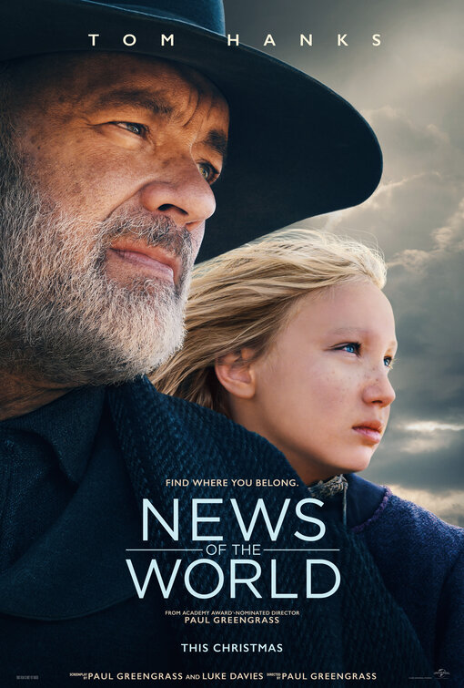
Much like Nic Cage did at one point, Tom Hanks is emerging as a fixture on this list. But it's not because the movies are bad or cheaply made that we so frequently see his visage plastered on some of the worst posters of the year. It's studio laziness. "We've got Hanks. That's it. Just airbrush and photoshop the hell out of it and we're good. Oh, and make his head as big as possible." If forced to pick, version 2 is worse if only because of that horribly rendered ship, but the long and wordy tagline remains equally unreadable on both. By all means, Hanks should be the centerpiece of the movie's promotional efforts. Just not this clumsily. And it's been a noticeable problem for a while now.

Kristen Stewart, Mackenzie Davis, Dan Levy, Aubrey Plaza and Alison Brie are all in a movie together and THIS is the poster for it. Making this approach even more inexcusable, it's actually a really enjoyable film. Outside of a potential sequel, there are no second chances for Hulu as they blew it here, its poor promotional material luckily saved by the actual movie. This poster somehow makes them all interchangeable with a generic Christmas snapshot gimmick that buries everyone's star power. It's quite an accomplishment considering each of them have enough rabid fans to fully populate a new country. They should have instead gone with the illustrated retro greeting card design from the film's opening credits. A far safer route was taken, likely rationalized by the argument that the cast sells itself.

The chief offense of Netflix's teaser for Ron Howard's Hillbilly Elegy isn't how drab and uninteresting it makes the film look by simply showing an overhead shot of trees and a car, but the needless amount of text overwhelming it. It's almost as if the marketing department knew they didn't have anything so opted to stretch out the credits to hide the lack of any compelling image or message. Kind of like that time in school when you wrote as big as possible on really small paper so the book report would look longer.

You just know Fred Goldman and Denise Brown are on the phone with their lawyers right now. And they should be, based on this deplorable one-sheet that finally answers the question of what really happened to...Nick Stahl and Mena Suvari's careers. Aesthetically, the poster isn't any worse than your average VOD stinker, but boy is that tag line scraping the bottom of the barrel, even for a brazenly exploitative thriller "inspired" by true events. Of course, those events seems to involve some cross country serial killer (with the "bloody glove?!") who looks to have either framed or helped O.J., a likely co-producer of this project. The one-sheet's just trashy enough to make The Haunting of Sharon Tate seem like a touching tribute, causing more speculation about the film's legality than its advertising. Assuming there's even a line anymore, it's just been crossed.
Next.

Isn't he holding the phone backwards? Wait, is someone else holding the phone? Whose hand is that? And wasn't this supposed to be a selfie? I hope they all don't think they're actually in the shot because that's just not possible. So confusing. From a strictly technical standpoint, let's at least hope the film fares better than this.

If anyone still feels brave enough to go for a dip in this water after seeing the look on Luke Wilson's face, let me know.


