If it was a better than usual year for movies, the same can't exactly be said for their posters, as the quantity of truly eye catching one-sheets fell off a bit in 2023. But there were still plenty of inspired designs if you looked, be it new twists on classic visual motifs or entirely novel approaches that stopped you in your tracks. And with an avalanche of releases now simultaneously hitting theaters and streaming, the movie poster is suddenly straddling the line between art and commerce like never before.
Despite offering a little something for everyone, no single list will be an ideal representation of the year's best posters, but it can highlight the standouts and jump start some interesting conversations. With no noticeable frontrunner, this is probably the toughest time I've had selecting the top pick, going back and forth between a few designs before arriving on a worthy selection, along with a few surprising inclusions.
The Top Ten are listed below, followed alphabetically by the Runners-up and Worst lists. Only official posters released during the 2023 calendar year were deemed eligible.
The Best...
10. Indiana Jones and the Dial of Destiny

It's been a while since we've seen this illustrated style employed for a blockbuster franchise entry like Indiana Jones and the Dial of Destiny. Reminiscent of Richard Amsel and Drew Struzan's classic posters from the original trilogy, Tony Stella does a superb job capturing the tone and spirit of the series, not to mention making a great case against studios' reliance on photoshopped floating heads to sell their movie. There's definitely a lot going on, but its layout is well composed with the illustration fading into that tan border. The only thing missing is the iconic Indy title treatment, but I'm willing to bet Disney made that call rather than the artist. Still, it's easy to be grateful for what we got, which was far better than anyone expected.
9. Dream Scenario

Continuing his streak of bizarre films with equally unusual posters, Nicolas Cage makes his annual appearance with one of his more thematically effective one-sheets. In A24's Dream Scenario he plays a biology professor who becomes an overnight celebrity after appearing in everyone's dreams. It's a great premise cleverly conveyed in River Cousin's daringly original quadrant style design. The dark brown background and pink title combo are far outside the norm of what we're used to, with the four illustrations almost literally jumping out at you. The girl flying over the title and nearly off the poster succeed in creating that desired three dimensional effect, as does the escaped crocodile. Featuring different versions of Cage's character stumbling in and out of dreams, it all converges to create an oddly original and offbeat portrait.
8. Crumb Catcher

Most probably have no idea what Crumb Catcher is, when or where it was released, or even who stars in it. Luckily it has this poster to cover for that. A home invasion thriller where a newlywed couple are held captive by maniacs, it's kind of amazing we haven't seen a design similar to this before. Going by the synopsis, it fits especially well, with the newlyweds traditionally posed on top as their unhinged kidnappers approach from below, all them depicted as plastic cake toppers. The cream colored border and bright stylized title treatment draw even more attention to an already unsettling image, while a running car and piles of gifts at the base are smart touches. And thanks to that spotlighted red backdrop, the whole scene eerily resembles a creepy storefront bakery display.
7. They Cloned Tyrone

Possibly taking a cue from one of my favorite poster designs, GrandSon's one-sheet for Netflix's They Cloned Tyrone features an illustration from Marvel artist Mike Thompson that's very much a visual companion to the film. It focuses on an unlikely trio (played by John Boyega, Teyonah Parris and Jamie Foxx) who uncover a government cloning experiment and the design for this is more aesthetically pleasing than most of the streamer's generic advertising of late. As even the worthiest content sometimes struggles to stand out, uniqueness like this helps, piquing the curiosity of anyone who notices a few more heads than usual trailing off the page. The mustard colored background is a bold choice, its title and credits are well placed and even that ubiquitous Netflix logo is fairly unobtrusive. The film boasted a series of successful posters (see below), but this is undoubtedly its strongest.
6. Rebel

After topping 2021's list with his astounding work for George A. Romero's The Amusement Park, Polish designer Aleksander Walijewski gives us this limited U.S. release poster for Rebel, with which it shares certain similarities. Strikingly symbolic in depicting how Belgian rapper Kamal (Aboubakr Bensaihi) is peeled and torn to reveal a blazing inferno behind his eyes as he's forced to join Islamic state in Syria. With an orange and black color scheme and intimidatingly large title treatment, it's hardly subtle but feels like the ideal choice given the film's plot and themes. Interestingly enough, this is the first project from writing/directing duo Adil and Bilall following the infamous burial of their Batgirl movie by Warner Bros.
5. The Zone of Interest

Expertly utilizing negative space, this Kellerhouse creation for Jonathan Glazer's The Zone of Interest accomplishes the near impossible by visually delivering a concept worthy of a film many count as the year's most quietly disturbing. Focusing on Auschwitz commandant Rudolph Höss (Christian Friedel) and his family trying to build a life next door to the concentration camp, this image captures that horrifying juxtaposition, as their backyard gathering unfolds against a pitch black sky. While not exactly the kind of poster you'll be rushing to hang on your wall, the picture it paints is chilling, especially when your eyes wander below the darkness to see that barbed wire fence separating the two worlds. The use of stark white for the title and bottom border create a horizon effect that further accentuates the contrast of privileged partygoers reveling as atrocities unfold on the other side.
4. Poor Things


It's too hard singling out only one of these eccentrically abstract Vasilis Marmatakisis prints for Yorgos Lanthimos' Poor Things since they're all so oddly inseparable from each other and the film itself. At their center is Emma Stone's Bella Baxter, a woman resurrected with an infant's mind, rapidly maturing as her personality develops in unexpected ways. The first two posters play into this, tinkering with perception and reality to create trippy imagery that highlights the heroine's twisted fairy tale journey. But that last one is a departure, as you need to look closely to notice those smudges on Bella's face are actually images of the film's male characters. It also masters the lost art of a unifying, distinctively odd title treatment. Like it or not, this squiggly Dr. Strangelove-like font will probably be associated with this film for some time to come.
3. The Killer

Contemporary British artist James Paterson's noirish, water color style painting for David Fincher's The Killer is as clean and tidy as the obsessive, unnamed title character (played by Michael Fassbender) believes himself to be. In this Kellerhouse design, the unnamed hitman is masterfully drawn with his cold, blank stare as we face down the barrel of his gun. Hypnotically dark and murky, the white credits stand out against a bleak, blueish green hue, but the real takeaway is that bullet hole title treatment, with a fallen "I" and blood spattering over the adjacent "l." Elaborate and attention grabbing, it captures the protagonist's methodical precision with a single unforgettable image. Paterson's other two posters in this series accomplish much of the same, but it's this one that most stands out, effectively placing us in the crosshairs of its cold-blooded assassin.
2. Paint

GrandSon's brilliant teaser for Paint serves as a reminder that there was a pretty
good idea for a comedy here with Owen Wilson doing his best Bob Ross
as Vermont public television painter Carl Nargle. Regardless of how that eventually turned out, it at least had the potential to be a subversive parody in the vein of Walk Hard. It's evident in this
one-sheet, which is gutsy enough to conceal the face of its star while
capturing the warm, fuzzy feelings associated with
Ross and his show. Between the painting, hair and Wilson's name, we immediately know who he's
playing. The "go to a special place"
tagline hammers that home, as does the retro typeface. While it's unclear how Ross would feel about
his soothing paint lessons being parodied in a feature comedy, you can bet he'd probably appreciate the poster much more.
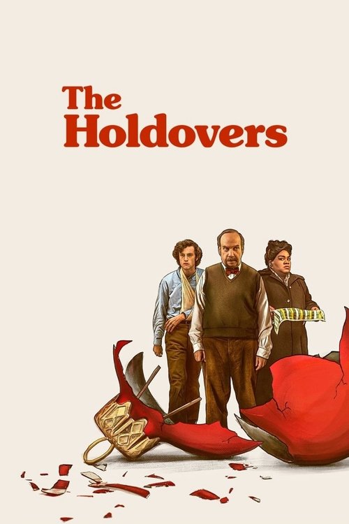
1. The Holdovers

The biggest surprise about AV Print's design for Alexander Payne's 70's dramatic comedy The Holdovers is how it takes a different approach from its LP soundtrack cover art. There's that throwback quality, but it's bolder and more unexpected, while still retaining the nostalgic holiday vibe. And few images better encapsulate the plight of these three characters stuck with each other over winter break than giant fragments of shattered Christmas ornaments at their feet, just as shattered as they are.
The disappointment and anguish exasperated New England prep school teacher Paul Hunham (Paul Giamatti), rebellious student Angus (Dominic Sessa) and grieving head cook Mary (Da'Vine Joy Randolph) experience is fully captured with a perfect rendering of their characters. The bright red pops against the cream background and its sensible formatting is enhanced by a retro title treatment and inspired tagline. And as someone who thinks every poster is hampered by excessive credits, one look at a bland, textless alternative proves empty space isn't always preferable, especially when everything's laid out this well. The design not only fits this movie like a glove, but belongs front and center in a multiplex lobby, attaching one of the year's best pictures to an equally impressive poster.
Runners-Up


And The Worst...


Unlike the inventive South Korean poster for Beau is Afraid seen above, these standard, run-of-the-mill studio teasers for the film are exactly why many bemoan the absence of creativity in mainstream American movie posters. Only Ari Aster's film couldn't be less "mainstream" and the usually adventurous A24 still took this generic route. You can at least get what they were going for with the first one, but even that's undone by the year's worst photoshopping. No matter how you feel about the divisive film, it deserved better than this.

Try not to doze off looking at this basic, unimaginative effort for George Clooney's The Boys in the Boat, a historically based sports drama that probably needed all the help it could get in the promotional department. What it gets instead is drab coloring, forgettable titling that fades into the background and bad photoshop. The poster's such a non-entity it might actually evaporate before our eyes.

The series of character posters for Book Club: The Next Chapter revolve around a visual gag that most outgrew by early childhood. So go figure. They'll just use that to market a movie aimed for and starring septuagenarians.

Hulu's Boston Strangler supposedly wasn't too bad, which only makes this poster all the worse. At least choices are made with even the worst designs. Here, they just pasted a still of Keira Knightley from the film and threw some white lettering over it. And while there are few recent developments as annoying as streamers planting their logos over every poster, this is a really egregious example.

For those tired of social media-themed movies, meet your worst nightmare. The poster's border is literally a phone, the characters are taking selfies, and just to top it all off, the title's a hashtag. According to its imdb description, this is about four influencers who live stream their trip to Devil's Manor, which once housed a satanic cult. Based on the image, that info unfortunately checks out. And how about this guy in the green hoodie?

LO O K AT ALL THAT TEXT ISN'T IT TOO MUCH WHERE'S THE TITLE HELP ME I'M HAVING PROBLEMS READING IT MOVIE POSTERS AREN'T SUPPOSED TO LOOK LIKE THIS


You'd assume a director of Martin Scorsese's caliber would at least have some input into how his films are marketed. Or maybe more frighteningly, he did. It's unclear how these designs for Killers of the Flower Moon saw the light of day, each seemingly worse than the next. Strangely positioning this Best Picture favorite as a B-level action thriller you'd find in Walmart's $5 DVD bin, its IMAX poster feels worthier, as does artist Addie Roanhorse's minimalist illustration.


Everything said about Flower Moon goes double for this series of Napoleon posters that look like the ultimate cut and paste job. There's nothing to this other than seeing Joaquin Phoenix against a variety of fake backgrounds. While the first is definitely ugliest in terms of style and execution, that Dolby close-up version is more perplexing the longer you look. By attempting to inject some kind of artistic flair, it ends up resembling a school project gone bad.

Time for another round. Or not. What's so compelling about this monstrosity is how on the surface it's just a poorly designed and laid out poster for a bad Hangover rip-off. At least until you notice a title that not only covers a quarter of the image, but is enclosed in a loud, bright purple label you'd expect see in a supermarket aisle. Luckily for all involved, there doesn't appear to be a credited director or cast, giving John Cena some degree of plausible deniability.


