
If a single word springs to mind when considering the most memorable movie posters, it's probably "iconic." It may not apply to every one, but chances are if you're able to instantly conjure up a single, striking image in your mind whenever that film's title is mentioned, it applies. Think Jaws, E.T., A Clockwork Orange, The Shining or Vertigo. All top-tier cinematic achievements matched by one-sheets that transcend a poster's purpose, resulting in a beautiful union of marketing and art.
Those are extreme examples, occupying space in the pop culture lexicon alongside the film itself and emerging as an easily identifiable logo. Occasionally it becomes such a calling card that you could conceivably remove the title treatment (often also memorable) and still identify the film. So even if the theatrical experience has undergone drastic changes over the past few years, movie posters always seems to adapt along with it, their initial intent remaining the same. This idea of iconography isn't gone, just rarer.
None of 2022's best designs can touch those classics, but that doesn't mean the principles and concepts behind them aren't still in play. Unlike 2021, where I scrounged to fill ten spots, this was a much better year, proving again there's usually a strong correlation between a film's quality and its poster. It's always a toss-up whether the top pick will present itself early and obviously with little competition, or be an unexpected winner that emerges from a crowded field of contenders. This time it's the latter, which I actually prefer, since it speaks to the quantity of exceptional designs over the past 12 months.
Just a reminder that only official, studio approved theatrical and screening posters released during the calendar year 2022 (possibly including upcoming 2023 films) are eligible. Most images via Impawards.com Below are the top ten, along with an alphabetically ranked runners-up list, and of course, the highly anticipated, but always entertaining year's worst.
The Best...
10. Everything, Everywhere All At Once

Capturing the polarizing chaos that is Everything, Everywhere All At Once would seem to be an impossible task, but illustrator James Jean nails it, melding all its wackiness onto a kaleidoscopic one-sheet that tells us everything and then some. From the googly eyes, to the hot dog fingers all the way to the two Evelyns framing the top and bottom, there's this strange thematic organization to the insanity that'll likely remind the movie's most ardent defenders why they love it (and prolong the agony of its detractors). Lots of little details here, all converging in Jobu's "everything bagel" black hole. A24 also released a series of parody posters based on the film's many multiverses, but it's this that easily stands as the most inventive and visually appealing of them all.
9. Fall

In the case of the vertigo-inducing, high altitude location thriller Fall, this is exactly how the movie looks, feels and is shot. No false advertising here, as you'll know with one look whether you're up for it. Just glancing at it may make some acrophobiacs nauseous, but there's a brilliant simplicity to Richard Rho's approach that only grows in impressiveness the longer you stare. The awesome use of all that wide open negative space and the breaking ladder captures the film at the apex of it suspense. You also have to love how the blinding sun against the blue skyline is sandwiched in between the top of the tower, nearly kissing its tag line. The functional sans serif title treatment is a perfect choice, with a navy typeface that's bold, impactful and well placed. "Dropping Soon." Clever. Amidst a myriad of throwback designs, this poster's almost jarringly modern, which was a gutsy choice Sometimes a teaser doesn't even need to knock your socks off, just convey the film as cleanly and efficiently as possible. Bonus points for playing with perspective and height in an inspired way I can't remember seeing since this.
8. Spin Me Round

If GrandSon's design for Jeff Baena's romantic comedy Spin Me Round looks slightly familiar that's because it is, strikingly resembling the Criterion Collection cover art for John Waters' Polyester. While there are noticeable differences, the romance novel paperback theme is front-and-center and maybe creatively executed a little better here, going even further with that aesthetic. Drumming up curiosity as to what the film could have up its sleeve, it's busy, but you have to appreciate how the typeface is configured and repurposed to look much more like a trashy airport read than a movie poster. The label on the top left and even that crease going down the "spine" is proof of that attention to detail. With vibrant colors and top notch illustrations (just look at Alison Brie) are topped off by the couple perfectly posed behind that cheesy-looking title treatment.
7. Butterfly in the Sky

Featuring interviews with host LeVar Burton and the legendary PBS show's creators, to say the 2022 "Reading Rainbow" documentary, Butterfly in the Sky slipped under the radar would be an understatement. But just look at this poster, which is everything the program represented in a single, eye-catching illustration that not only conjures up nostalgic memories of its opening credits, but the iconic theme song itself. It would have been so easy to just photoshop Burton onto the poster, add a title and call it a day. But this avoids replicating the errors of the disappointingly bland 2018 one-sheet for that masterful Mr. Rogers documentary, Won't You Be My Neighbor? You can't look at these images (especially the pages flying out of the TV) and not immediately reflect on everything the show meant to those who grew up on it. And it looks fantastic to boot, with dazzling illustrations and colors, a flawlessly placed brown title and the Tribeca laurel reef, all accompanied by a nice, clean border. Still trying to uncover who designed this.
6. Get Away If You Can

Here's another film that really fell through the cracks. Released back in August on VOD, actors and writer/directors Terrence Marin and Dominique Braun's sailing thriller, Get Away If You Can came and went with little fanfare, but Aleksander Walijewski's poster for it is unforgettable. With a plot revolving around the exploration of a deserted island, the studio at least knew to place the great Ed Harris at the forefront of what can best be described as a highly unusual, but visually captivating one-sheet that isn't overwhelmed by an onslaught of type and credits. The beige border and aqua blue color combo makes for a great contrast, with the two divers descending toward the title below and away from Harris' face on the bottom of the boat. As far as why Harris' face is on the bottom of the boat? Who knows, but it's a great choice. The design takes a page from Jaws, but in reverse.
5. Armageddon Time
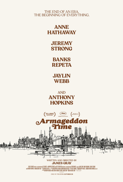
Sending out some classic The Last Picture Show vibes, this elegantly simple throwback for James Gray's autobiographical Armageddon Time demonstrates an understated excellence that's gone missing in modern posters, Successfully channeling the film's New York setting circa 1980, this GrandSon design also manages to replicate the style of poster that would accompany the film's release during that era. It's very deliberately intended to convey the theme and tone of the picture rather than misrepresent or oversell the picture as anything other than an adult prestige drama. And by taking this route, it ends up serving as the best, most honest advertising for this release. Those who want to see it will and that's the audience most likely to appreciate the artistry behind this one-sheet. The brown title treatment against the beige is immaculate and what even needs to be said about that spectacular skyline sketch? Part of me wonders how good this would look if you kept the tag line on top, but removed the vertical cast credits down the middle, freeing up even more negative space. Then again, it does help to know who's in it. Just great work all around.
4. White Noise

The first official poster for Noah Baumbach's White Noise was surprisingly underwhelming. Then a few character one-sheets followed that weren't much better and we're left wondering...that's it? Yes, it's Netflix, but Don DeLillo's 1985 supposedly unfilmable novel on which this is based should be insane enough on its own to inspire some really wacky designs. And now here it is, as illustrator Marija Tiurina summons her inner Where's Waldo? to give us this gloriously detailed collage of chaos that's bursting through every corner of the page with moments and characters from the film. As fun as it's been seeing Waldo photoshopped into this online, there's actually enough going on that we don't even need him and you could just try spotting Don Cheadle instead. Posters and even t-shirts like this enjoyed spurts of popularity during the 80's and 90's, but this approach is still kind of a deep cut, albeit an entirely welcome one. You just don't see this kind of thing anymore and Tiurina does it about as skillfully as you'll ever see, crafting a worthy homage that reflects the movie's zaniness.
3. Pearl

While the influence behind MOCEAN's "X-traordinary" design for Ti West's Pearl is clearly Italian horror movie posters of the 70's and 80's, it possesses that rare, attention-getting quality prevalent in those aforementioned classic one-sheets. There is an iconic quality to it, evident by the fact that you really could take away that bloody title treatment (which is outstanding) and credits and still completely know what this is. A lot of that can be attributed Mia Goth, whose performance and look in the film is so immediately recognizable that you could have gone in numerous directions designing the poster, just as long as she's prominently featured. The optimistically wide-eyed "who, me?" look is almost too perfect, complete with the bloody hands covering her cheeks. The black background makes the bright red pop and there's some good manipulation of perspective with a sepia toned Pearl chopping up her victim as the blood flows down the road into that beige background, forming the title. This retro aesthetic is nothing new, but it's still in a class all its own, serving as the ultimate companion piece for West's film.
2. Resurrection

P+A's design for the twisty Rebecca Hall thriller Resurrection could on the surface just be described as a grainy, black and white image of her character. But there's a lot more going on, to the point that we really have to question what we're looking at here. Especially the incorporation of those imprisoning orange vertical lines, taking an ordinary head shot into a creepy realm that befits the film's subject. The stark contrast between the black and white and those strong, bold orange bars is what jumps out most here. Pressed up and piercing through it is her eye, resulting in a genuinely unsettling sideways glance that lets us know something's askew. With thick, functionally placed off white title type and a superb border of the same color, notice how those bars feed right into those bold black pull quotes at the bottom and the credits. While undeniably a throwback, it's tough coming up with many past examples it draws from, suggesting maybe this concept is more original than it's gotten credit for. Hall is no stranger to appearing on memorable posters for her films, and here's yet another one, wildly unique enough to lure you into giving it a watch.
1. Tár (All Versions)


If anyone would appreciate the symmetrical composition of these posters, it's the embattled fictional conductor Lydia Tar of Todd Field's Tár. Emerging from the darkness and towering above us all, AV Print's ingenious concept for one of 2022's most acclaimed films lets us know under no uncertain terms that this is Lydia's space and anyone else will be shrunk and overwhelmed by her greatness, much like the characters she's stepped over on her path to dominance. Arms outstretched, it's as if a whole page couldn't even contain the character's wingspan, physicality, ambition and talent. Another great example of cleverly manipulating space and perspective, first two posters still manage to maintain that austere, inaccessible quality that makes the film itself such a challenging mystery box enigma.
The huge transparent title and credits across Blanchett's torso compliments the image well, but for comparison's sake, look at that second version, which removes everything but the title. A noticeable improvement, only reinforcing the idea that text is often the biggest obstacle to work around. So despite far preferring the simpler version, they did a great job using text in a manner that really fits the overall design's form and function. But better still is Desi Moore's official Cinemark poster (also doubling as the 4K/UHD blu ray cover art), which captures the emotionally detached maestro in all her repetitive obsessiveness with that hypnotizing illustration. All these posters loom as large as the title character herself, which is quite a feat.
Runners-Up...


...And The Worst


Both these films boast impressive casts. So impressive that they should be prominently listed. See, they're big stars. You can read their names here. In text. There are many of them.

While the idea of Jon Hamm playing Fletch definitely has potential, you'd never know it looking at whatever this is supposed to be. The familiar paperback concept (executed to far greater effect above with Spin Me Round) strangely resembles a Xerox copy of a rejected art assignment. Besides Hamm not looking quite like himself at all, everything just seems off, not to mention surprisingly unpleasant to look at.

Despite being photoshopped beyond all recognition, it's hard to not to be mildly impressed that Tomlin, Fonda, Moreno and Field will all be sharing the screen together for the first time (bonus points for matching the correct names to the actresses). And yet it's still cringeworthy, managing to meet all the middle of the road expectations you'd expect from a comedy depicting four senior friends' trip to Super Bowl LI to watch their hero. Tom Brady doesn't need to be on the poster, but you wonder how much goofier this could have been if he was.


Coming soon to your local public library...Steven Spielberg's The Fabelmans. That Toronto Film Festival poster really does look like something you'd see on the bulletin board next to a missing pet flyer or babysitting inquiry in the lobby while returning your overdue book. But even that can be forgiven, until you realize the borderless theatrical version is identical, yet somehow drabber. And all these sentimental images do little beyond reinforce everyone's biggest Spielberg misgivings going in. Supposedly, the film's much better than this, but young Sammy Fabelman walking toward projected images of his life on a studio backlot only heighten any concerns of syrupy content. At least they were smart enough to put Michelle Williams front and center, but that's about it. Maks Bereski's unofficial poster shows how this could have been done well.

Poor Andy Garcia, who looks legitimately perplexed at either how he ended up in HBO Max's Father of the Bride remake or got digitally manipulated onto its poster. Maybe both. Can't say I blame him. As far as no one knowing the film exists, generic advertising like this helps explain why.

Even by Netflix standards, this is pretty uninspired. And very, very blue. And that they simply repeated the same formula for the individual character and ensemble cast versions makes it clear what the game plan was all along. Just throw stars on the posters. They'll watch anyway. It doesn't matter.


To Jeff Goldblum's credit, he has his trademark bemused look suggesting he'd rather be anywhere than on a character poster for Jurassic World: Dominion. And it's hard to disagree. But I feel worse for that unidentifiable actress below who's baring only a vague resemblance to someone who looks like Laura Dern.

Just a guess that this is supposed to be one of those body swap comedies, but Diane Keaton actually looks de-aged here (defeating the conceit of a younger person trapped in a senior citizen) and the others just look superimposed into a background containing the tidiest, most carefully placed pool party mess you've ever seen.

Tom Hanks is a lot of things, but "Grumpiest Man in America" doesn't exactly feel like the most accurate descriptor. But putting that, his menacing scowl and a fake cat aside, this does seem to represent a trend for the actor of late. They've basically just stopped designing posters for his films, opting instead to just paste the actor on a one-sheet with some text. If anyone deserves better, it's him.

It's not a list without our requisite Cage entry and this one doesn't disappointment. It seems like they've ironically gone to great lengths to age him in this poster for The Old Way. But his name sure is perfectly centered on that hat, depriving us the knowledge of what crazy hair he'll be sporting this time.

The most dramatic rose ceremony ever.

The Son blah blah blah blah Florian Zeller blah blah blah Hugh Jackman blah blah blah blah. When pull quote posters are done well, there's nothing better, but this is just an mountain of small, unreadable italicized text. On the bright side, this does look like Laura Dern.

Forget about appearing on the same poster, Eva Longoria and Matt Walsh don't look like they're even sharing the same country, state or zip code here.

What a disappointment. The Whale should have been the movie poster of the year. Just an illustration of Brendan Fraser's head on a whale's body. Someone needs to get on that. Instead, we get the now ubiquitous screenshot cleaned up and photoshopped to such an extent that it actually undermines the dramatic subject matter. The bright aqua title type is an interesting choice, but with this uninspired approach A24 has again revealed their discomfort promoting the film due to the fat suit "controversy." The hesitancy isn't doing the film or Fraser any favors.


