After a multi-year dry spell where singling out ten picks worthy of the upper echelon proved challenging, 2024 marked somewhat of a comeback for the movie poster. While there's no shortage of great designs every 12 months and the form is never in danger of extinction, some years are just stronger than others. This was a very good one, with the winning poster being fairly obvious early on as the rest fell into place with minimal second guessing.
Some of those told us everything we needed in a single image when others left more to the imagination, daring us to see the final product and fill in the blanks. The examples below suggest both approaches work, even if keeping it simple and uncomplicated still stands as the golden rule. Messy, chaotic posters can always slip through, but there's usually a method to the madness with those that mirror the film's themes or stylistic approach.
The most alarming development in this year's crop is found on the Worst list, which features a greater number of high profile, award contending releases to go along with the more predictable dreck we're accustomed to. It might also mark the first time a Nicolas Cage picture doesn't crack either list, but that wasn't from my lack of trying. A few unofficial, alternate designs did sneak in, but none managed to crack the top tier. As usual, only posters dropped during the calendar year qualify, regardless of the film's expected release date. The ten best are below, followed by the alphabetically listed runners-up and worst lists. But you know the drill. Here they are:
The Best...
10. Strange Darling
There were more predictable routes B O N D design could have taken with their teaser for JT Mollner's critically acclaimed cat-and-mouse thriller Strange Darling, such as the film's opening scene of "Lady" desperately running across the field in her red scrubs. And although we got that anyway, this takes a cue from the film itself by going in a totally different direction with an eye-catching, hot pink and black one-sheet featuring Willa Fitzgerald's unnamed lead.
Highly stylized, it looks concocted by a committee intended to target more mainstream audiences, but there's absolutely nothing wrong with that. The pink hair, "Love Hurts" tagline and an incandescent glow emanating from her against that dark background gives this a transfixing blacklight effect. But the best detail might be those two silouettes of the main characters incorporated into the title treatment. There's a similarly themed alternate design below that's impressive in its own right, but this one's operating on another level.
9. Mother Couch
The red background was an ideal choice, with the title and credits carefully placed, freeing up a large amount of negative space that enables the illustration to just absurdly hang there in the middle of the page. The crudely scribbled Mother Couch title font must have been a consciously creative choice, but I'd still be curious to know the full intention behind it. Either way, weirdness at its best.
8. Notice to Quit
This extraordinary set of posters for the comedy Notice To Quit sees failed actor turned New York City realtor Andy (Michael Zegen) at the end of his rope, tie, cord and apartment key when his estranged 10-year-old daughter Anna (Kasey Bella Suarez) shows up as he's evicted. The Fable Agency's illustrations harken back to a concept that's inexplicably fallen by the wayside, wherein a series of similarly themed designs visually convey a film's unifying concept. In this case, that idea is an overwhelmed protagonist being pulled in just about every direction.
The consistent title treatment, cream color scheme, related taglines and burgundy border give all of these a clean, classy look, but the true standout are these illustrations. Whether it's a disheveled Andy falling off the poster while hanging from the phone cord, getting caught in a literal whirlwind as his life blows away, or the most ingenious of the bunch showing him teetering on the edge with that NYC landscape forming the key's teeth. Clever.
7. The Featherweight
You have to do a double take after seeing Sister Hyde's one-sheet for Robert Kolodny's 1964 set boxing biopic The Featherweight, which effectively sells the film as having been released in that year. If this level of authenticity is at work with the advertising, it makes the mind race about the movie, which looks as if it must be a love letter to sports nostalgia based on this imagery. Genuine enough to succeed as far more than just an homage, we get quotes around the title, a throwback color scheme, and a great old school tag line ("Willie Pep Has Had 231 Fights. What's One More?").
Pep out front in full fighting stance atop the bold title treatment reinforces just how easily this brilliant collage work could have ended up as a photoshop nightmare with less skilled execution. What we ultimately get is a poster that wouldn't look out of place lit up in a theater lobby or hanging on the wall of a local boxing gym in the '60's. Maybe more than any other entry on the list, this generates real interest in what the film is, regardless of its quality.
6. Rumours
According to its synopsis, Rumours centers around "leaders of seven wealthy democracies getting lost in the woods while drafting a statement on a global crisis, facing danger as they attempt to find their way out " The premise seems intriguing enough and Walijewski employs a dark, twisted visual metaphor for this horror/sci-fi political satire. Featuring the G7 members all squeezed together between those columns while sharing a single burning brain, the implications are pretty obvious, but spectacular nonetheless.
Here's another excellent use of that pink and black color combo, with bonus points for a three dimensional title. While the cast alone makes it a must-see, it's tough to recall a poster as creative in incorporating all its characters into this insane a design. As far from your standard floating heads approach as it gets, this feels like a poster that will probably maintain a longer shelf life than the film. In fact, it's safe to say it already has.
5. Late Night with the Devil
Late Night with the Devil's gripping set of posters each reflect somewhat differing takes on the film's traumatic events that unfold over the course of a live, late night television talk show in 1977. Creepy Duck Design's initial teaser puts David Dastmalchian's embattled Night Owls host Jack Delroy front and center amidst a blue glow, flames engulfing his feet as he stares into the abyss, giving off some major Pink Floyd vibes.
While this design channels the found footage thriller's 70's aesthetic with a retro title treatment, over-the-top tagline and tan border, the character boxes on the bottom serve as a once identifiable staple of the era's big event posters. Having the corresponding actors' names under each box would have been better, but considering the amount of credits they had to jam in, it gets a pass.
P+A's one-sheet further builds on the concept, as Delroy's head is replaced by a raging fire, creating an unsettling image heightened by the host striking an introductory pose in his leisure suit. The bright red typography stands out, to the point that it doesn't even matter that they jammed all those tiny credits below the title. And the "Do not adjust your set." tagline on the bottom right cuts straight to the point.
That last design by Sister Hyde is obviously a riff on the classic Network art, but it's a good one and they undoubtedly picked the right film to pay homage to in terms of theme, content and time period. For a spoof, it's kind of astounding how good it looks, especially the black, white and red color scheme. Complete with horns and a devil's tail emerging from the TV, it's effectively subtle while marking a complete 180 from the others.
4. The Apprentice
Speaking of horror movies, Ali Abbasi's woefully underappreciated, surprisingly complex Donald Trump origin story The Apprentice had a variety of options to draw from given its controversial subject. And yet poster artist Danni Riddertoft manages to exceed expectations of audiences either anticipating or dreading a film that recounts the future President's younger days as pupil to venomous prosecutor Roy Cohn.
It's ironically fitting that a poster so effective at conveying the film's themes of manipulation and artificiality came under some attack for allegedly utilizing AI. True or not, the end result speaks for itself with a strong, striking image of Sebastian Stan's Trump smugly sits atop his golden throne while Jeremy Strong's heavily tanned Cohn presides over him as puppet master, staring a hole right through us.
The phone, that tiny flag and of course Maria Bakalova's Ivana decked out as the Statue of Liberty converge to create the kind of garish, ornate souvenir that wouldn't look out of place on Trump's own desk. With the exception of the Donald's trademark red tie, Ivana's face and Cohn himself, it's all gold everywhere since there's no color more closely associated with New York City's emerging real estate magnate. And the title treatment is perfect, stylized in a gold neon light that just screams Trump. Is it all too much? Of course, but that's precisely the point.
3. Skincare
GrandSon's one-sheet for Austin Peters' crime thriller Skincare features a staggering visual concept, as Elizabeth Banks' famous aesthetician Hope Goldman wipes the makeup off her face and the poster. It also makes exceptional use of a black background, drawing this quizzical line between what's revealed and concealed as makeup drips from her eyes. And in flawlessly utilizing negative space, the designers resist the urge to fill the top and bottom with credits, instead unobtrusively condensing everything to the image's right.
Pink and black proves again to be an unbeatable combination, along with an explosively retro title font that looks like it came straight out of the 80's. Giving the appearance of bright lipstick smeared across a mirror, it's ideally formatted to replicate a high end cosmetics ad you'd find in a magazine, only slicker. The movie may be set in 2013 rather than 1986, but who cares? When something works this well you just go with it. And that tagline, "It's Just A Little Cover-up," is a witty play on both the cosmetics and criminal plot elements. In a less competitive year, this poster could have taken the top spot.
2. Saturday Night
Jack Davis' classic one-sheets for It's a Mad, Mad, Mad, Mad World and The Bad News Bears, Phil Roberts' work for 1999's Detroit Rock City, or even Mark Stutzman's design for 2019's Echo in the Canyon seem to be the obvious inspiration for this cartoonishly chaotic Saturday Night poster. While incorporating a large sprawling cast of colorful characters into one crazy, all encompassing illustration isn't new, it's still one of those concepts that make you smile whenever it pops up. And especially if the film really warrants it, like with Jason Reitman's biographical account of the frantic minutes leading into Saturday Night Live's 1975 premiere.
The movie's premise cries out for this treatment and BLT Communications responds with the best recent version of this style we've seen in years, as Gabrielle LaBelle's Lorne Michaels literally carries his then unknown troupe of SNL players on his back. The caricatures aren't just dead-on depictions, but entertainingly identifiable with their on screen versions, making for a fun "Where's Waldo?" game of spot the star. In scanning the page for Radner, Chase, Aykroyd, Curtin and others, smaller details stand out, like a bumble bee clad Belushi's grimace or the small clock reminding us what the cast and crew are racing against. It couldn't have been easy capturing the film's frenetic energy, but does this ever get the job done.
1. Woman of the Hour
Doubling as a vintage paperback cover, P+A's poster for Anna Kendrick's directorial debut, Woman of the Hour is as oddly compelling as the crime thriller itself. When aspiring actress Sheryl Bradshaw's (Kendrick) 1978 appearance on TV's The Dating Game brings her face-to-face with prolific serial killer Rodney Alcala (Daniel Zovatto), the circumstances and overall attitude of the times lend an inevitability to what occurs. And that's all encapsulated in this striking poster that feels ripped from the era this film takes place, with Sheryl's profile appearing in silhouette against a bright orange background, converging to create a haunting effect that eerily resembles a charcoal drawing or ink blot painting.
Since orange isn't a color typically used to this extent, its presence only bolsters the retro feel, as does that synopsis right below her eye, calling back to a time when those elaborate descriptions seemed commonplace in movie advertising. And in keeping with the throwback aesthetic, we get an awesomely stylized 70's title font, along with a white border to frame off the image's rounded corners. But what really sends this design over the top is Sheryl's eye, or rather Alcala's shadowy silhouette embedded in her bright, heart shaped pupil. Netflix's more accessible poster for the film was completely pedestrian, but this is art.
Runners-Up
And The Worst...
Its title might be The Amateur, but did the marketing department really need to take that idea so literally. Even if amateurish is probably preferable to the bland slickness of Rami Malik...looking over his shoulder. With the steel blue titling, this kind of resembles a Christopher Nolan poster, if it lacked a soul.
Welcome back Cameron. But I'll guess it wasn't the promise of this poster that coaxed you out of acting retirement. While probably not the comeback vehicle most had in mind, this is about as prototypical a Netflix poster as it gets. The tagline isn't bad though.
I'm all for subtlety and minimalism, but really? At first glance you'd swear from the color and its hoity toity title that this must be Sofia Coppola's latest. But no, it's "A New Kind of Love Story From The Creators of Barbarian." So maybe we can reserve judgment. Still, if you're not ready to give us the actual poster yet, it never hurts to just hold off.
One of the most acclaimed films of the year and a locked Best Picture nominee gets this. Maybe they figured the movie's so good that it doesn't matter. Floating heads in a cross, generically ill-placed title treatment, photoshopped backgrounds and nearly invisible credits. Luckily, Oscars aren't given for marketing.
As far as extreme close-ups go, this definitely isn't the worst offender we've seen and there's an attempt to add some color with the credits, but what a terrible route to go for a film as daringly different as Emilia Pérez. At least most expected a staid, conventional one-sheet for something like Conclave, The foreign version is better.
There are a bunch of bad variations on this Fly Me to the Moon poster, but something about this one is particularly awful. Take a choice between the obvious photoshopping, horrendous background cropping or whatever they were trying to do with the title. And Channing Tatum appears to be missing a leg. In all fairness, it's the kind of design most expected the movie to get. But that doesn't make it any better.
Say what you will about the reception to Robert Zemeckis' Here, but a concept ambitious enough to span decades and generations in a single location deserves better poster treatment than this, especially when its source is an acclaimed graphic novel. It looks almost exactly like those generic inserts you find in newly purchased photo frames, even right down to the sappy tagline. For a second there, I thought they used the Forrest Gump font for Hanks and Wright's names, which would have been a cool touch. It's close, but not quite.
Anyone wanting a rundown of Steven Soderbergh's filmography can check imdb or this poster for his upcoming Presence. You can vaguely see what they were aiming for, but light gray over black, or even worse, light gray over light gray, aren't exactly color combinations ideal for...reading. I guess that's supposed to be a blurred face in the background. Just an awful conceit, and one that completely obscures the film's title for the sake of list making.
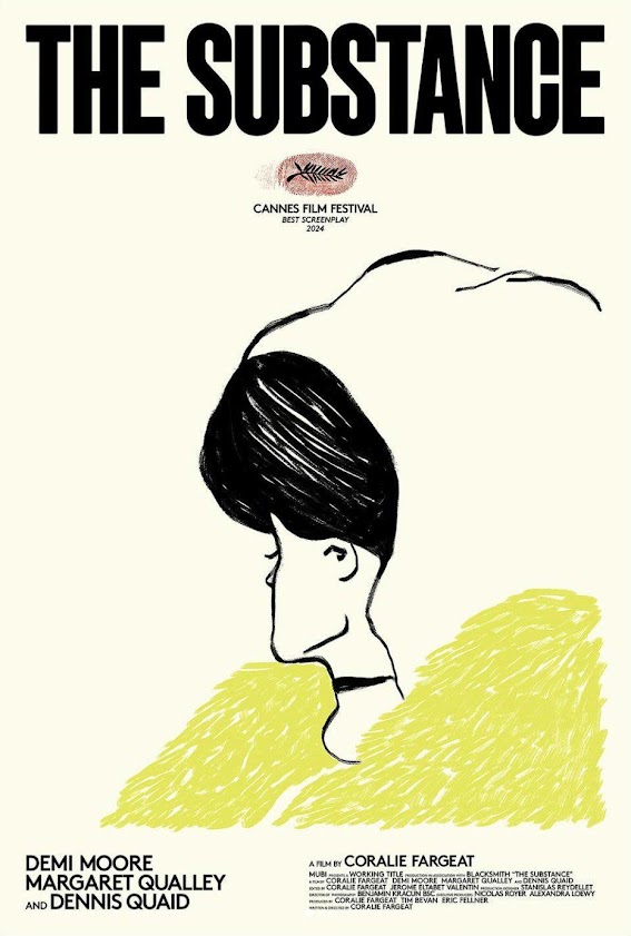
Nothing against Ronald Reagan, or even Dennis Quaid, who gave one of my favorite supporting performances of the year in The Substance. But unfortunately he appears to be buried under more prosthetics as the 40th President than either of his co-stars in that film. So of course we get an enormous close-up of his face along with a fake aurora borealis-like skyline serving as backdrop. The slapped on white typeface is the final sign they've thrown in the towel, or ran out of money.
It's a good thing Saturday Night got that illustrated beauty of a poster above since this early version is basically a worst case scenario. The inspiration is clearly SNL's opening credits but it just doesn't work at all in this context since movie posters should always show rather than tell. This tells us a whole lot of nothing by plastering every inch of the page with words.
No, none of these actors are ugly, but this layout sure is. And it's time to take back that assertion that the Back in Action poster represented Netflix's trademark design. This does. A photoshopped cast awkwardly positioned on the page with white typeface across the bottom, as if vomited out by their algorithm. Just seeing this image as a thumbnail would qualify the title as an immediate skip.


