Tuesday, January 24, 2017

2017 Oscar Nominations (Reaction and Analysis)


Changing things up a little, The Academy this morning revealed their nominations for the 89th Annual Academy Awards, not at the Samuel Goldwyn Theater in Beverly Hills in front of media and publicists, but using a live stream on their website and digital platforms, along with satellite feed. I actually detested this approach as the "big event" feel of the announcement was completely lost in favor of impersonally finding a video online, entirely diminishing the spectacle and pageantry surrounding the nominations. They tried something new and it failed. And I hope they never do it again, especially if the primary motive was letting everyone know that the now digitally hip and connected Oscars have maybe moved into this century. But we'll look no further than the actual nominations to determine that, as the duties were handled bright and early by my favorite Academy Award Winning Best Actress, Brie Larson, Jennifer Hudson, Emmanuel Lubezki, Jason Reitman, Ken Watanabe and AMPAS President, Cheryl Boone Isaacs. Many were elated, some were disappointed, and a few less than usual were left wondering what on Earth the Academy was thinking. So, that's a plus.  Let's see how it all played out, running down some of the shocks, snubs and surprises from the morning's announcement. The full list of nominees can be viewed here.

-The big story is obviously La La Land tying Titanic and All About Eve's all-time Oscar record of most nominations with 14. This isn't entirely a surprise given the steam it's picked up and at this point it would be a shock if it doesn't win on February 26th. Universally beloved, it just doesn't have anything working against it other than the potential backlash of it being TOO successful, which is ridiculous.

-Most of the nominations shook out exactly how most thought they would across the board, as many of the acting nominees seemed locked in months ago. There weren't tons of options from the get-go and it was pretty clear who was and wasn't getting a nod, with very few exceptions.

-Didn't think Arrival would get in for Best Picture knowing the Academy's historic bias against sci-fi. But I should have known better. With anywhere from five to nine slots (and lately it's been nine) available, what else would make it? I still say they should go back to the traditional five, which would make each nominee mean more.
   
-I was right that Amy Adams wouldn't get in for Arrival. It was just too crowded a category, and if any actress could afford to be left out, it's her. 

-The highly respected Annette Bening's absence for 20th Century Women (which did earn a screenplay nod) might be the closest thing we have to a snub here. Depending on your perspective, either Ruth Negga (Loving) or Meryl Streep took her spot. I'd prefer to point the finger the latter.

-These Streep nominations for whatever she happens to appear in that particular year has now officially crossed the threshold into a running joke with Florence Foster Jenkins. I'm sure she's fine in it, but give it a break already. Even she must be laughing at this now.

-The thought that Emma Stone could very well win Best Actress is undeniably thrilling, especially for anyone who suspected such a feat was possible since Easy A. 

-Mel Gibson is back. No one ever questioned the talent but the Academy finally forgave and forgot, welcoming him back into their good graces with Hacksaw Ridge after nearly a decade in Hollywood purgatory. Nods for Picture, Director and Actor (Andrew Garfield) indicate they feel he served his sentence. Now we'll see what he does with his second chance.

-The Best Actor field turned out exactly as expected, with maybe Viggo Mortensen for Captain Fantastic the only question mark going in. And even that was kind of a given. Casey Affleck is basically a lock to take this. 

-Did anyone really think Deadpool would be nominated for anything substantial knowing voters' tastes? Sorry, but that was real long shot.

-Count me among those who don't feel O.J.: Made in America should be eligible as a documentary. It's great, but an 8-hour episodic series for TV. And it's probably winning.

-Thought Hidden Figures may have peaked a little too late in the race to get in for Best Picture, but it did, with Octavia Spencer also earning a Supporting nod. She'll be competing against her former The Help co-star, Viola Davis, the likely winner in this category for Fences.

-Was really hoping for that surprise Kevin Costner supporting nomination but it just didn't materialize. Too bad. That would have been something if it did.

-Speaking of comebacks, did anyone think we'd again be talking about Slumdog Millionaire star Dev Patel in relation to the Oscars this year? Lion slowly built momentum and overperformed considerably this morning with a nomination haul of 6 (including a Supporting nod for Nicole Kidman and Adapted Screenplay). Not bad for a movie few have heard of and even fewer have probably seen.    

-After last year's #OscarsSoWhite controversy, 2017 boasts a record six nominations for black actors, which will no doubt raise the question as to how much of an effect that had, if any. The Academy wasn't racist so much as not afforded the opportunity to nominate minorities based on a problem much larger and more systemic within the studio system. Whether that's changed at all remains to be seen, but we can agree that one year doesn't make a difference either way. This year or last. And simply counting nominations won't be indicative of that change.

Monday, January 16, 2017

Christine


Director: Antonio Campos
Starring: Rebecca Hall, Michael C. Hall, Tracy Letts, Maria Dizzia, J. Smith-Cameron, John Cullum, Timothy Simons, Kim Shaw
Running Time: 119 min.
Rating: R

★★★★ (out of ★★★★)

"In keeping with Channel 40's policy of bringing you the latest in 'blood and guts', and in living color, you are going to see another first—attempted suicide."

On the morning of July 15, 1974, Florida news reporter Christine Chubbuck drove into work at WXLT-TV studios in Sarasota ready to try something she's never done before: Lead off from the anchor's desk. Only the film reel of the story jammed and, eerily composed, she looked into the camera and read that statement above. Then she took out a gun, put it up to her head and pulled the trigger, committing the first on-air suicide. The fact that she described what she was about to do as "attempted" reveals a lot, and much of it is corroborated in Antonio Campos' Christine, one of two 2016 films about this woman and the shocking, tragic circumstances surrounding her death over forty years ago. It also brings to the forefront a debate about the extent of a filmmmakers' moral responsibility when handling controversial, sensitive material based on true events. And, like it or not, there's always a certain level of responsibility.

Ironically, this film, closer to what we'd consider a straightforward biopic in how it dramatizes the final weeks and days leading up to the suicide, shows more compassion toward its real-life subject than the "documentary thriller" also released this year on the story, Kate Plays Christine. In that, an actress prepares to play the role of Christine Chubbuck, dragging along with her all the psychological baggage it entails. But what it's really about is a director being swallowed up by his own meta gimmick, going to almost extraordinary lengths to avoid telling us the story Campos does with such empathy here. We don't go to movies to see filmmakers work through their guilt over tackling potentially tasteless or controversial subjects. Any subject is tasteless if handled wrong, so if you don't want to make it, then don't. And if you do, you've certainly lost the right to wag your finger at audiences and reprimand them for watching it.

We're not, as that other film implies, a bunch of bloodthirsty animals clamoring for a dramatic recreation of this woman shooting herself on live TV. And Campos knows we're better than that. He knows that while most care about the whereabouts the infamous tape of the event, few aside from callous "death hags" would actually be interested in viewing it. And while he knows it may be the circumstances of her gruesome end that initially draws us in, his film is full of faith that we're far more interested in exploring how and why this happened.

When dealing with a touchy, sensitive subject, Christine proves it's sometimes best not to dance around the issue and just do it. Those thinking it's exploitive will have that reaction regardless of how it's presented, so the only defense is to make a great film that finds the humanity in its subject and hope the rest of the cards fall into place. For Campos they do, and its the highest compliment to his direction and Rebecca Hall's Oscar-worthy performance as the title character, that before the film enters its dreaded final act, I momentarily forgot what she was going to do. I was so invested in this woman's struggle to fit in and function under the stress of mental illness, that I thought maybe she'd somehow pull through. But the more people try to help the further she seems to fall, to the point that what eventually occurs feels like a cruel inevitability.

When it comes to the depiction of that fateful day, there's just too much at stake to do anything but step on the gas and floor it. Holding back would be a disservice to both the person and her story, which seems as relevant and important today as it must have then. Maybe more so considering there were few who knew how to react at that time, causing it to slip from the public consciousness. Only now, with what seems like the proper amount of time and distance, we have a film that treats this situation with the depth and complexity it deserves.

As the host of Florida's "Suncoast Digest,", a community affairs talk show on Sarasota's WXLT-TV newscast, reporter Christine Chubbuck (Hall) shines a light on issues affecting the region, conducting interviews with local business leaders and reporting on human interest stories that have an impact on the everyday lives of viewers. But personally and professionally, her own life is falling apart, as she rapidly approaches her 30th birthday still a virgin who hasn't been on a date in years and is struggling with depression that's only been exacerbated by news that a medical condition could prevent her from ever conceiving children. She lives with her single mother, Peg (J. Smith-Cameron), but that relationship is strained by Christine's unpredictable mood swings and disapproval of her mom's dating habits and carefree attitude.

On-air, Christine's composed and professional, proudly wearing the label of a perfectionist who takes her job very seriously. It's a quality her friend and protégé Jean Reed (Maria Dizzia) seems to admiringly tolerate, even providing moral support during her frequent breakdowns. But when orders come down from the station manager, Mike (Tracy Letts) that the newscast is going in a sensationalistic new direction following a significant loss in viewership, Christine must readjust if she wants a shot at a potential anchor job in a bigger market. "If it Bleeds, it Leads," becomes the studio mantra as the types of positive stories covered on her segment fall by the wayside in favor of "blood and guts" TV that focuses entirely on murder and violence.

Disgusted by the station's new direction and correctly forecasting decades in advance the bleak future of television news, Christine starts to unravel. Further complicating matters is her crush on lead anchorman George Peter Ryan (Michael C. Hall), who takes an interest in his co-worker, only to be frustrated by her frequently standoffish behavior.  As she reaches her inevitable breaking point, there are signs that someone or something can intervene and stop what's going to happen. And it's then that we're coldly reminded that this is 1974 and she's not only a driven woman, but one suffering from undiagnosed bi-polar depression and working in a male-dominated industry. Despite everyone's best intentions, the help she really needs can't possibly arrive in time.

Of course, the running joke bubbling just underneath the surface of a film that does have kind of a dark, bleak sense of humor about itself, is that if Christine was this disturbed by state of television news in 1974, she probably would have torched the studio if she saw what was going on today. In that sense, maybe we should be grateful this happened THEN, but you have to believe the fact that she was caught on cusp of this jarring media transition at the time played a major role in what occurred. Though an argument can also be made that tragic acts like this have actually been happening ever since, only in a different form, and often taking on the shape of the news stories Chubbuck so vehemently resisted reporting on. But Campos and screenwriter Craig Shilowich know better than to conveniently put the blame on the media when this woman wrestled with so many other problems that eventually led her down this hopeless path.

When we first meet Christine, she's talking to an empty chair on set, fake interviewing President Nixon about Watergate. This is the level of ambition she has, even as her talent rarely seems to match it. On camera, she often appears stilted and unnatural, and while acknowledging the tireless work ethic she demonstrates to be the best in her field, there's still something's missing in the presentation. It's almost as if her obsessive professionalism prevents her from ever truly being comfortable on-air or radiating enough charisma to ascend to the pinnacle of her chosen profession. And unfortunately, anything less would be a failure too painful for Christine to possibly endure. Sadder still is that through aboout 80 percent of the film we're exposed to someone who, despite her mental health issues, is a great person who cares deeply about other people and her community. A woman who spends her free time putting on puppet shows for sick children in the hospital. And at times we maybe wonder if she cares too deeply, as we watch her overly idealistic view of the world get slowly shattered over the course of two hours.

While she has this self-deprecating sense of humor that's obviously masking more serious issues, Christine's more often than not a likable presence who seems, on the surface, to have all her ducks in a row. Therein lies the genius of Rebecca Hall's performance, which suggests from the onset that something's off. It's scary how from the very few clips available of the real person, Hall seems to nail Chubbuck's physical mannerisms, from the flat tone of voice to her posture. But then Hall also creates this walk when in the throes of this woman's many manic episodes, putting her head down and lumbering through the studio's hallway like a giant, arms uncontrollably thrashing to her sides as her long black hair drapes over her face. The description seems ridiculous, but onscreen the actress so subtly brings it to life, standing in stark contrast to the character's "happier" moments, where she appears not only perfectly normal, but even somewhat relaxed.

As Christine's personal problems pile up to the point that they become indistinguishable from her professional ones, it's clear she doesn't view the world like everyone else, lacking the emotional tools to successfully interact with people or cope with the roadblocks she feels are being put in front of her. Obviously, this results in many cringeworthy moments, including one late in the film with a TV executive that comes from a place so uncomfortably awkward and desperate that it's almost difficult to watch. And yet, you still kind of admire her moxie for doing it, as delusional and deceptive as it is.

Even as she pushes them away and isn't the easiest person to get along with, nearly everyone in Christine's life tries to help. In fact, you could even argue some bend over backwards, doing pretty much all they can considering the limitations of the era they're in and the complete lack of knowledge about her condition. It's this detail that prevents the film from becoming the depressing dirge or dreaded death march it could have otherwise been given the end result. Even the station's gruff, demanding manager, superbly played by go-to authoritarian Tracy Letts, tries to push her in the right direction while she frequently responds to his criticisms and suggestions like a bull in a china shop. Soon, their relationship devolves into what can best be described as the most hellish version imaginable of Mary Richards and Lou Grant's from The Mary Tyler Moore Show.

Christine's attempts to present "sensationalized" news stories are understandably disastrous since she just isn't wired for it, her introspective think pieces seeping through even the sleaziest stories. The best reaction shot in the film comes from her friend and co-worker Jean when Christine pitches an idea so spectacularly  ill-conceived all she can do is stand there with a look of sympathy and confusion, dumbfounded at how bizarre it is. It's almost as if in that moment Jean is revealed as the only character who grasps the true extent of her friend's issues. Jean is this constant throughout, as Maria Dizzia's performance subtly surprises in how her character silently supports throughout, often without dialogue and with only a passing glance or understanding look conveying that she gets it. She knows how bad this is and wants desperately to do something. And often she does. But it just isn't enough. Upon rewatching the film, it's almost astonishing how present she is in the background, but it isn't really until the final minutes that you consciously realize her purpose.

As the unrequited recipient of Christine's affections, Michael C. Hall's slick anchorman, nicknamed "Gorgeous George," is a more polarizing character. While there are times he comes off as a dumb ex-jock who fell into this cushy anchor spot, there's no denying he's sincere and trying to reach out to her in his own kind of ridiculous way. The script cleverly leaves some doubt as to just how interested he is and creates a palpable sense of fear as to Christine's potential misreading of it. Hall takes what should be a simple role and instead chooses to plays his cards close to the vest to make it more complicated. We're never quite sure exactly what to make of the guy and neither is Christine. Unfortunately, when that eventual realization comes, it's the final blow that takes her emotionally past the point of no return.

You have to wonder how viewers with no knowledge of the incident (falsely rumored to have inspired the film Network) will react to the ending and how shocking it'll undoubtedly seem. And it's here where we see the true value of the biopic format, which has long been dismissed as a genre that just goes through the motions, frequently criticized for not telling us anything we didn't know about historical figures or deceased entertainers. Often that's true, but what about situations like this? A story about someone no one's ever heard of or forgot, its circumstances having long-term ramifications that are very much relevant to what's going on today. This is what a biopic was built for. The finale is terrifying not only because of what happens (though that's certainly terrifying enough), but everything that brings her to the tragic moment.

There's this strange sense of serenity and acceptance on her last day, as if finally taking control and making the decision to end her life has ironically provided her with the happiness she was searching for the entire film, and likely her entire life. Obviously, this was a very sick woman, falling completely in line with the standard description of most with her condition, with one glaring exception: How she does it. In the most public way possible, almost to send a message, but consistent with this intensely private woman who felt trapped in the spotlight, yet craved attention. The cruel twist is that it didn't work, since the footage was buried and the incident largely forgotten for decades. Until now. It's oddly appropriate that the statement she reads would acknowledge an "attempted suicide," since, as a reporter with an uncompromising attention to detail, she wanted to accurately acknowledge the possibility she could survive. A journalist right up until the end.

This isn't a biopic in the strictest sense since as they often excise details of Christine Chubbuck's life that, while factually accurate, could clobber viewers over the head or come off potentially exploitive on screen. We don't need a scene of her discussing the best suicide methods with a police officer even if that conversation supposedly took place. Campos' choice of replacement is far quieter and unnerving, showing its subject far more respect by not engaging in the media sensationalism so crucial to the thematic narrative of this story. There's no teasing or foreshadowing, not only because it's amateurish or would have audiences ghoulishly "anticipating" the event, but because this is a character study with more important issues to delve into.

Technically, there's a real concerted effort to accurately reflect the era during which this takes place, especially considering how uniquely it informs the story. Shot by cinematographer Joe Anderson as if it were actually filmed in that decade, the painstaking extent to which we're pulled into a 1970's television newsroom, and all the baggage that accompanies the attitudes of the times (as well as the music), brings to mind how we were indoctrinated into the print worlds of All the President's Men and Zodiac, both generally of the same era. On a far smaller budget, this may not be an achievement on that level, but watching it, you'd never know.

The real tragedy here, and a question worth pondering long after fade-out, is how much of a victim Christine is of the era during which she lived. It's very revealing that early every newspaper article and TV report following the suicide described her as a "TV Hostess," language that today would be considered sexist and patronizing enough for anyone associated with those outlets to lose their jobs. It was definitely a different time and you almost also have to believe that if this happened years later, Christine would have been diagnosed as bi-polar and properly medicated. Then again, there's another voice permeating through the film that suggests otherwise. That nothing's changed. That if someone in a similar position was going through this today, we'd end up with the exact same result. If the accurately predicted sensationalism of the media has only worsened, what else has? Christine's final minutes suggest maybe the faintest glimmer of hope, a heartbreaking call-back to one of its more empathetic moments. Like the film, it serves as a reminder of how far we've come in understanding people, while bravely acknowledging that we still have a long way to go. 

Wednesday, January 11, 2017

Sully


Director: Clint Eastwood
Starring: Tom Hanks, Aaron Eckhart, Laura Linney, Anna Gunn, Autumn Reeser, Mike O' Malley, Jamey Sheridan, Sam Huntington, Katie Couric, Mike Rapaport
Rating: PG-13
Running Time: 96 min.

★★★ (out of ★★★★)

There are some noticeable hurdles in the way of cinematically adapting the real life story of Chelsey "Sully" Sullenberger, who on January 15, 2009, successfully pulled off an emergency landing of US Airways Flight 1549 on the Hudson River, in which all 155 passengers and crew survived. For one, the admittedly remarkable event itself lasted all of about ten minutes, and while many lives were most definitely in jeopardy, this story has as clear cut and happy an ending as it gets. There's also no antagonist to speak of, and as much as the media rightfully built Sully up as a hero, he's a low-key, introverted guy you wouldn't expect translating to the big screen as a charismatic action savior capable of carrying a movie.

You have to wonder how director Clint Eastwood does it, essentially stretching a human interest story that captivated the public for a couple of weeks into an over 90-minute feature film. Besides being oddly matched for the material, you'd think there wouldn't be enough there for him to dramatically sink his teeth into. And yet it's fun watching all the ways that he tries and just how successful he is at dodging so many of those potential roadblocks.

Sully's still somewhat slight and fairly predictable, but when it ended I was convinced we got as strong a film as we possibly could considering the subject at hand. Initially, Eastwood wisely shifts the focus away from nuts and bolts of the situation in favor of making this about Post-Traumatic Stress Disorder. It's a curious choice, as is his decision to very broadly depict a "bad guys" in a story in which we were sure none existed. How accurate this all is will be up for debate as Eastwood goes pretty far in pumping up the conflict with what seems like an over-the-top investigation considering the circumstances. What we do know is how much our perception is wrapped up in the fact that a dialed down Tom Hanks is playing the title role, internally unraveling with each new development. Unsurprisingly, he holds this all together, turning the actual subject's limitations as an intriguing movie character into strengths audiences can rally behind.

The film opens not with that flight, but its aftermath, as Captain Sullenberger (Hanks) must face a barrage of mostly positive media attention about his split second decision to make an emergency water landing after a flock of birds disabled both engines, making any kind of runway approach impossible. Unfortunately, the National Transportation Safety Board (NTSB) doesn't see it that way and are determined to follow through on their investigation into whether Sully, along with co-pilot Jeff Skiles (Aaron Eckhart), made the right call under what could best be called extremely unusual circumstances. When doubt arises regarding the condition of the engines and their possibility of making it to one of the two airports, Sully starts mentally unraveling, as most would under the intense microscope of this investigation.

Between abbreviated, but emotional late night phone calls with his wife Lorraine (Laura Linney) and panic over the impending hearing and frequent TV appearances, Sully not only starts to doubt himself, but his abilities as a pilot. And he suffers silently through all this while still maintaining a calm, stoic facade for the public, who now claim him as their hero. It's a role he's entirely uncomfortable with both as a person and as a pilot with 40 years of experience who feels on that day, like any other, he was doing his job. Now clearly at his breaking point, he wants nothing more than to just quietly go back to it.

It's to Eastwood and screenwriter Todd Komarnicki's credit that the script (adapted from Sully's autobiography, Highest Duty)  is filled with tiny details we didn't know or simply weren't privy to. That there's actually a co-pilot for one. Throughout all the media coverage of the incident, it's tough to recall his name even being mentioned, but here Skiles is played really well by Aaron Eckhart and his relationship to Sully is defined entirely through this ordeal. They're not exactly friends, but what begins as a cordial, if somewhat prickly professional rapport between co-workers, evolves into strong bond following the incident and ensuing investigation. If anything, it's Sully who must lean on his more charismatic co-pilot as the newly anointed celebrity psychologically struggles under the bright lights during interviews with Katie Couric and David Letterman.

Presenting most of the events out of chronological order is kind of a neat angle Eastwood takes in that it more easily allows him to put the focus where it needs to be while distracting audiences who think they know the whole story.  Interspersing brief flashbacks of Sully's history as a pilot, we're eventually led into the day of take-off, which is by far the most suspenseful, excitingly directed portion of the film and the section fewest will have any complaints about. We get to know some of the passengers, who within minutes must face what seemed at the time to be certain death, while Sully makes that split-second decision in the cockpit that saves their lives. But more intriguing than that is the protocol following the water landing and how the passengers were somehow safely evacuated in the midst of utter chaos. Besides miraculously landing the plane, Sully also played a key role in that, more concerned with the well-being of the passengers than his own safety or the avalanche of criticism coming his way.

The most problematic aspect is the depiction of this NTSB inquiry, and while we'll never know the true extent of its depth, it's clearly beefed up for effect in the script, which is fine. Still, it can't help but feel manufactured when you consider the fact that the media would absolutely eviscerate this NTSB board if they even came close to going after Sully like they do here. That's especially true when you consider the film's implication that his job, marriage and home were in serious jeopardy due to the potential findings. Stopping just short of depicting them as mustache-twirling villains, this committee of basically two (played by Anna Gunn and Mike O' Malley) are there to question every decision Sully made in flight while completely removing the human element from the equation.

Of course, this culminates in a hearing that plays out very "Hollywood," during which the embattled pilot must defend himself against one-sided allegations, enabling the doubters to see the incident from various perspectives before realizing what we've known all along: He did the right thing. No big revelation there. But Eastwood holds our attention anyway, thanks mostly to the performances of the actors and the gripping recreation of events that preceded it. 

The film just kind of stops as opposed to conclusively ending, but thankfully most of that hearing, as over-the-top as it is, is a clever device in circumventing a story that didn't exactly need retelling. Was Tom Hanks the right actor for the role? There are no "right" choices for the role, just different ones, and the selection of Hanks suggests a specific vision for the material that Eastwood mostly follows through on. Sully, the real person and character, is a likable "everyman" so the casting is a no-brainer in that sense, even if it isn't necessarily an inspired, outside the box choice. Hanks wisely avoids playing him as "Mr. Nice Guy," as he's internally tormented and wrestling with his conscience through much of this.

While there wasn't a lot to work with here, Eastwood still manages to milk everything he can from it. And it's at least a lot tidier and more straightforward than his Oscar-nominated American Sniper, which received significantly greater praise despite a myriad of issues. Sully doesn't have those problems, and even if it doesn't exactly linger in the mind long after the final credits have rolled, Eastwood and Hanks prove they're capable of engaging us with a story few thought could successfully be transferred to the big screen.
 

Sunday, January 8, 2017

The Best (and Worst) Movie Posters of 2016


Just as if you've seen enough movies that you can start identifying patterns and trends and weeding out the good from the bad, the same can apply to their posters. After the tenth year of this, my favorite annual post hands down, I've started to realize that finding truly great theatrical posters is getting harder not only since the one-sheet's role in selling a film has changed (lessened?) so much within the industry, but because we now have easily identifiable types and styles that seem to crib from each other. Sometimes they work. Other times they don't. But what it really means is that originality, a key component to a successful poster, is now a bit harder to come by. But it's out there. You just have to look.

For all the repetitive superhero character posters and bad 80's horror homages, I'll still come across enough that knocks my socks off each year. And it may even be something like those, executed well enough or with just enough of a visual twist that I'm forced to sit up and take notice. If it doesn't make me want to desperately see the film then it hasn't done it's job and probably doesn't belong on the Top 10 list below.  And if I can't see it on my wall then it usually isn't the top pick. There's usually a correlation between the quality of a film and its poster because if a studio can't effectively sell their movie, chances are that's only the only the tip of the iceberg as far as its problems.

Being last out of the gate with this list every year has its advantage and disadvantages, and while I always make it a point to browse other lists of this sort when we head toward December, it's tough to recall a single instance where it directly influenced my decision-making process, as it should be. Where it helps (as it did again this year) is in exposing me to a few more obscure posters for consideration I wouldn't have otherwise seen. As for my top choice this year, you can imagine my surprise in discovering that one of my most anticipated movies of the year also had the best, most creative poster of 2016, designed by an artist whose work I'm a big fan of. It's been a while since I've been as excited about a top choice and believe it to be one of the strongest visual concepts to make its way onto a one-sheet in years. Even putting my anticipation of the actual film (which should probably be reviewed on here soon) and the artist's previous work aside, when this poster was released, it was clear nothing could possibly beat it. And it's in pretty good company, as you can see below with my previous "Movie Poster of the Year" honorees:

2006: V for Vendetta
2007: Premonition
2008: Funny Games
2009: Moon
2010: The American
2011: The Ides of March
2012: The Master
2013: Spring Breakers
2014: Men,Women and Children
2015: Queen of Earth
2016:   ?

So, what is it? We're about to find out, along with the rest of the Top Ten, the Runners-Up, and of course, the highly anticipated "Worst of the Year." As usual, all poster images are provided by Impawards.com and only official theatrical posters (not Mondo or alternative designs) released in 2016 are up for consideration. Let's do it.


The Best...

10. Jackie


Full disclosure: I'm not the slightest bit excited to see Natalie Portman play Jackie Kennedy in Pablo Larrain's widely praised biopic. On paper, I think she's completely wrong for the part, but look forward to the possibility of her proving me wrong. She's done it before. There's even something about her slouching posture in this poster that bothers me and feeds into all my doubts she won't be able to pull this off. Having expressed those misgivings while still very much rooting for her, I absolutely love the poster. The concept behind it. The whole execution of it, with Jackie kind of lost, blending and disappearing into the blood red background just as she seemed to lose part of her identity following her husband's assassination. More importantly, it's such a direct, uncomplicated image. Clean and simple, topped off by the iconic "JACKIE" signature that seems to wrap around the actress and really stands out in stark white. I'll still need more to sell me on Portman, but this one-sheet teaser is surely strong enough to sway other skeptics on the fence about how this will turn out. While some would accuse the poster of being too dry or boring, I'd prefer to appreciate it as simplicity at its finest. They made the right call.


9. La La Land (Two Versions)


I'm still not sure how this artist, known simply as LA, has manged to design three-quarters of all the movie posters that seem to come out of Hollywood each year, but it must be a pretty cushy gig. While his work has been wildly mixed, sometimes showing flashes of genius amidst jaw-dropping failures, he hardly ever repeats himself, which is to be respected considering the sheer quantity of output. These two posters for La La Land represent some of his strongest work, handily topping his colorful, crazy piano keys poster for that made the runners-up list below. That one's definitely inventive, but there's just a little too much going on for my taste. These, on the other hand, represent understated excellence and that bottom IMAX one (made to resemble a great lost French movie poster) probably would have had this spot all to itself had it not only seen the light of day in the past week or so. Love what was done with the title and colors and has Emma Stone ever been drawn to look this captivating on a poster?

The teaser is kind of magnificent in how it channels those classic Blue Note vinyl record covers, right down to the type and layout. It's okay to copy something if it fits, and this is done really well. Not only does this approach perfectly dovetail with the musical's old school style, but it actually looks cool and contemporary as well. Ideal for the Best Picture frontrunner that's been labeled both an out of time throwback and timeless all at once. The couldn't have picked a better shot of Emma and Ryan either, with the blueish-green popping off the page against that beige background. Well done. It's mind-boggling to think the same person designed both of these, which couldn't be more different, yet accomplish their goal just the same.


8. Captain Fantastic


Power To The People. Stick it to The Man. Here's a poster that could have easily been grouped in with other "types" or "styles" that are so frequently imitated. We'll call it the Shepard Fairey rip-off, except for the fact that Fairey did actually draw this (with a design assist from Studio Number One). For all the acclaim he received for that famous Obama "Hope" design, he's never primarily known as movie poster artist and has actually done very few of them. Most of have been spoofs or variations on that very image, but there's something about this that seems completely different in both tone and execution. You can still tell it's a Fairey piece, but the idea of Viggo Mortensen's hippie warrior title character looking pensive and Presidential enough to be found on a coin or dollar bill speaks directly to the film's theme of him ruling over a society of his own making. The drawing of Viggo is amazing as is the detail went into the illustrations of the six kids his character controversially raises "off the grid." You have to love the idea of a political propaganda style design for the most politically charged movie of 2016. And now with this poster, it feels as if Matt Ross' film now has its very own freak flag to proudly fly.


7. The Divergent Series: Allegiant


For the past couple of years I've strangely had to set aside a spot in the Top 10 for a teaser poster for the latest installment of the Divergent YA franchise. This year it's Allegiant, designed by the aforementioned LA. While this doesn't even come close to approaching the visual grandeur and complexity he delivered with his Escher's Staircase-inspired Insurgent design from last year, it's still formidable enough to earn a slot. It's another visual trick of sorts with Shailene Woodley's Tris running within an endless loop that seems to swallow her up, and whoever happens to stare at it long enough. I really like what they did with the bright red, slanted title in the top right corner and the tagline ("Escape The World You Know") couldn't more appropriate to the visual being conveyed here. Say what you want about the series (I haven't seen a single film in it), but nearly all the posters have gotten the job done, especially the teasers. Even the numerous character posters, the most dreaded promotional tool in any studio's ad campaign, have been impressive throughout. I never thought I'd be bemoaning the conclusion of any YA franchise, but just might if it means the end of these posters. Just imagine if an eighth the creativity and visual ingenuity present in these designs translated to the actual films. This is at least one property we can be certain didn't fail because of its marketing.


6. The Invitation


Shockingly, while browsing all the year-end lists of best posters, this creepy, beautifully subtle one-sheet for Karyn Kusama's suspense thriller, The Invitation was no where to be found. How it that even possible? Just look at this. In fact, you could argue that no 2016 poster better or more honestly conveys in a visual sense exactly what their movie is, at its core, than this. This is how it looks. This is how it feels. It's this dark and disorienting. No false advertising here. The decision to have all the key players framed at the bottom the page, huddled seance-style and bathed in glowing orange light against a pitch-black background is ingenious. Of course, it's an actual dinner scene from the film but it looks entirely more dangerous and sinister the way it's presented here. Love how they made Logan Marshall-Green's Will's the centerpiece, spotlighted, just as he is in the movie, as the one person entirely uncomfortable with the very strange dinner invitation they've all received. And look what's been done with the placement of the credit type (even the SXSW laurel wreath), further emphasizing the negative space, and of course, that infamous lantern that factors into the plot in such a memorable way. My only wish is that I knew who the design company or artist was so proper credit could be given. There's another teaser for the movie featuring the protagonist in a wine glass, and while it isn't bad, the concept is too goofy looking to properly convey the film's sinister tone like this does. It's perfect.   


5. Weirdos


Thisone-sheet, designed by the prolific Midnight Marauder, kind of came out of nowhere toward the end of the year, and for good reason. No one's really heard of this low-budget, black and white indie set in 1970's Nova Scotia about a teen running away from home with his girlfriend. And I suspect this poster, as great as it is, still won't move the needle much on that. But it sure does look nice and anyone who lays their eyes on it won't soon forget what they've seen. Again, it's very much a stylistic "type" of one-sheet that's quite recognizable. We've seen it successfully executed with Nebraska a few of years ago, but it was really Woody Allen who got there first with this idea (or maybe second). Either way, there's something aesthetically pleasing about applying a poster design format popularized over thirty years ago to contemporary film set in that period. In a way, this is one of the better examples of it and if I didn't know any better I'd think someone pulled it out of an old theater bin.  From the bold type to the strong border and just how perfectly symmetrical everything looks on the page, with the couple pre-kiss on the bottom. And if we're talking about negative space, this is just about the best possible use of it there is. Clean, simple and unfussy, Of everything on this list, this might be the one that would look the best on someone's wall.


4. The Founder


One of these days, this film will actually be released so I can shift my focus toward that and stop talking about the brilliance of this one-sheet teaser for John Lee Hancock's The Founder, a biopic charting the journey of controversial McDonald's founder, Ray Kroc (played by Michael Keaton!), who basically swiped the company out from under the McDonald brothers to build the first multi-million dollar fast-food empire. The rest, as they say, is history. This one-sheet takes a page from some of my favorite biopic teasers like last year's Steve Jobs and the Lance Armstrong-focused The Program in presenting its subject in the light with which we're most familiar with them: Their brand. Where it was the clean white for Jobs and the bright, Livestrong yellow associated with Armstrong, we know instantly when we see the red and yellow golden arches who and what this will be about. And that posed, photographic silouette of Keaton is just recognizable enough, in case his name above the stylistically distressed title didn't give it away. This is one of those rare cases when you can use a universally known brand and logo to sell your movie and no one has any right to complain. Really clever tag line as well.


3. Miles Ahead


Don Cheadle's Miles Davis biopic, Miles Ahead, received decent enough notices upon its release, but just seemed to fly under the radar. It happens. But there's absolutely no excuse as to why this poster (which frustratingly lacks a credited artist) wasn't singled out for its creativity because it looks like no other piece of film advertising, print or otherwise, that's come out over the past year. I'm a sucker for quote posters and feel it's a lost art that's unfortunately fallen by the wayside as we've become more and more obsessed with visuals. Quotes, whether it be review blurbs, lines from the film, or a list of awards, can be a valuable tool if incorporated creatively enough that it doesn't feel like you're reading blocks of text.

This is one of the best uses of that approach I've seen since not only are they actual quotes about Davis from other well-known musicians, they come together to form an unforgettably colorful image of the man himself, blowing away as two figures (Miles and someone else?) make a run for it across his trumpet. And I love that title design with the small silhouette of Davis playing the "S", which is a strong enough logo to be its own poster. But what really makes this pop is the positioning of the image and the colors. The whole thing is just a treat to take in and, again, I'm not sure how this got lost in the discussion of the year's best posters. Few were better. Actually, only two.


2. The Birth of a Nation


The movie that just can't seem to catch a break. At about the midway point of the year, Nate Parker's The Birth of a Nation was already pegged the Best Picture frontrunner before anyone had even laid eyes it. Then they did, but scandal and controversy hit and it was pretty much never spoken about in those glowing terms again. Things like that happen fast. And amidst all that, this poster was released and boy is it a beauty. The film, which literally takes its title away from D.W. Griffith's 1915 racist propaganda picture of the same name, tells of enslaved preacher Nat Turner's leading of a slave rebellion in 1830's Virginia.

This event is quite viscerally depicted on the one-sheet as the rebelling slaves are not only painted in and dripping blood red, but collectively making up the stripes of a worn American flag. It's a really powerful and thematically significant image, to the point that you could easily be caught staring at it for a while, transfixed by both the depth and skill necessary to pull this off. It's that bleeding paint effect along with the bold, cursive, constitutional-style typeface that makes this stand out as something that far transcends what we usually expect from a pre-release poster, much less one for a project that's managed to stir up as much controversy as this. Say what you want about the film's staying power, but we won't soon be forgetting this iconic piece of movie art. 


1. Christine


Last year, artist Brandon Schaefer just missed grabbing the top spot on this list with his memorably creative poster for the indie, James White. And now this year he gets it with his even more conceptually brilliant festival teaser for Antonio Campos' biopic, Christine, one of two films released in the past year (the other being the quasi-fictional documentary thriller, Kate Plays Christine, for which Schaefer also designed the poster) exploring the 1974 on-air suicide of Florida news anchor Christine Chubbuck. The later theatrical version appears below in the Runners-Up and it's worth mentioning that I love that "official" poster nearly as much (in fact it's hanging on my wall) and its absence in the Top 10 is only due to the fact I felt this deserved the spotlight all to itself for obvious reasons.

Juxtaposing two wildly different concepts for the same film makes for an intriguing case study in the ongoing battle between art and commerce in poster design. And hopefully proof that there doesn't necessarily have to be a battle, as sometimes a satisfying middle ground can be reached. The poster you see above is so visually outside the box (no pun intended) of what the moviegoing public is used to that there's just no way any studio could justify releasing something this weird into the world as their "official" poster, even taking into account how mesmerizing and thematically relevant to the film it is. So considering the mainstream concessions that needed to be made to sell this to the public, Schaefer did a great job designing that more commercial, but no less impressive Mary Tyler Moore-inspired poster below (love the TV test pattern bars across the sides). It's far different from this, but understandably so and has a throwback quality that makes it a worthy, if noticeably safer, companion piece.

Thankfully, no poster will be "too weird" to top this list. Uniqueness should be rewarded and I can't honestly say I've ever seen a teaser that's looked like this, or so effectively portrayed what the film is about in a single, unforgettable image. Yes, her head's stuck in a TV. And yet it makes perfect sense considering the tragic story of a woman who was trapped in a prison of her own depression, while also being caught in the stranglehold of an increasingly sensationalistic media that had little regard for female newscasters at that time. I love how everything about the poster is so period-specific, from the television showing Rebecca Hall's pensive expression, to the colors, background and border. Borders aren't used nearly enough, and this shows just how much they can add to the central image under the best of circumstances  And without it, we wouldn't have that awesome effect of the TV antenna protruding out from inside the frame. The credit placement is perfect and whatever font that is being used for the title was a great, understated choice. From where I sit, it's the best of the year but you're probably better off listening to Schaefer himself explain his process in designing it here.       


Runners-Up (Alphabetical)...


And the Worst...


Really? We're gonna do THIS? No shame. Just poorly lift a poster design from a Best Picture winner, add some floating heads and photoshop it within an inch of its life and you have Burn Country, which if the credits on the bottom are to be believed, is a highly decorated entry into numerous film festivals. Why does James Franco look like David Foster Wallace? Is Dominic Rains the guy in the middle? So many questions. And look at that title actually burning, because, well, you get it. The only aspect of this I like is the the classic Orion Pictures logo on the lower right. Though after seeing this, the studio might want to reconsider and have it removed.


Now I'm just piling on. It's almost too easy and to be fair there have been other summer blockbuster posters more atrocious to look at, even if few are as insulting . There's just something about this that looks so wrong. And yes, I'm talking about the poster and not the fact that they remade Ghostbusters with an all female cast (my bigger problem was actually that they chose THIS cast). Other than that, the shiny new logo is an eyesore, taking a previously iconic symbol and "updating" it is the most generic, uninspired style possible. And maybe aside from McKinnon, their poses are goofy and everyone looks as airbrushed as the side of boat. With audiences already irate at the mere idea of their universally beloved comedy being remade, they released this poster, confirming everyone's worst fears it would be an uninspired cash grab. 


I'm not sure if we should be relieved or not that it's difficult to tell if this is the second sequel to the Da Vinci Code and not a rare direct to V.O.D. Tom Hanks release. Hanks and an unrecognizably altered Felicity Jones look like they're appearing in two different posters and movies and what they did with the title was a terrible choice, rendering it somewhere in between unreadable and invisible, despite it being in a bold red. The upside-down cityscape effect done at the bottom is the most tolerable aspect here but it's so incongruous with the rest of the design that it hardly registers. Enjoy, since I have a feeling this is the last we'll be seeing of this franchise in any form.


There's something that seems just so self-conciously artsy about this one-sheet that I just had to include it, perhaps forsaking even more deserving entries onto the year's worst list. This overlapping effect they're going for here makes little sense visually and is delivered so poorly that it actually makes me yearn for one of those generic, floating heads action movie posters which would at least likely be more concise and easier to look at. The credits are a jumbled mess and just enough to distract from the fact that Bruce Willis is facing off against...Mark-Paul Gosselaar? Ironically enough, the man of the hour, LA, also designed this, further proving that you just never know which of the side of the creative bed he'll wake up on each morning.


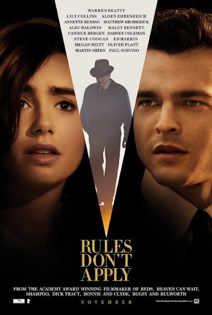
Rules most definitely don't apply to this design, which I don't know quite what to make of. Make no mistake that I'm absolutely thrilled Warren Beatty is back and bringing his long gestating Howard Hughes project to the screen, even as I hear it how little it actually has to do with the reclusive, eccentric billionaire. At least this poster is somewhat honest about this, as ill-conceived as that credit dagger going down the middle is. With the focus is so clearly on Lily Collins and Alden Ehrenreich as star-crossed lovers, I guess they had to find a way to squeeze Beatty in there somehow. But that still doesn't explain what's going on with that block of credits. I don't actually despise this as much as some of the others since I can at least appreciate what they were going for. There's a goofy, old school appeal to it that just went woefully wrong along the way, as it also did with its other (slightly superior) poster.


What's going on with all these acclaimed directors getting the shaft with thrown together posters for passion projects they've been working a quarter of their lives on?  This is so bad I don't even know where to begin other than to point out I used to roll my eyes when posters were criticized as being "fan-made." This actually earns that label by being just so visually unappealing in every sense. Nothing works. The colors are bland. I think that's Liam Neeson but won't be putting any money on it. The placement of the image of Garfield and Driver looks MS Paint amateurish and awful titling even manages to bury the lead: That this was directed by Martin Scorsese. 


He's back. I look forward to the day that no Nicolas Cage film (or his hair) make the Worst Posters list, meaning he's escaped movie purgatory and all his debts are paid. Unfortunately, today's not that day. On the bright side, he released a fairly well-received movie this year that was accompanied by a pair of posters not quite bad enough to make this list. So there's that. These two were. From what I've heard, The Trust is actually decent so it's a shame there's a safe opening within his body and he's sporting that goofy mustache.  
USS Indianapolis: Men of Courage is the worse offender and not only because it more closely resembles a an insane Navy recruitment ad than a theatrical poster. And between his pained facial expression and photoshopped uniform it's hard to recognize that man as Cage. Luckily, they help us out with "NICOLAS CAGE," really bringing new meaning to the term, "top billing." Is it wrong I'm kind of curious to see this?