While it wouldn't be completely fair to categorize 2017 as a "weak year" for movie posters given the amount of great work to be uncovered if you hunt hard enough, it won't be remembered as one the strongest. But the good news is that since I first started doing this list over a decade ago, there's been a huge surge in design quality, quietly reversing the fortunes of an art form once at risk of being absorbed into soulless studio PR departments obsessed with the bottom line and lacking any creative vision. At least that's what it felt like in 2006. Perhaps, similar to the reemergence of vinyl records, more film fans started to appreciate and respect the role of the one-sheet in not only effectively selling a movie to the masses, but giving us a tangible piece of art to admire, display and even collect.
Whereas the big complaint ten years ago was the lack of illustration and the growing irrelevance of legendary poster artists like
Drew Struzan in an era of excessive photoshopping and floating heads, there now seems to be a legitimate return to illustrated designs. There's still a lot of that terrible stuff coming from the major studios, but for the first time a while, there's an almost equal amount of inspired work as well. With the rise of companies like
Mondo and increased popularity of
alternative movie posters, independent artists now have a larger than ever online platform facilitating creativity. And now finally, the major studios are catching on. In fact, you could argue we have a new problem of too many high concept posters competing for attention to the point that they're all starting to look the same. In this way, "geek culture" and superhero fandom has both helped and harmed the movie poster business.
An over-reliance on artistry may be a good problem to have, but it should also serve as a reminder that a movie poster should still look like one. Of course, I say this knowing full well my selection for the top spot this year looks like it should be hanging in an art gallery instead of a theater. But despite echoing the sentiments of the pack and endorsing aesthetics over concept, few could argue 2017's winner is simply the strongest design by a considerable margin. And that's not to say the concept isn't just as strong. There's a reason this poster's topped or appeared on just about every other
list out there, with most agreeing it at least equals or surpasses the polarizing film itself. Regardless of anyone's feelings on the movie, we should all just be grateful that one-sheets from risky, underseen projects are being seen by a much greater number of people.
By now, you know the rules. Any 2017 official theatrical poster is eligible for consideration, even if it's for a movie scheduled for release during the following year. Alternate movie posers, fan-made art of any kind, or a one-sheet not commissioned by the studio releasing the film do not qualify. Below are my choices for the ten best, followed by an alphabetical listing of the runners-up. And of course, they're followed by my depressing picks for the worst. All images are courtesy of
Impawards.com
The Best...
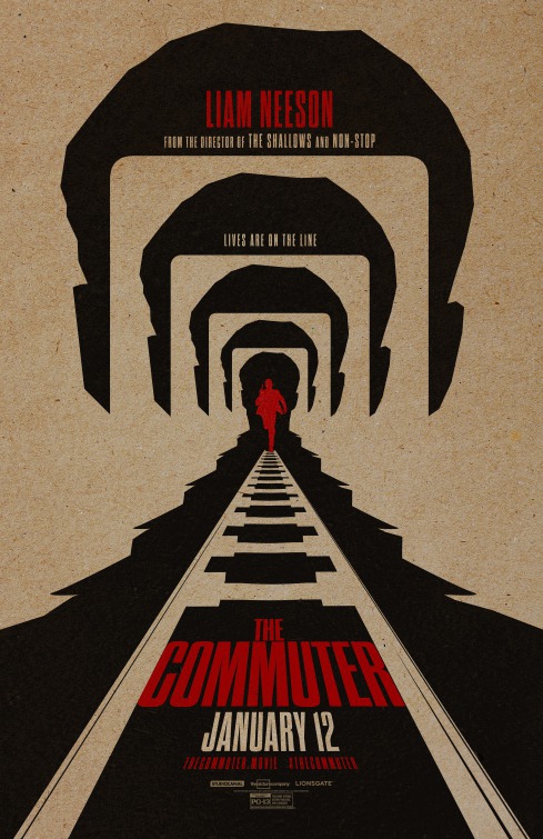
10. Star Wars: The Last Jedi
What a difference two years can make. In
2015, an embarrassingly cluttered, heavily photoshopped
The Force Awakens poster made the cut for one of the worst that year. And for good reason. This, on the other hand, feels as if balance and order has been restored to the force, recalling that classic Tim Reamer
design for 1983's
Return of the Jedi, and really all the posters from the beloved original trilogy. Clean, simple and striking, it gets everything you need to know abou
t The Last Jedi across within a single image. The contrast of red against the retro-infused white border and blue lighsaber is eye catching and that familiar trope of the two floating heads spliced together actually seems completely fresh for a change because of its context.
Everyone suspects Luke Skywalker and Kylo Ren will be on a collision course with Rey caught in the middle, so besides the choice being visually mesmerizing, it makes creative sense. And how about that symmetrically perfect placement of the title treatment on the bottom center, where it's never looked as bold. Ironically enough, the ubiquitous artist known as
LA also designed that aforementioned
Force Awakens disaster, lending credence to claims the designer may just be giving the studio what they want when it comes to a huge franchise like this. Either way, I like what they wanted this time. A welcome return to basics.
9. Baby Driver
At first glance, the official theatrical poster for
Baby Driver doesn't seem like much, aside from the fairly unusual color combination. Like me, you could even initially be fooled into thinking that it's another one of those jumbled photoshopped character collages where they try to contractually jam everyone onto the page. But look closer. Someone actually drew this (a really talented illustrator named
Rory Kurtz), and even from a close distance the artwork is so painstakingly realistic you'd never be able to tell it isn't a cast shot. Of all the posters on the list, this is the only one I own, and while that was kind of unplanned, I still can't help but marvel at how meticulously designed it is, especially for a major commercial release.
Besides the detail on the illustration itself, all the characters are incorporated into the print without it looking too busy or anyone seeming unnecessarily shoehorned in. Neon pink (which after
Drive, must now be the official getaway driving color) and tan already feel like an iconic pairing that instantly brands the movie, whether that be on a subway billboard, an on-demand thumbnail, Netflix menu, or full-size poster like this. It just works, as do the speeding vehicles careening diagonally as if they're literally racing off the page, creating what's nearly a three-dimensional effect. The credits are perfectly placed on the right, and while the title treatment isn't too flashy, it doesn't need to be because everything else is, allowing it to stand out. It's just a cool, crisp, efficient design, further proving just how much Mondo and other alternative outlets have infiltrated and influenced the major studios in positive ways.
8. Get Out
As a big fan of using blank or "negative" space in movie posters, I
couldn't help but grin with approval upon laying eyes on the one-sheet
for Jordan Peele's
Get Out, which actually had a lot of options on the
table as far as what could be done. And yet, because of the
controversial subject matter and sly social commentary, most of
those options probably weren't all that feasible. And that was for the best, as the one thing
you didn't want was to go over the top, for both the risk of spoilers
or marketing the film as something it's not (an exploitive race-baiting
thriller). Sometimes the simplest, most obvious solution is wisest,
resulting in a design that's subtly powerful precisely because of how
much it holds back.
The movie itself is a slow burn and this poster
reflects that, as well as the growing disorientation and fear of the
protagonist, Chris Washington (Daniel Kaluuya), whose teary eyes have
become the indelible symbol of the story's horror. And maybe even
2017's. Love how the design recreates that claustrophobic feeling of him
being completely boxed in and totally gut-punched by the
shocking circumstances he's encountered. This poster, possibly even
more than the film, may as well be a case study for using minimalism for maximum impact. The
black lettering against a stark white background is most definitely not
a purely artistic choice, but it's really all that spacing that makes
everything stand out, especially the ingenious tag line: "Just Because
You're Invited, Doesn't Mean You're Welcome." Isn't that the truth?
7. Lady Bird
This one breaks every rule. A simple side profile shot of the
film's star doesn't exactly scream excitement or inspiration. And it
probably won't persuade moviegoers unfamiliar with the film's premise to
line up at the multiplex. But who are we kidding? Anyone who wants to
see Greta Gerwig's acclaimed coming-of-age drama,
Lady Bird, already knows what it
is, and those who don't, will or won't go anyway based on recommendations
and Oscar buzz. Unlike the two previous entries, this is free from the
constraints of having to do a hard "sell," resulting in magnificent,
stately image that casually envelopes you in the movie's tone and feel.
By taking something we've seen hundreds of times before with a
head shot of the title character and making it undeniably captivating, it's as if we've never laid eyes on anything like it. Or her. Saoirse Ronan
casts a great profile, the red hair gets your attention and that
rainbow-colored stained-glass border with matching credits definitely
isn't something you see everyday. And don't even get me started on that
classic Gothic title font, which fits like a glove in this particular
instance. Even the concise, strangely moving tag line,
"Fly Away Home" feels completely right for a female-driven drama. Sometimes it's the smallest touches that add up big and while it's often foolish to equate a movie's quality with its poster
(especially before you've seen it), if the advertising can do this with such a basic concept, it's probably a good
sign the film has something special up its sleeve.
6. Colossal
One of 2017's most unfairly overlooked films features Anne Hathaway's best work in years, but also presents a conundrum in terms of marketing. This could explain why
Colossal, in which the actress plays an unemployed alcoholic unknowingly controlling the movements and actions of a giant monster rampaging through Seoul, Korea. And that just scratches the surface, so you'd imagine there's no guidebook on how to design a poster for such a high concept project. But you have to imagine what
Boland Design Company and artist Tim Biskup come up with here is as good as it possibly gets at selling the challenging idea. The title treatment (love that Pac-Man "C"), a highly unique purple/midnight blue color scheme and a really bold video game styled illustration featuring Hathaway and the ubiquitous creature eliminates any need for further explanation. And the tag line, "All She Could Do Was Save The World" couldn't be more fitting.
This was a campaign full of great one-sheets, like this minimalist
teaser, as well as the hand drawn Akiko Stehrenberger
illustration and U.K. quad
version also featuring Jason Sudeikis' character and an arguably even more sensational title treatment. But it's this one that was seen everywhere, justifiably leaving the largest impact. No matter how strange a movie gets, you can usually count on someone having a really clever idea for its poster, or in the case of
Colossal, quite a few of them. All the complaints that too many posters get released for a single film is temporarily disproved here, with each serving its own creative purpose.
5. Ingrid Goes West
The whole social media-inspired movie poster phenomenon
began a couple of years ago and has been done to death ever since. Whether it's making the one-sheet resemble a Facebook post, a tweet, an Instagram profile, an Iphone screen or some other nonsense, you can't help but roll your eyes or cringe each time you see another one. Some are better than others, but it's still one of those design fads that's spiraled completely out of control, to the extent that nothing would make me happier than a nice, long break from them. But this beautifully illustrated design from the aforementioned
Akiko Stehrenberger for the indie dramedy,
Ingrid Goes West, nails it.
Starring Aubrey Plaza and described as being about "an unhinged media stalker who moves to LA to insinuate herself into the life of an Instagram star," this entire concept actually makes sense for a change because it's germane to the film. And while that helps, let's not kid ourselves as to why it's really here. It simply looks better than all the others that have attempted to go this route. An already masterful, uncanny illustration of Plaza is heightened considerably by the grid and title design, as it vaguely recalls another classic poster about media celebrity, the ahead of its time
The Truman Show. The Instagram-style credits on top are clean, unfussy, and unpretentious. The same can be said about the entire poster, making it a creative rarity among social media inspired poster art.
4. Free Fire (Character Posters)
Talk about negative space. You probably wouldn't be surprised to learn that out of all these cool, retro-style character posters for Ben Wheatley's 70's set self-contained shootout thriller,
Free Fire, the Brie Larson one is my favorite. But they're all almost equally great, providing a welcome respite from the tiresome trend of every release having over a dozen character prints each. If only even half of them were as creative and eye-catching as these. While I've yet to see the film and plan to, it should be unofficially awarded 2017's best print ad campaign, despite its posters going inexplicably M.I.A. on most year-end lists. Part of that can be attributed to the movie being released stateside way back in April and flying under the radar, but let's instead just blame the fact there were too
many creative designs to choose from.
There were also a number of alternative options that couldn't qualify, like this similarly old school
print from Mondo's Jay Shaw and a Little White Lies magazine cover
illustration of Larson's character that's leagues better than almost everything in this top 10. But it's
Empire Design's set above, which superimposes black and white, mid-action images of the film's characters onto their own retro-style, grainy, color coded one-sheets that earns the spot here. The color contrast, 70's title treatment (more like a logo) in the bottom left, and what seems like miles and miles of blank space help create the ultimate in retro cool. And look at those shadows in the "Vernon" and "Chris" posters. Impressive attention to detail.
3. Carrie Pilby
Much like you, I have little idea what
Carrie Pilby is and had never even heard of it before seeing this unforgettable poster designed by
The Refinery. What I do know is limited to an imdb logline describing it as being about "a person of high intelligence struggling to make sense of the world as it
relates to morality, relationships, sex and leaving her apartment." And it's currently on Netflix. But that right there is the very point. We don't need to know anything about it precisely because of this arresting one-sheet. The poster has done the work for the film with a single desperate, illustration of star Bel Powley. In many ways, elements of it recall that classic 2008
Funny Games poster that featured an even more haunting, desperate close-up of Naomi Watts. While this is a tonally similar idea with far different execution, it also proves to be a rare exception to the rule that extreme, giant close-ups of a star's face can't still be presented in a fresh, innovative ways.
The blueish-gray color scheme is captivatingly original and the placement of the title and billing across the side of her face, column-style, is a bold choice. Also noteworthy is how the left side of her face just kind of disappears, merging into the background of the poster. It's entirely possible these types of giant close-ups are frowned upon because its hard to find faces that lend itself to such an intimately invasive treatment. With eyes that immediately grab your attention and successfully function as the print's centerpiece, that clearly wasn't an issue with Powley.
2. Battle of the Sexes
It definitely didn't have to go this well. Given the subject matter and track record for this sport on the big screen, it's safe to say we had a pretty good inkling of the posters we'd get for
Battle of the Sexes, which chronicles the circumstances surrounding that infamous 1973 tennis match between number one-ranked player Billie Jean King (Emma Stone) and flamboyant former champ and shifty hustler, Bobby Riggs (Steve Carell). We did eventually get those predictably
awful posters, complete with the two stars' faces plastered all over them. But that's the great thing about a teaser. It's just meant to set the table and whet the public's appetites by giving them just enough, but not too much. And let's face it - the teaser is usually about ten to fifteen times better than whatever designs follow, and this is no exception.
This approach is so winning that I dare say it actually makes the movie look cool. What happens when the credits roll may be a different story, but this design does supply some hope we'll get the first quality film about the sport of tennis. Variations on this concept have been attempted
before, but this is functioning at another level. The fake folds, the optic yellow background, white border and 70's scoreboard title font all successfully contribute to its throwback look . Symbolically topping it all off is that ball with the lit fuse, as fitting a visual metaphor for this movie as it gets. Everything is in its right place here, resulting in the cleanest, most efficiently designed poster of the year. The second you see it, there's no mistaking what film it's for.
1. mother!
If not for Jennifer Lawrence pulling her heart out of her chest, artist
James Jean's jaw-dropping design for Darren Aronofsky's twisted
mother! more closely resembles the type devotional imagery or religious iconography you'd see hanging in an art gallery. And that's not to mention the fact we're talking about a film that features one of the world's most popular actresses. But it's also everything it appears to be and more, the best of a really strong series of posters for this film, including that impressive
Rosemary's Baby homage below that, while thematically relevant, still isn't half as terrifying, strangely beautiful, or compelling to take in as this. I've heard all the complaints that the illustration doesn't "look enough" like Lawrence or that the purpose of a poster is to make you want to see the film rather than run in the opposite direction. And while both viewpoints are duly noted, they fall by the wayside when considering this final product, a visual assault in illustrative form that somehow invokes the same queasy, confrontational feelings as the picture.
Such an extreme juxtaposition of angelic imagery and pure horror has ben previously attempted with similar
concepts, but it's interesting to note that for the past three years my top posters of the year have featured visual representations of a female protagonist in a state of serious psychological distress. And two of them were illustrations. As disturbingly flawless as the actual artwork is here, it's the minimally classy title treatment that makes as much of an impression, giving the teaser an even more distinctly non-movie poster aura. As a work of poster art, it stands as an ideal representation of the film's huge ideas, many of which shell-shocked audiences are still attempting to recover from.
Runners-Up (Alphabetical)...
And the Worst...
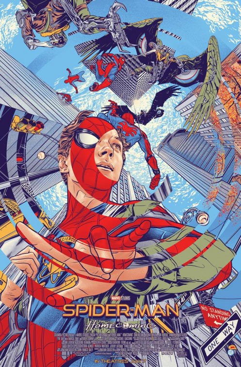
Yes, I get what they were trying to do here. But does that really make the execution any better? Supposedly,
Spider-man: Homecoming isn't that bad for an even more unnecessary than usual reboot, but you'd never know it looking at this mess. As far as uninspired ideas go, giving us the same jumbled presentation as any other superhero one-sheet, but hiding behind the scribbled book cover concept, scrapes the bottom of the barrel. And it's aesthetically unappealing to boot. The literal definition of a cut and paste job. Even
Spider-Man deserves better than this.
And yet, this might be worse. In an image so poorly photoshopped it'll have you yearning for the 1970's cartoon, Spidey is hanging from something that appears to be a highway sign overlooking what appears to be a city. What's scary about this design is how it seems no one bothered to care at all. "Just put him on the poster and get it out there. They won't know the difference." Sadly, those Marvel execs are probably right.
So, this is what it's come to: An Iron-Man poster for a
Spider-Man movie. And a really lazy one at that.
Just so you don't think I'm picking on superhero franchises, I really liked this Justice League
teaser, which actually had a cool, original comic book vibe to it. This Batfleck character poster for the same film makes no visual sense whatsoever, despite working with what was probably a solid initial concept. I'm assuming that idea was having a split Bruce Wayne/Batman one-sheet. Instead, this happened, overcomplicating a relatively simple idea. What's going on here with the shading?
There's little doubt a tasteful 9/11 film can be made, as both
United 93 and even the lesser
World Trade Center have previously proven. I'm not sure why anyone thought a photo of Charlie Sheen (alongside less controversial co-stars Whoopi Goldberg and Gina Gershon) in one of the doomed towers would prepare audiences for anything other than tasteless exploitation. And it may not even be that, which would only make this approach even more head-scratching. Needless to say, few can remember this film even being released anywhere, if at all. While you shouldn't judge a project by its poster, it's just too tempting here.
Following the season premiere of
Gotham on FOX, don't miss Christopher Nolan's latest chapter in
The Dark Knight saga and fall's most anticipated TV event,
Dunkirk: The Series. We know Nolan projects have very distinctive branding as far as imagery and title treatment (blue meet gray), but you have to wonder how it didn't occur to anyone this slick approach would be tonally incongruous with a World War II movie. The scary part of this is that it may not be, which poses an even bigger problem.
I'm all for ripping off the Jaws poster, but you have to commit to it. For legal reasons, I'd see how that wouldn't entirely be possible, but this looks like an uncomfortable straight to VOD hybrid of
Open Water, The Shallows, Jaws: The Revenge, 47 Meters Down, Piranha, or whatever else tickles your underwater horror fancy. This really does look like five or six posters in one, with the layout and design doing none of them any favors. .
This is supposedly a really good film, and given its director, I wouldn't be surprised. But don't you just detest that title,
Brad's Status? Or the bland, drab, almost colorless way it (dis)appears on the poster? How about co-star Austin Abram's completely nonsensical silhouette, through which the barely readable cast list appears? Light blue against even lighter gray probably isn't the best idea if you want people to, you know, read text. For a small, character-driven piece from an acclaimed independently-minded filmmaker, it's all surprisingly inept.
I kind of feel guilty including this since an attempt was made to be different, and of all the bad designs, it's definitely the least worst. So, that's saying something. Or, Something, Something. But it's okay to appreciate motivations while realizing the end result is somewhat of an eyesore that looks too mainstream truly to capture the authentic, spontaneous "lightening in a bottle" feeling they're aiming for. But for those already dead-set on seeing this adaptation of Nicola Yoon's YA novel, none of this will likely matter one bit.
And you'd have to be to successfully read the type or find anything worthwhile about the one-sheet for this unknown vehicle starring Alec Baldwin and Demi Moore that went as quickly as it came. It's a different color scheme, but that's offset by the utterly ridiculous shot of Baldwin, looking as if he was just caught in the middle of another horrid
SNL sketch.
You know what we need: Another
Little Miss Sunshine, but without any of those expensive actors. And more more photo boxes. Hey, is that the resurrected
Orion Pictures logo on the bottom right? The only good thing about this.
It would be insulting that they tried to squeeze all these actors' heads onto one poster except for the fact that no one's actually on it at all. Cut-outs of their likenesses from various other projects are. Forget about finding the father, that they successfully glued on all those heads, decided where everyone should go, and determined who got top billing is the real miracle.
James Franco will do anything for his art. Anything. Whether it's hosting the Oscars, appearing on a daytime soap, starring in a Lifetime movie, teaching college courses, or playing Tommy Wiseau, there's nothing this man won't try. Including that mustache. Or starring in
The Vault, which has a poster so bad you have to love it. You can't tell me the studio wasn't completely aware of how gloriously awful this looked and are just messing with us. And that's why the perpetually meta performance artist Franco never seemed more at home than on here. It's everything a bad poster should be and makes you want to see the movie just to say you did.


