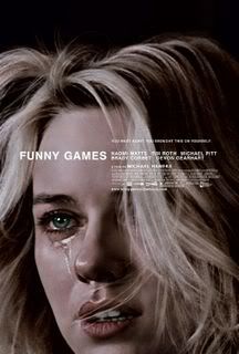
They're not ranked or anything but I have saved the big winner for last. I should mention this was not a good year for posters (or really movies for that matter) but the choices here I still believe are top notch and I'd gladly have any of them on my wall (if I had any space left). Three qualities make a great movie poster in my eyes: 1) It's different and interesting 2) It grabs your attention visually 3) It sells the movie effectively and makes you want to see it. Remember I'm judging the poster, NOT THE FILM. If you think I overlooked a really good one feel free to post it or let me know.
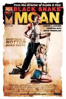
Black Snake Moan- It's a good thing I'm not judging the film because I really didn't care for it at all. This comic book style poster on the other hand is awesome and contains an image that not only looks cool, but is unsettling and impossible to shake. I've noticed spoofs of this poster popping up all over the place, which is a sure sign they must have done something right. One of the most memorable of this year.

Good Luck Chuck-You can say what you want about how bad the movie is (I can't because I haven't seen it yet) but you can't tell me this poster doesn't do an effective job selling it. This is a classic example of really knowing your audience and catering to them in the best way possible. Everyone was perplexed how this movie took in so much money but I wasn't. The reason is pictured below and I'm not even that big of an Alba fan. Imagine if she ever radiated just half the sexiness onscreen that she does on this poster. We can dream can't we? The other one-sheets for this comedy (including one of Alba and Dane Cook tastelessly spoofing John Lennon and Yoko Ono) are as bad as the film supposedly was. Accept no imitations. This one's the real deal.
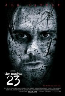
The Number 23-Yeah Jim Carrey as a tattooed serial killer doesn't exactly grab me either but this image does. You have no choice but to look at it. If you don't Jim Carrey will find you and kill you. I love how you can barely read that Joel Schumacher directed the film. Probably a wise move. After all, you do want at least a few people to go see the movie.

Invasion-Talk about old school. Could there possibly be a poster that better fits only the ten millionth take on Invasion of the Body Snatchers? It has a real retro Twilight Zone feel and if I didn't know any better I'd think this came right out of the '60's. It's genuinely scary and makes great use of color. Well done.
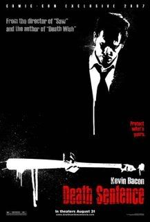
Death Sentence-If this poster looks a little familiar it's probably because it so closely resembles the series of posters used for American Gangster that featured Denzel Washington and Russell Crowe. While those looked good visually I thought they were just too boring to make the cut. This isn't. The dripping bat. Bacon's look of remorseful resignation. The bright red lettering against the black background. Good stuff.
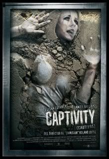
Captivity-Everybody needs their Elisha Cuthbert fix and here she is getting her Han Solo on in this disturbing, unforgettable poster. I can't say it's the most original poster this year but it is by far the coolest. And this wasn't even the Captivity poster that caused all that controversy over the summer. That one was too tame. This is a foreign one that wasn't even released in the United States. I have no idea why everyone got so worked up over the marketing for this film. If it's a thriller about being held captive what did they expect? This is really clever and I'd imagine it would look even better framed and on someone's wall. Supposedly the movie sucked, but the studio can take solace in the fact that they really did their best in the marketing department.
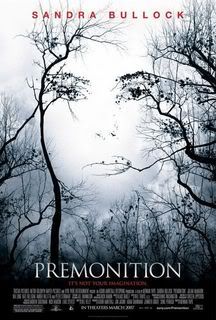
Premonition-Sandra Bullock may have not made a good movie in years but at least she can claim she starred in the best movie poster of 2007. Don't ruin the perfect image this poster conveyed for you by actually viewing the film. That would be a huge mistake. If you did already, my condolences. Don't worry though we can always just stare at this brilliant poster that offers up the promise of what this psychological thriller could have been.
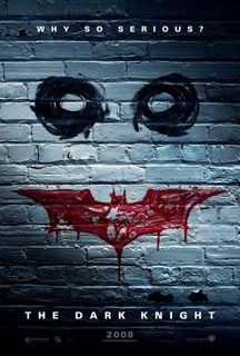
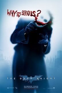
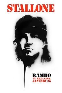
It isn't too early to start looking ahead. These 2008 posters are better than anything I listed above.
The Dark Knight (Teaser 1)
The Dark Knight (Teaser 2)
Rambo
Funny Games


No comments:
Post a Comment