It's funny how every year I do this list (and apologies for the tardiness this time) I plan on posting just the ten best and before long the entire page is filled with images and explanations. And here I was thinking this was actually one of the weaker years for posters. Maybe not. Here's the best and worst of 2011:
10. (Tie)
The Devil's Double
I had literally no clue what this film even was before seeing the poster (the title refers to the man chosen for the job of "body double" for Uday Hussein, the playboy son of Saddam). Knowing that, this image makes a lot more sense, in addition to an all gold poster just looking incredibly cool.
We Need To Talk About Kevin
Or rather, we need to talk about how creative this poster is. There's nothing wrong with using classic movie posters as your inspiration provided it's done well and it really doesn't get much better than this
Rosemary's Baby-esque design. From the devil tail on the sonogram to the old school book jacket style, this is top notch, selling it as pure horror instead of drama. And from everything I've heard about the film, that may not be a misrepresentation.
9. Martha Marcy May Marlene
It was between this and the other QR Code-inspired
MMMM poster (see runners-up below), but I far prefer this one. Really clever using the overlapping images and dreamlike photography to reflect the film's themes. Not sure if all that text is necessary but everything else is so visually arresting it hardly matters.
8. Hesher
Part of another great set of posters (see the teaser below) and the most attention-grabbing of the bunch. Looks like a vintage Metallica vinyl record cover, complete with the band's title font. If you've seen the movie (and if not you should) you'll appreciate this even more as it perfectly captures the anarchism of the title character. Nice touch with the cigarette burns.
7. Meek's Cutoff
Didn't like the movie, but LOVE the poster. How often do you see a woodcut-style design for a film poster? My only worry is that people may check out the movie based on it and be disappointed it isn't quite as bad-ass as this.
6. Rise of the Planet of the Apes
Kind of resembles a WWE
D-Generation X poster...starring an Ape. It might also be the first time a hashtag is prominently featured instead of the actual title. Yet somehow it's still very clear what the movie is. Bravest design of the year.
5. The Girl With The Dragon Tattoo
Should I post the censored version? The uncensored version? I settled for the one in between. This advanced teaser (which seemed to appear no where outside the internet or overseas) caused a lot of controversy when it leaked. But it got your attention and generated interest which is exactly what movie posters should do. Shock value doesn't always work, but in this case it definitely did.
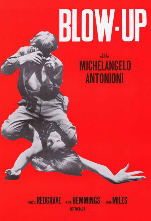
4. Haywire
This is for a movie technically released in 2012, but its art house style poster dropped in 2011 so I'm counting it. This comes from
Neil Kellerhouse, the artist who designed some of the best prints of the past decade, and while I wouldn't rank this as high as those it's still among the more impressive and interesting of the year. It effectively plays up the sex and violence with a
Blow-Up-inspired image depicting the most memorable scene of the film.
3. Shame
I'm starting to notice a trend here. How do you sell an NC-17 film about a sex addict? I have no idea. Which is what makes this poster so impressive. They somehow answered that question. You just let it sell itself. Those who know about the movie will think the striking, lonely image of crumpled bedsheets makes perfect sense, while those who don't will be intrigued enough to want to know more. Perfect.
2. Young Adult
A brilliant film gets an equally brilliant poster to go along with it. The idea of having the poster double as a YA book cover in honor of its (anti-) heroine is really inspired and the execution is even better. All the details like the "Jason Reitman" seal and creases in the corner prove the designers gave as much attention to this poster as Reitman and Diablo Cody gave to their tragicomedy, which was easily 2011's most criminally underrated film.
1. The Ides of March
Once
again George Clooney stars (or at least co-stars) in the year's best poster. The guy must be doing something right if all his movies are not only being touted for awards consideration, but their posters are also topping "best of" lists. Featuring the two acting MVP's of 2011, this is a fresh, inspired twist on the usually stale concept of plastering stars' faces and heads on the page. The best posters are ones that can convey multiple meanings and given that Ryan Gosling plays press secretary to George Clooney's Presidential candidate this is a clever visual play on how a person's identity can be lost in someone else. And I haven't even seen the movie yet. Who knew those two looked so much alike?
Runners-Up:
The Best Unofficial Movie Poster of 2011
If only the actual movie were as captivating as this
Drew Struzan-inspired 80's throwback poster implies. A mixed bag if there ever was one, J.J. Abrams'
Super 8 was 2011's most strangely disappointing (but at times oddly entertaining) blockbuster. Anyone looking for a reason why it didn't completely succeed should just stare at this image. While the movie managed to capture only the superficial pleasures of early Spielberg, this poster looks and feels like the real deal.
And The Worst...
The alternate Fassbender
version is just as bad, but something about the silhouette of the wheelchair superimposed with the floating MacAvoy head gives this one the edge.
Tom Cruise just dropped a new hip hop album.
One of Quentin Tarantino's favorite movies of 2011. No,
seriously.
The Spy Kids posters are always an eyesore but this takes it to a new level. Haven't we all been waiting for 4D Aroma-Scope?
A close call between this and the Spanish
version. Very close.
You knew this would show up here. Much like the film, it doesn't even seem like they're trying.
I was almost tempted to put this on the "best" list because at least it bothers to be hilariously awful and entertainingly over-the-top. Complete with photoshopped cash that's likely more than the film's box office total. No one can claim this doesn't capture the movie's spirit. For better or worse. Would you let that man chaperone a school trip?
What does that title even mean? Forget it. I don't want to know.
Nothing "cool" about this. This kind of looks like Community: The Movie if Community was, you know, unfunny and went straight to DVD. What's on Sean Astin's head?
What would this list be without the inclusion of the ubiquitous Nicolas Cage, who at one time not only starred in quality movies, but quality
posters. This one looks like an ad for a wax museum.


No comments:
Post a Comment