I have to admit
to being a little surprised at just how popular my annual movie poster list is but I'm thrilled because I love doing it and it's easily my favorite post to work on each year. While this isn't the best selection I can remember, there's still a lot to choose from and more than enough for me to justify doing it a month ahead of schedule. And the more I do these the more obvious it gets how a important film's poster is to selling a movie to the masses. Granted there are always other factors and sometimes your mind is made up whether you want to see it anyway, but when it comes to marketing there's no denying it's key role and studios would be wise to remember that. From an artistic standpoint they're always fun to check out and critique...at least for me. Below is the best, worst, as well as some others with my comments. You know the drill. Here it goes...
THE BEST
10. Best Worst Movie
The best worst movie gets the best worst poster. In case you're wondering, it's a documentary about what's widely considered the "worst movie in history," 1989's
Troll 2. The makers of this obviously never saw
Fool's Gold or
Nick and Norah's Infinite Playlist. I have no doubt this film is better than any of those or
Troll 2, and after looking at this perfect comic book inspired poster I kind of want to see it now. The approach has been done to death but that's only because it's so successful.
9. The Runaways
Here's the quintessential teaser for a movie. With a single striking image that conveys the theme of the film it shows just enough to build anticipation and get the point across without overdoing it. The
subsequent posters actually featuring Fanning and Stewart in character were boring and ordinary. There's nothing ordinary about this. They even faded the edges to make it look like a worn LP. That's commitment. Awesome tag line as well.
8. Carlos
"The Man Who Hijacked The World".... and a poster from the 1970's. The retro tactic can get tired if the design is lacking but this is so well done it feels more like an original print from that era than an homage or duplication (reminiscent of
The Bank Job poster a couple of years ago) It just exudes cool and even though I have no idea what's the movie's about they've piqued my interest with this one-sheet. Sometimes simplicity really is best way to go.
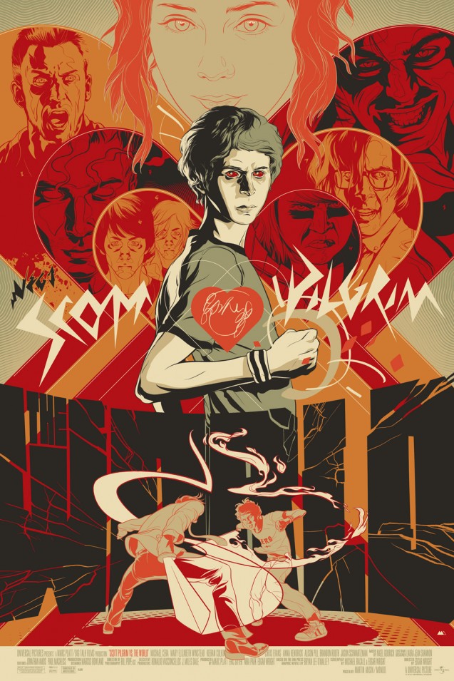
7. Scott Pilgrim vs. The World (Unofficial)
What was that I said about the comic book design being done to death? Well, no complaints here again especially since this really is a legitimate comic book movie and they'd be crazy not to use an action-packed illustration. I'm cheating a little here since this is an "unofficial" poster but what shocked me was the quality of the art work and just how damn good it looks, making me wish all promotional materials were hand drawn by real artists (in this case the great
Martin Ansin). I'll soon find out if the movie can live up to it.
6. I'm Still Here
So here's a different take on the popular, familiar "floating head" poster. I'd say the floating head is excusable when that head belongs to an insane, homeless looking Joaquin Phoenix who pretended to be homeless and insane for a year so he could make this film. It seems impossible that a poster would be able to effectively capture that but this somehow does. It's oddly strange yet compelling how the title weaves in and out of his face. And yes, that's an observation I never expected to make when describing a movie poster. Ever.
5. For Colored Girls
Who said great work can't be done with watercolors anymore? You won't find this hanging on someone's refrigerator in the kitchen. You're more likely to see it in an art exhibit. It's that good. This is really classy and sends the desired message that it's a film to be taken seriously. I'd argue that message is more necessary than usual in this case considering it's a Tyler Perry movie, though you'd never know that looking at this. Major props to him for not plastering his name all over the poster and letting that unforgettable face against the stark white background speak for itself.
4. Black Swan (Take Your Pick)
The best thing about these four international art-deco style
Black Swan posters? Natalie Portman isn't anywhere to be found (yep, I said it). For my proof just look
here and
here. Yeah I think we should stick with these since Portman in kabuki makeup really didn't work out so well
last time. If I didn't know what these were and just saw them hanging in someone's living room, I'd be tricked into thinking they're valuable. And they are in a way since movie posters this ambitious and artistic don't come along every day. But how dare Natalie and her evil ballet movie even attempt to compete with....
3. The Social Network
Oh, what a surprise. 2010 may go down as the year when they finally cracked the code to making faces and heads look visually interesting on a poster. I assumed it wouldn't even be possible to get me more excited for this film than I already was or possibly design a poster that could somehow do justice to a masterpiece but this
Man Who Fell To Earth-style teaser gets the job done. Not that it should be a surprise considering the design company behind it (
Kellerhouse, Inc.) were responsible for one of the decade's most memorable posters
last year. Nice touch with the Facebook sidebar.
2. Buried
If you're going to copy an artist you could do a lot worse than Saul Bass. It's been done thousands of times before but who cares? It works, mainly because the best way to make your point is with striking simplicity. Of course, it helps when the film's premise lends itself really well to that technique. Had I not known anything about the movie before hand I could glance at this and tell you immediately that it's a suspense thriller about a man being buried alive. No poster this year gets its plot across cleaner and crisper than this, or is more fun to look at. The alternate poster isn't too bad either (see below).
1. The American
Audiences hated it. Some critics love it. Say what you want about
The American as a film but both camps would have agree that this movie got a poster way better the movie deserved and that's coming from someone who really
liked it. It's almost as if someone sat down and studied the grainy, minimalistic style of all the
classic 60's prints and put all their energy into reproducing it as accurately as possible. In fact, I have no doubt that's exactly how they went about designing this. Anyone wondering how a movie everyone seemed to hate still racked up so much money at the box office needs only to look above. Sure Clooney's good, but he's not THAT good. He had some help from the marketing department on this one. Retro reigns supreme again.
Runners-Up (Alphabetically)
The Black Waters of Echo's Pond
Buried (Version 4)
Happy Tears
Salt
Continuing the trend of visually striking floating head posters, it's a considerable asset when that floating head (along with those eyes and famous lips) belongs to Angelina Jolie. There's no other approach that would have made more sense here since it's all about her anyway, right? But there were still ways this could have gone all wrong, but didn't. And it sure beats her trying to
eat a small child. I like the bold choice of not centering her.
Saw 3D: The Final Chapter
We get one of these posters every year for each new installment and they all more or less seem the same. But this one for what's supposedly the "final chapter" is actually creative and inspired. The construction of Jigsaw. At least an effort was made to be different and completely break from the usually tired horror teaser trend.
Shutter Island
It's hard to justify why I find this so cool because on the surface it seems very ordinary and has an almost direct-to-DVD quality about it, but the visual and colors capture the movie so well. This other
similar one isn't nearly as eye-catching, and that probably comes down to the color scheme. I'll be ripped for saying it, but I actually kind of prefer the haunting poster to the actual film, which
I enjoyed by the way.
Tron Legacy
Youth in Revolt
"If Only The Movie Could Be Even Half as Good as This Poster" Award
Iron Man 2
Artist:
Tyler Stout
Frost/Nixon Award for Weirdest Poster of the Year
Wall Street: Money Never Sleeps
Wasn't sure whether I should put this under "Best," Worst" or maybe both, but if I were a multi-millionaire sitting at my granite topped desk smoking a Cuban, reading the Wall Street Journal while drinking a scotch, this would be in a sleek custom frame hanging over my head. If in concept it's nearly identical to the portrait from 1986, why is this one so much funnier? Is it LaBeouf? It's tough to see here but I like the attention to detail in making it actually resemble a real oil painting. Totally insane, but a keeper.
THE WORST
The Bounty Hunter (Version 2)
The
other one's pretty bad but this is worse. Aniston looks like a giant. Butler is either breaking her spine or sitting on an imaginary curb. It's one thing to have a pun that awful as your tag line, it's another entirely to be so proud of it that it annoyingly overpowers everything else on the poster.
Extraordinary Measures
The grumpy, transparent airbrushed ghost of Harrison Ford haunts Brendan Fraser. The saddest part is given the recent track record of both actors the movie was already down two strikes and desperately needed the poster to not look like this for anyone to even CONSIDER seeing it.
The Ghost Writer
Speaking of ghosts, one of the most
overrated movies of 2010 gets one of the most poorly photo shopped posters, but even I'll concede the film is substantially more intelligent than this lets on. Strangely though, it does kind of capture how run-of-the-mill the whole thing felt. We even get a visual shout out to that ridiculous final scene.
Hereafter
Avatar 2 starring Matt Damon... and his
Rounders haircut
.
The King's Speech
Rather than going through all the trouble on photoshop, I'm wondering if it just would have been easier for the designers of this poster to go to David Fincher's house and hand deliver him his Academy Award in person a few months early.
This poster is for a potential Best Picture contender. Let that sink in a second while I write them a thank you note for securing
The Social Network's victory. Supposedly a second superior poster is forthcoming but the damage is already done. And wait...doesn't this kind of strangely resemble a
certain poster for a Kate Hudson rom-com a couple of years ago?
Knight and Day (Versions 2 and 3)
Both of these are just so bad I couldn't choose, though if I had to the top would probably win (lose). Though I'm a fan of theirs, Diaz and Cruise haven't exactly been in audiences' good graces so to literally paste their bodies (and what kind of resembles their faces) front and center in silly action poses probably wasn't the way to go. Sadly, the first
throwback-style teaser that didn't feature them at all was actually pretty good.
Morning Glory
Here's Mr. Grumpy again. On a note not entirely unrelated to this poster, why does Harrison Ford even bother appearing in romantic comedies? He always looks so miserable and embarrassed to be in them, to the point that even the fat pay check for it looks like it would do little to cheer him up. I really don't understand the multi-colored font choice and why this looks like a sixth grade art class project, with all due respect to sixth graders, most of whom would probably agree with me on its awfulness. There were two more of the same poster featuring Diane Keaton and Rachel McAdams but why does Ford's seem like the worst? On second thought, let's not answer that.
The Switch
So I guess this finally settles the debate whether Jennifer Aniston got botox, if there was one. Apparently, while she was there she also got a discount on airbrushing and photoshopping. I feel bad for Bateman
, not just the sole highlight in the movies in which he appears, but now also their posters.
When In Rome
To answer the tagline, yes I have wished for the impossible. Unfortunately, I'm starting to think the "impossible" is Kristen Bell starring in a quality film that doesn't give off Kate Hudson-like vibes. As lackluster as
When In Rome was it still deserved better than this lame treatment, as does she. It's as if they went out of their to make her look as ridiculous as possible and that bright yellow is almost always the enemy on any movie poster. The little car with a mini Josh Duhamel and friends really sends this one over the top. Hopeless.
I can't end on such a low note. While fully acknowledging my bias here, the following aren't actual movie posters (though they definitely could be)
but a series of
brilliant illustrations for
The Social Network by artist David Ansin done exclusively for
Wired magazine. And they're cooler than just about anything else I posted here.




 Posts
Posts


