While my choice for 2025's best "movie" poster is in many ways a first, the intention wasn't to go so far outside the box that a TV design would take the top slot. Yet that's exactly what happened, not due to a lack of viable candidates or this being an off year for movie art, but because it's simply better than all the worthy runners-up listed below.
If anything, it was a strong 12-month run, silencing the usual naysayers who still stubbornly insist this art form is straddling the edge of extinction. And those accusations are getting tiresome, especially when you can easily round up a batch of 80 to 100 high quality one-sheets each year, many of which have abandoned photoshopped floating heads in favor of more illustrative approaches.
What started as a hypothetical morphed into this one poster winning by a considerable margin, regardless of the medium it's intended for. And with the line separating movies and TV getting thinner by the day, you could argue whether this result was eventually inevitable. The rest are fine, just not necessarily different enough from what we're normally spoiled with each year. Still, there are many eye-catching designs below, followed by some true stinkers. A reminder that only posters dropped during 2025's calendar year qualify, regardless of the film's expected release date.
The Best...
10. Hard Truths

Desi Moore's beautiful illustration for Mike Leigh's Hard Truths says all that's necessary with a simple, striking portrait of Marianne Jean-Baptiste's embattled protagonist Pansy. You don't even need to know what this film's about to appreciate what it says. We're given enough to deduce she's in enough emotional distress to wilt away before our eyes. From that look of resigned pain to those falling stems enveloping her and falling onto the bright yellow title, it's an unforgettable image.
9. Jay Kelly

Polish poster artist Aleksander Walijewski's design for the exclusive 35mm engagement of Noah Baumbach's Jay Kelly topped many "best of" lists, even when the film itself didn't. While I'm not quite as impressed by this as some, part of that could stem from the fact an artist as talented as Walijewski is always competing with himself and his previous work. The visual metaphor is clear, with the film strip representing the title character's unraveling life as he leaves behind a trail of familiar faces from his past and present. It's an uncanny illustration of Clooney and the black cursive typography lends this a throwback feel appropriate for its subject. And while white suits against white backgrounds aren't usually advisable, it's effective here in conveying Jay's gradual disappearance from his own life.
8. Death of a Unicorn

Death of a Unicorn's teaser poster was admittedly clever, but this Tony Stella design is on another level, employing a style and approach that invokes warm memories of the late, great Drew Struzin's iconic 80's art. That's some company to be in, and of the current artists attempting the same, Stella comes closest to channeling the master (look no further than Dial of Destiny). If there's a difference, it's that his work tends to skew darker, frequently matching that film's tone. His ability to convey Unicorn's magical realism makes the movie look better than it actually is, giving off some serious Labyrinth, The Dark Crystal and The Neverending Story
vibes, especially with that border and all the characters contained therein. Those illustrations of
Ortega and Rudd are particularly amazing, but the whole piece promises a twisted fairy tale come to life.
7. One Battle After Another

While not an officially commissioned poster for Paul Thomas Anderson's spectacular One Battle After Another, it may as well be since the "official" ones are awful, failing to capture the scope and grandeur of 2025's defining film. But this piece designed by Italian artist Alessandro Montalto (A.K.A. Nocturnal Layouts) accomplishes that and then some. Much like Death of a Unicorn and the selection you see below, it's another Struzan-inspired design executed to perfection. And it may be the most vibrant, with the yellows, reds and browns leaping from a collage that perfectly captures the propulsive, chaotic nature of the film and its core characters.
6. Eddington


Here's another illustrated poster, this time by artist Jack C. Gregory for Ari Aster's polarizing political satire Eddington. Between this, Death of a Unicorn and One Battle After Another, it's fair to categorize this approach as 2025's defining poster trend. And of the three, this is probably the cleanest and most easily identifiable. The orange and beige color scheme is sensational, the painterly likenesses spot-on, and it doesn't feel overcrowded. Even those who love the movie would probably admit it's somewhat of a mess so credit A24 for cleverly embracing that quirkiness, as they often do. As for the photographic teaser, U2 got there first, but the black and white image of a herd of buffalo following each other off a cliff couldn't be a more apt analogy for the film while that bright orange title font now feels like Eddington's calling card. But it's the brilliant tagline ("Hindsight is 2020") that takes this over-the-top.
5. Die My Love

Using film stills for posters is a risky proposition that can pay off. Such is the case with the one-sheet for Lynne Ramsey's Die My Love, which stars Jennifer Lawrence as Grace, a young mother who goes mad, much to her helpless boyfriend Jackson's (Robert Pattinson) horror. Since Lawrence is no stranger to risky projects or appearing on the crazy great posters accompanying them, this is just another day at the office for her. But if you're picking a shot to capture moviegoers' attention, it doesn't get more evocative or thought provoking than this.
A mystery wrapped in an enigma, her protagonist looks hypnotizingly numb, physically present but emotionally elsewhere as confetti falls on her face into her mouth. Head back, eyes closed, she's someplace else. But where? The juxtaposition of Grace's body language and trance-like expression with the raucous party is jarring. As is the large, bright white title treatment and unusual spacing, further reinforcing the character's disorientation. It's an image begging and daring us to find out more.
4. The Life of Chuck

Mike Flanagan's adaptation of Stephen King's The Life of Chuck is an abnormally structured, shockingly moving mix of apocalyptic thriller, musical and coming-of-age drama that defies standard classification, earning a place alongside the author's best adaptations. But for a while there was reason to worry this wouldn't get a poster it deserved, especially since some of its early designs highlighted the marketing challenges such a unique movie faces. It's not as if those posters were terrible, but they felt hamstrung by the vagueness required to conceal the film's mysteries and revelations.
This illustration finds a way in, showing just enough to generate curiosity and intrigue. All three sections of its non-linear structure are linearly represented by Chuck at the different ages at which he appears, its memorable supporting characters reflected in his glasses. It's a creative concept that also matches the movie, and though the credits are sort of an afterthought, that's understandable considering our eyes are immediately drawn to the three faces. Those who saw the film should only appreciate this that much more.
3. The Secret Agent


For comparison's sake, here's the official poster for director Mendonça Filho's Brazilian political thriller The Secret Agent and its textless version below. I'm a little mixed on which is superior since less text frequently seems preferable, no matter how eye catching the font or title treatment. But even if the absence of credits in this instance further emphasizes an incredible illustration, the poster also looks a little naked without them since typography is as much a part of the design presentation as any image, often in ways not immediately noticeable to the naked eye.
Still, both of these are magnificent, largely because it so accurately invokes the quintessential late 70's/early 80's style of poster that would accompany this movie if it premiered in the era its story takes place. It's no homage or knock off, but the real deal, more authentic looking than many of the retro one-sheets that inspired it. Only adding to its uniqueness is how all three faces belong to various incarnations of Wagner Moura's title character, a scientist who inadvertently becomes a target of Brazil's military dictatorship. But as amazing as the illustration is, it's tinier, subtler details like those shadowy figures in the foreground and a passport stamp in the corner that leave an equally large impression.
2. Bugonia

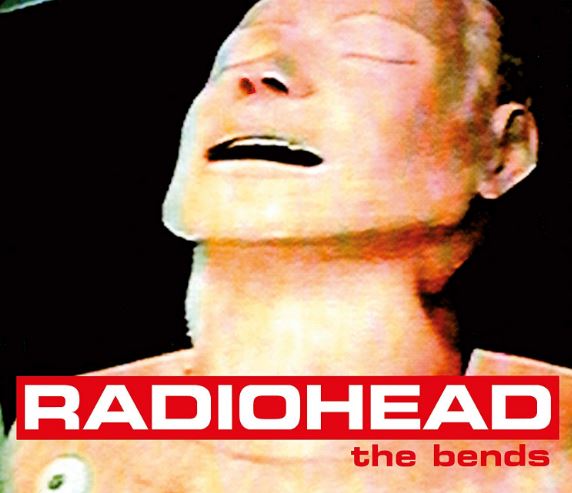
Another year, another wonderfully odd and insane Vasilis Marmatakis poster for a Yorgos Lanthimos film starring Emma Stone. And if his movies aren't already weird enough, the artistic inspiration they provide for its marketing is always on point, with Bugonia joining The Favourite and more notably 2023's Poor Things as some of the more ambitious poster art we've seen this decade. There's definitely a touch of Radiohead's The Bends in this image, only a whole lot slimier and more disgusting, as the bald Stone's abducted pharmaceutical CEO Michelle Fuller is drenched in a cream familiar to those who've seen the film.
With her face dripping in that crimson, yellowish goo, it's almost as if Stone's character is fighting to escape and get air while the fluid spreads, doubling as a fitting visual metaphor for the story. Eyes looking upward, there's a claustrophobic helplessness to her situation that's uncomfortably mesmerizing to watch despite its ickiness. And that futuristic Churchward Roundsquare title font will now exclusively be identified with this film, its bold usage only amplifying the quirky sci-fi thriller's futuristic tone and style.
1. Pluribus

Sharing little in common with Breaking Bad or Better Call Saul besides an Albuquerque, New Mexico setting, Vince Gilligan's highly anticipated post-apocalyptic sci-fi series Pluribus is unmistakably its own thing, And that's really all we could have asked for. While predictions will vary on where the premise goes from here, few could argue it's made with the same care and quality we've come to expect from the showrunner. If nothing else, he's earned our trust to take the ride, with this poster reeling us in before even a single episode aired.
Simple, sharp and uncomplicated, it immediately grabs hold, at least partially due to a bright school bus yellow color you don't see every day. And just look at all that negative space, save for the cleverly stylized "Plur1bus" title and a surprisingly unobtrusive Apple TV Plus logo on top. But it all comes down to illustrator Michael Koelsch's awesome rendering of Rhea Seehorn's understandably cranky pirate romance novelist Carol Sturka screaming into the abyss. About as truthful a depiction of her maddening situation as it gets, the image looks accurate enough to be mistaken for a real photo. The choice to cut her off at the bottom with hair wildly flailing hammers home this existential crisis. It all makes perfect sense to those who watched this series while still piquing the curiosity of anyone who hasn't.
Runners-Up


And The Worst...

Just when you thought his Batfleck days were over, Ben Affleck returns in a very DC adjacent one-sheet for The Accountant 2, this time parodying a poor man's Riddler from The Batman.

How I Met Your Mother: The Movie. Photoshopped actors, a title treatment you'd sooner see in the supermarket aisle, a silly tagline and a poor visualization of its time-hopping door motif. But what's worse is how safe and sterile it looks, more closely resembling a corporate travel guide than a movie poster.

At least this looks fun bad and the idea of a Currey/Gardner Fall reunion is exciting. But photoshopped dogs is where I draw the line. And how they separately cut and pasted the three stars onto a background that looks like one of those screens you'd use during Zoom calls to pretend you're on vacation. Hopefully somewhere nice, with exploding boats.

And you thought his final match was bad. Difficult to even find the movie's title, until you realize it's directly above that eyesore of a Prime logo. There are other character posters but the Cena's is just too easy.

A digital work of art. You could complain how this woman looks nothing like Scarlett Johansson, but if we're going there, that doesn't look much like a cliff, waterfall, rope or dinosaur either. At least the poster's consistent.

A bad concept that somehow came out looking worse than was likely envisioned. Placing actors inside a silhouette almost always fails but this is particularly clumsy due to the layout. The credits are oddly placed in relation to the title and that's not even getting into the awkward photoshopping or hideous background color. Total disaster all around.

On the bright side, the movie's only 90 minutes. But there's a 97.5% chance I may have laughed after seeing this poster, which is buried beneath a tremendous amount of text. It's hard not to smile at the audacity of its plot, which could be thrilling if you enjoy watching Chris Pratt try to outwit an AI based justice system from the comfort of his own chair. At least Rebecca Ferguson still looks cool doing anything.

According to the blurb on top, "It's a Powerhouse Return To Oscars Form For Russell Crowe" Well, he's in some kind of form, but it has little to do with awards. And have you ever seen a group of actors superimposed in front of a sliver of a screenshot like this?

We can laugh now, but when this generic one-sheet for One Battle After Another first dropped it was tough to accept this as the promotional material for one of our greatest directors' most anticipated films. But while the advertising still didn't improve with its subsequent character posters, the movie still delivered in spades. And at least we'll always have that great alternative design, which is a relief since gun toting Leo in a bathrobe just wasn't cutting it.

Forget about the poster. Let's talk about Pete Davidson's character. So many questions. Is he a security guard? Has he been kidnapped? Is he a pro? Or a con? And whoever this guy is doesn't resemble Eddie Murphy at all. The bills are a nice touch, along with that hilariously gigantic title.

Damon and Affleck reteamed for a Joe Carnahan Netflix cop movie? The RIP might look DOA but at least it can't be as bad as this poster... can it? Its transparent title and laugh out loud tagline are certainly choices, but the whole thing reeks of executives just giving up and throwing their hands in the air. "Fine, we'll do it."

DC should have quit while they were ahead with these. The first teaser was really strong and the runner-up above creatively paid homage to the Reeve films. Unfortunately, pesky franchise obligations dictate we need dozens of character posters and Superman's somehow turned out the worst of all. It's the kind of image we feared seeing when the film was first announced. Luckily, the movie was good enough to overcome it.

W H A T
W E R E
They
T H I N K I N G
With
T H I S
Poster?


No comments:
Post a Comment